Thursday, March 14, 2013

Beginning watercolor 3/14/13 Letting Value do the Work

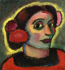
Working on the self-portraits in class, it was clear that the value contrast between the first and second layers did most of the job of creating an illusion of light and substance. The reliability of this effect makes it possible to be bold with color, as long as you hold on to the value relationship. The first layer, for example, could be richly multi-colored if the colors are similarly pale. The shadow pattern, too, could be made up of a variety of colors if they are all dark enough to work together to make the shadows.
Alexei  Jawlensky

Take advantage of the opportunity to experiment with exaggerated color relationships. Try making all the downward facing planes similar in color temperature, but different in hue. Or try making the shadows all cool and the lights all warm, or vice-versa.

Andre Derain   Portrait of Matisse

It is also possible to use color to provide all the contrast, as Derain has done here. Much of the blue shadow side of the face is no darker than the yellow, sunlit side, but it still reads as shadow. This work will carry over to our figure painting next Wednesday.

Have fun. Let go.

Thursday, March 7, 2013

Beginning Watercolor Homework 3/7/13 layers, again

In class we discussed the process of making a step-by-step demonstration of the sequence of layers that led to a simple study of an image. To review the process, please read this description carefully:

Start by identifying the major shapes in the image. There should be no more that 10 or 12.
Make a simple drawing that locates the shapes.
Paint in the first layer - the lights - of each shape, keeping the treatment as simple as possible (no texture or detail).
Now make two more first layer pages, so that you have 3 more or less identical sheets.
Put the second layer - middle value - on top of the first on two of your 3 sheets.
Finally, apply the 3rd layer - the darks - on top of one of the second layers.

When the process is finished, you should have one sheet that just has the first layer, one that has first and second layers, and one that has three layers. If you need a fourth layer to get the super-darks, just apply them on top of the third layer. No need to make a separate , fourth version.

In case you missed class, here are a couple of simple images that will resolve nicely into three layers. If you think there should be a fourth layer of super darks, put them on top of the three layer treatment.


In case you were not in class, here's an image that resolves neatly into 3 or 4 layers.


Thursday, February 28, 2013

Intermediate Watercolor Homework 2/28/13 The Shadow Shape

When we work from the figure next week, we will have a single light source and a definite shadow pattern, which can simplify the representation of three dimensional form. To get some practice seeing the shadows as a separate layer from the pale first layer shape, try working from photos of figures, such as these, below;


The images are easy to find online. I searched Pre-Columbian sculpture and Greek sculpture. Something tells me these are not the only nudes on the web.

You can try painting the shadow shape alone, to see how much of the presence of the whole figure it carries. Or try being careful with the shadows and carefree with the first layer lights. You can play with hard and soft edges on the shadow shapes. Color temperature contrast. Counterpoint between figure and ground (light behind the dark, dark behind the light). Have fun.


Beginning Watercolor Homework 2/28/13 Translation

Choose an object with a simple shape, like a bottle, or salt shaker. Set it up with a single light source and a plain background. Paint it once or twice in monochrome, with an eye toward discovering which are the essential elements of the subject. Can you leave out the subtle middle values and still get the gist of it? What about the lightest lights? The darkest darks? Where is it important to get the drawing correct? Where can you let go of accuracy?
When you feel that you are starting to know the subject as a sequence of layers, introduce color into the exercise.

For each layer, ask the same questions:

Is there a way to paint the whole shape with an overall shape that can underlie everything that will come later?
Is there anything you should paint around?
Is there anything you should do while it is still wet?

Paint it a few times. As you progress, you will probably see that the range of what will "do just fine" keeps widening. Eventually, you will know the subject well enough in the language of watercolor that you can put the actual object back in the cupboard and still paint a perfectly fine version of it.


Gerhardt Richter                         Apfel            

Wednesday, February 20, 2013

Beginning and Intermediate Watercolor 2/20/13 Letting Go

Once you've had some experience oversimplifying a subject, it remains to practice deciding how much additional information to plug back in to your painting. Today, we spent some time selecting the one stroke among all the darks, for example, that would do the most work toward locating a given shape in space relative to all the others. Creating a hierarchy of significance helps you make incremental steps toward subtlety and complexity. Then you have a better chance of stopping before you over-paint the scene.
Most people took a photo home today, after spending some time looking for its basic structure. Lots of squinting, and lots of letting go. I find it useful to look for similarities between shapes, rather than differences. Then it's easier to notice structural realities, like the fact that the image below is basically warm below and cool above, with a strong dark shape in between. Lots of soft-edged lights are sprinkled in the dark zone. If that was all you took care to present in a painting, it might just be enough to tell the story. Specifics, like figuring out what that dark shape in the lower left is, are not essential information, compared to the basics. Let that one go. if the composition can use a couple of dark strokes down there, put them in, but don't worry if you have no idea what they represent. In fact, don't worry, period.


Make a very quick sketch of the bones of your image. It can be in monochrome, or maybe in a palette limited to one warm and one cool color. You might decide to try painting the middle values around the lights, and then insert the darks one at a time, according to their relative importance.
Let these overly simple studies influence where you go with the paintings that follow. Not everything you let go of needs to be reclaimed.

Friday, February 8, 2013

Beginning Watercolor 2/8/13 Master Copies

The first watercolor painting I ever made that was worth looking at was a copy of this Winslow Homer beauty:

Homer found an elegant way to simplify this very specific moment of light and air and movement. There are, really very few shapes, and not too much texture. The wash of muted turquoise, for example, is not as complicated as it may seem, at first. Carl Schmalz suggested it as a good subject  to copy. He also proposed this Edward Hopper:


Mister Hopper fine-tuned the value and color temperature of every shape, relative to all the others. The pattern of dark and light forms makes a satisfying abstract arrangement of shapes on the page, at the same time that it reveals the orientation of the planes of the structures toward the sun.

 You might give one of these a try. Most of you found something in a book that stirred you. There are images everywhere, so please do spend time browsing the vastness of Google image.
Copying a painting you admire is as close to guaranteed learning as i can imagine. You will be a better painter on the other side of the exercise. Take your time. Se if you get any clues about how the "master" was thinking. Enjoy the ride.

The feeling of the painting is more important than the exact look. 

What you see when you squint is what has to be in the painting.

How dark is the shape I'm about to paint? It is darker than _____, but lighter than _____.

Over-compensate for the lightening of the color as it dries.

Make it as simple as possible; make it too simple. In fact, a (virtual) prize will go to the simplest interpretation.

Intermediate Watercolor 2/8/13 Consolidating shapes

I often find it hard to let go of the identity of individual shapes that are clearly present in the scene I am painting, even if I know that they are not essential to the feeling I want to create. Little by little, Though, I am replacing that feeling of loss with one of freedom. There is a world of rewards to be enjoyed for consigning most of the "stuff" in the source material to the "Adios!" file.

In the past, I've repeated the phrase, "Shape first, then texture" like a mantra. Now I'd like to amend that to read, "Shape first (the bigger the better), then texture (if necessary)". In the study below, lots of information has been distilled down to a few big, primary shapes, each of which is embellished with just a little secondary information.
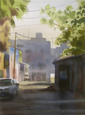
The "texture" within each of the big shapes is mostly soft-edged, which gives prominence to the more general statement; the hard edged major shapes. The group of buildings in the background, for example, is consolidated into one shape, which is entirely middle value. In the big picture, this is all the specific information we need to know about them. If i had insisted on making clear that there are 6 different buildings back there, that would have drawn too much attention to that area of the scene, confusing the sense of space. If they are adjacent shapes of similar value, in the same spatial plane, consider emphasizing their similarities, rather than their differences.
This approach flows from the supposition that a watercolor ought to progress from the general toward the specific. The idea is to leave the door open to adding information only as the painting requests it. In that middle-value background shape, I could have added some hard-edged shapes and darker darks if I  sensed that it would enhance the feeling of space or the mood of the painting overall. I still can, if I want to. There is no need to get specific before the need for specificity is demonstrated.

For homework, Find an image that involves adjacent shapes of similar value. Paint the overall shape first, nice and wet, then add information within the shape, as dictated by the job the big shape does in the whole context. Here's a picture that might get you going: