Saturday, February 26, 2011

Intermediate Watercolor homework 2/25/11


Warm/Cool

        
Oaxaca A.M.
Here's an exercise for exploring the concepts we've touched on regarding warm/cool.

Limit your palette to just 2 colors, one distinctly warm (yellow, ochre, gold, rich green gold, cadmium red light, pyrol orange, quin burnt orange...), the other very cool (any blue, violet, perylene green, hunter green, pthalo green...).
Make a version of a picture in which for every shape you decide how warm or cool it should be. The pure form of your warm color would be reserved for the very warmest part of the scene, and the purest form of the cool would only be used for the coolest part. Everything else would involve mixtures of the warm and cool colors. The second warmest shape, for example, would have a little bit of the cool mixed in. got it?


Sole
How you choose to make something warm or cool is a big category. At first it may seem arbitrary, but the more practice you have paying attention to it, the more your choices will be informed by patterns you've observed. To get started, look at the image you've chosen, to see if there is any content that you automatically think of as either cool or warm. The sky, for example, should be pretty obvious, as would the ocean, or a bare light bulb or fire. You might ask, "What would be the warmest (or coolest) part of this scene"? Then you have something to compare everything else to. If you decided, for example, that a brick wall in sunlight was going to be very warm, then the shadow on the wall would be somewhat cooler. The shadow on a clump of foliage would be even cooler, since the foliage in sunlight is cooler than the brick in sunlight. It's all relative, just like value. When you are deciding where on the temperature scale to place a particular subject, try looking for something a little cooler and something a little warmer than the part you are about to paint. Just as with value, when you notice that this new part should be lighter than THAT, but darker than THIS. So, too, with temperature, it helps to locate your new bit between two parts you're already committed to.
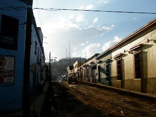
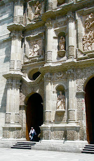
These photos would work for this assignment, but it’s always good to use one of your own, or work from life.

Please post your discoveries by leaving a comment.
Have fun
Tom

Beginning Watercolor homework 2/25 /11

In theory, each successive version of a painting should be closer to your ideal vision. You know how to identify what is not working, and you are prepared to refine the techniques and awareness that will give you the confidence you need. And yet...
It seems, at times, as if the painting has a mind of its own, and it wants to go somewhere other than where you think it should go.
I find it helps to proceed as if this were actually true. The painter as detective...

Be patient. It usually takes me 4 or 5 attempts before I can begin to reconcile what I envision and what is happening on the paper. Then it may take another 3 or 4 before I can distill it down to what the two have in common.
Simplifying the image is the most effective way I've found to remember what I wanted in the first place, and to discover what the image requires. After that is made clear, then you can embellish, tweak, distort, or otherwise personalize the painting until it tells you it's done.

Look for an image or a scene that resolves clearly into layers.
Identify the major shapes.
Make an over-simplified study.
Practice whatever looks tricky.
Paint.
Paint again.
etc.
Have fun


Rex Brandt

Thursday, February 17, 2011

Beginning Watercolor homework 2/17/11

Piling on the layers

There's a reason we're spending a lot of time practicing seeing a subject as a series of layers. For watercolorists, it just may be the most useful skill of all.

Here's an exercise that makes the progression of layers very easy to recognize, and creates a rich resource for the class at the same time:

Find an image that readily resolves into 3 or 4 layers (light, middle, dark, super-dark).
Paint the first layer.
Get another piece of paper, and paint the first and second layers.
Get another piece of paper, and paint the first, second and third layers.
If there is a fourth layer, you'll need a new paper, with all 4 layers on it.
When you're done, you should have a series of pages, showing the step-by-step progression.

Imagine the classroom wall with all these arrays displayed (displays arrayed?)


intermediate Watercolor homework 2/17/11

How do you decide which form of preliminary study will prepare you to make a well-informed painting?

There are many ways to distill the flood of information a new image presents. Some of us like to start with a simple pencil sketch, to get a quick version of the scene in two dimensions. Some want to see the image as a pattern of darks and lights, to get a basic understanding of the structure that will hold the picture together. Others like to eliminate detail and texture, to help sort out the essential from the optional. Then there's the 2 color, warm/cool sketch, that reveals the role of color temperature in determining a feeling of depth, and so on....
Choosing how to begin finding the essence of a new image requires a combination of knowing your own habits, and assessing the particular challenges of the scene. If you know that reserving the lights is difficult for you, for example, and the subject you've chosen involves some important, specific white areas, it would be a good idea to focus on a study that will help you make sure you don't lose those spots.
Remembering to ask, "What looks tricky?" before you launch into the painting is a good way to check both your own insecurities and the unique nature of the scene.

What looks tricky? 
The answer will not be the same for everyone, but for me, the challenges stem from  too many areas of interest.
This is a very busy scene, which is part of why I like it. Everywhere I look there are many individual forms. My eye wants to linger, but quickly gets drawn elsewhere. How can I give the viewer a sense of the wonderful complexity of the market, while still providing an image that can be perceived as a coherent whole? I need to decide what should be specified and what can be merely implied. 
Making a geometric study, where forms are refined down to flat shapes, with no texture would be a good pace to start. Then I can decide where I want to reinsert more information. I could also learn a lot by making an all soft-edged version, to see where I wish there were hard edges.


What looks tricky?
Hmm...Not too many shapes. Very clear dark/light pattern. Easy to read depth. Balanced composition. Nice warm/cool distribution. No need for fancy brushwork. Sometimes nothing looks tricky. What am I waiting for?

Find an image that attracts you. 
Make a written assessment of what looks tricky. 
Plan a preliminary study, or studies that address the challenges. 
Paint the study. 
Write down what you learned. 
Paint the picture. 
Have fun.

Thursday, February 10, 2011

Comments?

I've been adding to this blog for a while now, and never gotten a comment. It's a great place to post homework, and to store random thoughts, but it is also an opportunity to start a conversation. I hope, eventually, to see some interchange of ideas, questions, revelations and the occasional rant. Maybe I should be a bit more controversial...how about declaring a moratorium on paintings of koi, seen from above?

Intermediate Watercolor homework 2/10/11


I can see the benefits of thinking in layers showing in your work. Let's go a step further, and try using this awareness to simplify the image. In the following paintings, the artists have seen a way to refine a complex subject down to a few steps. Choose one of these, or another painting you find that you admire, and copy a section that presents itself to you as a series of layers - the street shadows in Alvaro Castagnet's bridge scene, for example, or the floor in John Yardley's interior.
Then, look for a photo that includes a similar subject, and see if you can apply the same kind of thinking to translate it into paint.
Have fun
Tom


Leslie Frontz       Brown-Eyed Beauties


John Yardley


Harbour Bridge, Sydney                   Alvaro Castagnet


Torgeir Schjolberg


Beginning Watercolor homework 2/10/11


Make paintings while the sun shines


Right now, and perhaps tomorrow there are bold shadows everywhere. It seems wise to put the layer project on hold and practice shadows for a while.
I can see shadows inside the house, and a great many from the windows. Try setting up with a minimal kit and doing numerous quick studies, focusing on a single effect, such as where a shadow passes from one surface to another, changing color. Don't concern yourself with painting a whole scene. This is meant to build seeing skills and technique, and to practice getting the essential info down and moving on.
Here are a few photos I took this morning, with notes about the watercolor variables that come into play for each:
Color: changes as shadow passes from one surface to another.
Value: darker nearer to shadow source.
Wetness: edges soften farther from source.

Color: Shadow color changes with orientation of plane and with proximity to reflected light.


Drawing: To make sense of the shadow pattern, follow one part at a time: The shadow of the newell post, for example, cuts to the right every time it reaches a new riser. Notice how the the shadow of the rail does not zig-zag when it crosses from one step to the next, but everything else does. Hmmm...can you imagine standing in a different spot, where the rail shadow would zig-zag, and everything else would be straight?

If you want to carry on with the layer project, take a look at last week's intermediate homework.
Have fun

Friday, February 4, 2011

Beginning watercolor homework 2/4/11

It was a treat to see the whole class working so hard on those onions on Wednesday. Bold color, strong darks, bright highlights, believable shadows. And maybe a few of those longitude lines. Do you think you could make a decent onion now, without actually looking at a real one?
This is a good time to practice the skills involved in discovering what needs to be correct in a subject, and what can be carefree.

Find a simple still life object - preferably one with dark darks and light lights. Make a 3-value, monochrome version, rounding up or down so that everything is either white, middle grey, or black.

Assess your study by asking "where do I want more subtlety?"

Write your conclusions directly on the study.

Make another monochrome study, this time using as many values as you feel the subject needs.

Move into color, limiting your palette to no more than 3 colors.


Here are some still life watercolors from various website; all kinds of approaches.


Have fun,
Tom

Intermediate Watercolor homework 2/4/11


Wednesday, in class, we spoke about the need to see beyond the darks and middle values to recognize what the first layer will look like. Here is a progression of images that illustrates this practice:
Deliberately ignoring the layers that come later is easier if you have a good sense of what they look like on their own. To see right through the darks, for example, it helps to be able to recognize them as a pattern apart from the lighter forms. Try picturing the darkest darks from this photo as a separate image. It helps to squint:


                                           Callejon, Oaxaca

Staring at the top, the wires would all be part of the darkest layer, along with the vertical poles, the eave and windows of the buildings on the left, the cast shadows of those buildings, the underside of the purple bougainvillea…what else?


Without the lights and middle value forms, the darkest layer would look like this:


                                           Callejon, Oaxaca                  Darkest darks

If the layers were printed on transparencies, this could literally be peeled back to reveal the middle values and lights beneath. Instead, when we look at the photo or the actual scene, we do the ”peeling” mentally.


How much care does each layer require?

With a high-contrast image like Callejon, Oaxaca, when we see the darks separated from the other values, it is clear that they do most of the work of establishing the illusion of reality. The cast shadows reveal the strong light, while the obvious perspective of the buildings defines a clear feeling of space. Recognizing this early on can be truly liberating. If we can depend on the darks to pull the whole picture together, the lights and mid-values can be applied very casually.

Callejon, layer #1


I have deliberately painted “outside the lines” to see if it’s true that the darks have enough narrative clarity to make sense of this mess. If it works, it means that when I’m laying down the first two layers, I need not be distracted by detail, and all of my attention can be devoted to simply making gorgeous, juicy paint.

Callejon    11 x 12


This is a good example of the benefit of asking “What Needs to be True in the Finished Painting?” Being a little careful with the darks allowed me to be carefree with everything else.

Look for a high-contrast image where the darks appear to do most of the narrative work. Try making a study of just the darks, in monochrome. How much does this inform the care you need to take with the first layers? If you are encouraged to relax with the lights and middle values, try really letting go. This is your chance to be as loose as you want. Go for it!
Have fun
Tom