Thursday, May 30, 2019

Intermediate Watercolor, 5/30/19 Who Needs Gravity?

We took some bold liberties with the decorative complexity of the Gasworks structures yesterday. If you enjoyed that process, perhaps you'll be encouraged to let go even further by looking up John Marin and Lyonel Feininger:


John Marin


John Marin


Lyonel Feininger


Lyonel Feininger


Lyonel Feinger

New territory?

You can use the sketches and studies you made at the park and see what happens when you set the shapes and lines free. 


Meanwhile, I hope everyone is entering something in the Best of Gage show. I've seen plenty of terrific work this term. Let's flood the halls with watercolors!

Beginning Watercolor, 5/30/19 Taking Your Time

When a painter wants to "loosen up" their brushwork, it might seem counter-productive to bring a lot of thoughtfulness into the process, but I am convinced that it is clarity of intention that gives rise to confident paint application.


Charles Reid


Asked if he painted as quickly as his work suggested, Charles Reid replied that,  in fact, he painted slowly. 
"I work very slowly, which may come as a surprise because most people think I paint loosely. That's an illusion. Each stroke counts. Fewer strokes with more thought is better. " 
Reid applies the paint quickly once he had made up his mind, but first he thinks for a long time about what to do next .

In class yesterday there was a palpable quality of attention to edges. We had talked and visualized enough that everyone was tuned in once we started painting. I've selected some images that welcome a variety of soft and hard edges. Think about your intentions and make decisions based on which kind of edges will support them. Take your time.


Please submit a painting to the "Best of Gage". 
I think everyone has gotten an email about the process.
Let's fill the walls with watercolors!


Thursday, May 23, 2019

Intermediate Watercolor Homework, 5/23/19 Rocks

Water, animals, cars...Do you have painting subjects that you avoid? How about rocks? They should be easy, it seems, since they hold still so well. But, somehow, they tend to come out over-worked.

Copying other painters rocks might light the way, especially if the artists have found effective ways to simplify the subject. George post comes to mind, and Sargent. Hopper, Wyeth. Painters who do a great job of elaborating rocks, like Stanislaw Zoladz or William Trost Richards, might also open doors for you, even just to borrow their shapes.

Right now the sun is out, and there's the promise of sun in the forecast. How about going out to look for one well lit rock that you can paint several times till you can make one without looking at the actual rock?

Here are a few images to get you started. Looking online for more images would be time well spent. At the least you'd get a better idea of what you like. Have fun!


Zoladz


  1. Post


Wyeth


Richards


Beginning Watercolor 4/30/20 What is Essential and What is Optional?


Look around for a simple object that has some strong darks and some very light lights. An onion or an apple would do, as would a tea pot. Make a painting of the object. Keep it simple. Shape is more important than texture. It is not necessary to make sure the rest of us can tell what you were painting, but take all the time you want. Now paint it again. And again. Paint it at least 4 times. As you become more familiar with the subject you will naturally find some features that have to be right and others that can be approximate. When you start to feel that the brushes and the paint are behaving dependably, put the object away and paint one from memory.


Please send me your studies, especially the one done from memory. Label your work with your name, and keep the image files down to no more than 300 per side


Friday, May 17, 2019

everyone's Homework, 5/17/19 The Lazy Watercolorist

Hi everyone
Tom has asked me to fill in for him while he is in D.C. putting the finishing touches on his portrait commission for the senate chambers. Here's the work in progress:

Not bad, eh?


I am called the lazy watercolorist. You've heard Tom say that with watercolor, the easy way is the right way. He got that from me.

Today, I want to talk about layers. Once you see your subject as a series of layers, the work of planning is pretty much done. Light, middle, dark, right?

 First, look for the major shapes. For each one, block in the lightest color as as overall wash. Many painters wet the paper before applying the washes, letting them run together somewhat. This is the EASY way! Why struggle to get the shapes to stay inside the lines when most of the first layer will get painted over by the time you add the middles and the darks?

If a shape has shadows on it, paint the whole shape with the lightest layer. There's no need to leave a white place where the shadow will be. The shadow can be applied right on top of the local color, which is much EASIER than trying to match the edges of a white shape.


Look at the shadows in this scene. Each rock has at least one facet in shadow. Imagine leaving all those white and then coloring them in without overlapping or leaving any of the white showing. Way too hard for me. I'd rather treat the rock pile as a single shape, all painted the lightest beige, and then apply the shadows as a second layer, right on top of the first. Then, finally, the few deep darks on top of the shadows. On top, not adjacent. Got it?

It may seem logical to keep the shadows separate from the local color. They are different colors, after all. But, when you apply the second layer on top of the first, the transparency of the medium allows the light and the middle to work together to give a perfect illusion of sun and shade.

One more thing; look at the shadow on the red wall. You would have to paint that on top of the lighter first layer while the red local color was still wet. You couldn't get those soft edges by leaving a white shape and coloring it in with the shadow color. 

Here are a couple more images that give you an opportunity to practice laying your shadows on top of the local color. If you have time, try doing them the easy way and the hard way, so you'll see why I always take the lazy route.
Till the next time
TLW


Thursday, May 9, 2019

Intermediate Homework 5/9/19 Using Color Dominance to Focus Attention

A very good way to focus attention on a particular part of a painting is to make it warm in an otherwise cool atmosphere, or vice-versa. Look at this scene, for example, where the windows are very warm while the rest of the setting is definitely cool:


The dominance of the cool makes the warm stand out.
The difference between the cooler and the warmer areas can be more subtle, like the relative temperatures in the scene, below, and still bring our attention to the portion of the image that is not dominant:


For homework, find an image you like and make a painting where you change the colors so that either the warms or the cools take up most of the total area. You can use one of the following images, or find one on your own.


You could cool down all this green and make the boat orange. Or make the trees and grass and water much more yellow and paint the boat blue. Or both!


Can you think of a way to leave the boat blue and change everything else?


What if you made the rocks rustier and changed the trees to Golden yellow fall cottonwoods? Then you could use more blue in the water and change the sky to sunset.

Beginning Homework, 5/9/19 Shadow Color

In class yesterday we came up with a fair description of how shadows are different from local color. By comparing aspects of the two we were able to conclude that shadows are generally darker, cooler and more neutral than the surface upon which they are cast. As with just about everything pertaining to art, there are exceptions to these rough guidelines. Let's do some comparisons to see how dependable the guidelines are.

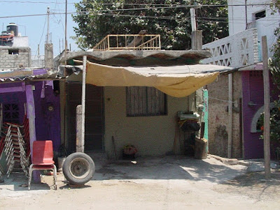
This image presents a real variety of shadows. The red chair is half in shadow, half sunlit. The beige tarp is sunlit on the upward-facing surface and shadowed on the under side. The tarp also casts a shadow onto the ground, where we could compare the color and value of that shadow to the sunlit dirt  beside it.
Is it true, in this case, that the shadow is darker than the local color?
Yes, definitely.
Is it cooler?
Again, yes, it is.
How about more neutral?
Well, not really. The ground is already quite neutral. The shadow is also neutral, but not more so. One is a warm neutral, the other is a cooler neutral. Hmmm. Lets compare the sunlit tarp to the shadow on its under side.
Is the shadow darker?
Yes, for sure.
Is it cooler?
No. If anything, it's warmer.
Is the shadow more neutral?
Um, no, it's not. The upward-facing surface is nearly white, which is pretty much a neutral, but the downward-facing surface is a rich golden ochre.
Some of the guidelines appear to be slipping away. All that's left is that the shadow on a surface is darker than the sunlit areas of that surface. How can we find colors that will work for shadows if we have no recipe for success?
The answer is to observe and inquire. Which is darker? Which is cooler (or warmer)? Which, if either, is more neutral?
And while you're at it, what kind of edge does the shadow shape have?


Find a photo that contains shadows and local color near or adjacent to each other, or use one of these, below. Starting with observation and inquiry, see if you can come up with answers to the questions above.
Take your time mixing colors to represent the local color and the shadows you see in your images. It is not necessary to make an exact match. Instead, focus on making a convincing  pair of colors. Do they describe a believable quality of light?
This is also an opportunity to practice mixing colors from the primaries. Choose one red, one blue and one yellow, and see if you can get reasonably close to the colors and values you see in the photos. Keep track of the colors you used by writing the mix beside the patches of color on your practice paper. To darken a color, try adding some of its compliment.
Don't forget to bring in your flops as well as your triumphs.


Saturday, May 4, 2019

Beginning Homework, 5/2/19, Damp into Wet


A great many images and scenes involve passages where detail and texture are best added while the initial wash is still wet. This soft edges of the secondary information keep it integrated into the general statement. This prevents the detail from being too specific and attracting too much attention. 


Sterling Edwards

Take a look at the grasses in the foreground of this landscape. The soft edges allow the varied strokes to read as all one thing, keeping the area from becoming too busy. It manages to be complex and simple at the same time.


                                                                       Tony Couch


Here's a similar foreground in which the artist has made a general statement with an overall light green wash. While that was still wet, he added vertical strokes of varied color and value. If the green wash had been dry, the foreground would have overwhelmed the composition (it's a close call even so).

The following photos include some areas where this concept would be useful. Try out adding complexity to a wash that is still wet. The real job here is keeping track of how wet the brush is. After the wash is applied, the brush you used still has enough liquid in it to pick up some more pigment from the palette. Stay out of any puddles there, and don't stick your brush into the water bucket. If the paint on the brush seems too dry or thick, remember you are about to add water to it when it touches the wet paper.

Practice this on a scrap of good paper until you see the results you want. Then you're ready to make a proper painting.


Intermediate Homework, Where Do You Really Need Hard Edges? 5/2/19

When we study a scene or a photo to consider how to translate it into paint, the part of the scene we are about to treat is almost always in focus. It's what we're looking at, after all. And photographs in this digital era are entirely focused. You have to pay extra for depth of field, I think.

But this is not how we actually experience the "look" of a live scene. When we are interacting with the components of a location most of what is visible is out of focus. How much of a painting, then, should be soft edged? How can you decide where hard edges are really needed when the image shows you everything in focus?


                                      Trevor Chamberlain

Acting on the premise that the best way to see if something belongs in the painting is to leave it out, making a study with no hard edges should provide you with a tool that you can use for a road map. With a "soft edges only" study in hand, you can ask where a hard edge is essential, and proceed incrementally toward just enough.

The technical requirements for this activity are important. It's not easy to keep the paper wet long enough to get even a quick study to be entirely soft-edged, but you can do it if you resolve to put the brush down as soon as a hard edge appears. Then dry the paper thoroughly and re-wet it where you want the next soft edge to appear.
after making a simple drawing, begin by wetting both sides of the paper. Wetter, please. Even wetter! It should be very shiny, but not quite dripping. Work that water into the sheet of paper.

Remember, This study is supposed to be approximate. Look at the middle ground and background in Trevor Chamberlain's boat painting, above. Half of the page is made up of non-specific shapes. Use a limited palette, say, one red, one yellow and one blue, so you won't spend too much time finessing your colors.
When the study is done, ask where a hard edge would enhance the feeling you want. Practice restraint here. It's easy to add too many specific marks. I want to stop while I think it still needs one more hard edge. I can always add it next year, if the painting still calls for it.

Here are some examples of paintings with a variety of edges, and a couple of candidates for a soft study.