This week we'll experiment with limiting our palettes by selecting only 3 colors, the primaries; red, yellow, and blue. You'll need one of each to make a triad, such as Ultramarine for the blue, Raw Sienna for the yellow and Burnt Sienna for the red. Any way you want to combine your colors is ok, as long as you only use the three colors you start with. The idea is to duplicate the colors in the photo as closely as you can. If your color keeps coming out wrong you may have to change one of the colors in your triad and start over.
Many realist artists, including Sargent, Zorn and Wyeth used limited palettes all the time, and most of the rest of us have explored the process now and then to take advantage of the cohesiveness the technique provides. I'll post a couple of images to choose from, but feel welcome to use one of your own.
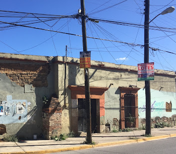
The palette I'm using in this example was one Sargent favored. The color choices would make a pretty good version of this photo, though he would have gotten stuck on that sky. It changes color as we go from left to right. What would you do? Try it and see what happens.
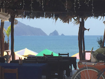
The image below looks challenging. Do you think you'l need a red?
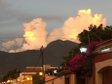
Here, to make that purple light below the bell tower on the right you might need two colors only. Hmmm.
Can you see why you will definitely need a piece of practice paper? Depending on the triad you choose it may not be possible to make all the colors in the image. It's best to see that before you get too far in a painting. If your triad can't make an accurate version of the image you'll have to go back to the beginning
and switch to a different set of primaries. Or just get as close as you can and accept the result. You'll still see the cohesiveness we're after.