Thursday, September 29, 2011

Intermediate homework 9/29/11 warm/cool/layers

Hi Everyone
Here's an old exercise, revised to extend our investigation of warm and cool.

intermediate Watercolor homework 3/4/11

....more warm and cool
I thought it would be a good idea to integrate the warm/cool concepts into the familiar layer approach to planning a painting. The goal is to make awareness of color temperature an instinctive part of your thinking.

When you are making a picture that involves definite warm and cool statements, you may have to commit to the color temperature right away.


Most of the major shapes in this image need to be warm or cool right from layer number one. This does not mean, however, that you would be obliged to duplicate these relationships exactly. You're in charge of all the decisions. Knowing where you would like to depart from accuracy applies to color temperature, too.

 Look at the three shapes in the central strip, for example. The middle shape could stand to be a bit more separate from the one on the right, so we could read the space more easily. Imagine the picture if that shape were a bit cooler than the right hand shape, while still warmer than the one on the left. 

Consider the value spread between the left and right shapes. Could you see darkening the central form a bit? Or lightening it?

How about that shadow on the right? What would you want to do with that, in terms of color and/or value?

At what stage of the painting would you make your changes? 

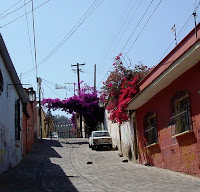
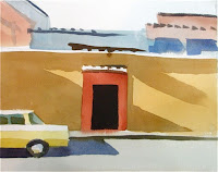
Look for an image (or use one of these) that invites a warm and cool treatment. Plan some changes that make the picture more to your liking. These could just be to make it easier, or they could be simply experimental. Write down where in the sequence of layers you plan to make the changes.


Have fun

Beginning Watercolor homework 9/29 layers and value

Greetings, painters
Please read through this article, then look for a photo that presents a wide range of values, from very light to very dark. Try your hand at the process described here. If you have time, and are inclined, see how what the value study teaches you informs a color version.

Five Value Monochrome Study
What role does value play in the relationships between the big shapes?
As a first treatment of a new subject, it would be hard to find a better exercise than a value study. Understanding the dark/light relationships between the big shapes in your composition is an essential step to making a painting that is cohesive. A five-value version  (white, light grey, middle grey, dark grey, black) can be done quite quickly over a simple drawing of the big shapes. It also provides good practice for seeing in layers. Choose a color (just one) straight from the tube, that can get dark enough to represent black. It’s better not to make a color by mixing, since that introduces another variable. This exercise is designed to focus on value only. Similarly, all paint should be applied to dry paper, to keep wetness from distracting your attention from value.
If you are tempted to get fussy about edge quality, or texture, or any kind of detail, remember, this is NOT A PAINTING, and it is supposed to be too simple. A door may be important, but the doorknob probably isn’t. I have seen some so-called value studies that are, in fact, very carefully observed monochrome paintings. They may be quite beautiful, but as tools designed to reveal the essential elements of the scene, they are not very useful. The best way to find out if something needs to be in the picture is to leave it out.
After each step, while you’re waiting for the paper to dry, assess how complete the illusion of light and space and substance feels.


Light is an important component of this image. Isolating the variable of Value should reveal the role it plays in creating the illusion of sun and shadow.


In your drawing of the big shapes, try to keep the number down to ten, or fewer. The profile of each shape is all you need to draw. The idea is to locate the shapes, not to describe them.

               
· Starting with the light grey, paint the entire page, except for any shapes that need to stay white.
Is there a feeling of light in the study? What about space? Substance?

                   
· When that layer is dry, paint the whole page middle grey, except for the lights and the whites. If you can’t decide whether a shape should be light or middle, round it off one way or the other. The finished study will reveal whether you made the right choice.
Again assess the state of the illusion: Light? Space? Substance?


· When layer two is dry, apply the dark grey over everything except the middle, light and white shapes. Now that the background figure has a dark grey layer, and the section of wall behind him does not, notice how effectively the two separate, compared to the previous stage.

                  
Finally, paint in the darkest darks.
The role of the darkest darks in creating an illusion of light, space and substance is clear even in a radically over-simplified image.

Where do I need more subtlety or specificity?
When the value study is finished, it can be compared to the source image or the scene to see where adjustments need to be made. Having come way over into the realm of too little information, we now have a basis for judging how much more needs to be included.  Don’t skip this step.  A study, as the name implies, is a learning tool. Your painting process will be more efficient and your paintings more cohesive if you extract all the lessons you can from your preliminary work.
In the photo, the two mounds of dirt are so similar in color and value it seemed sensible to treat them as a single shape. But the study reveals that it would be better to separate them, making it clearer that the one on the right is in front. It is also clear that the mound on the left does not separate sufficiently from the wall in the background. It looks ok where there is a shadow behind it, but where the wall is sunlit only the pencil line separates the two shapes. Perhaps lightening the left mound a little could solve both of these problems. Five values, in this case, are not quite enough. This is an example of the need for more subtlety.
The little raised frame beside the doorway that catches the sun is a fine feature  of the photo that I miss. It does an important job, describing the light. It is a bit of specific information that will add significantly to the picture without becoming a distraction.
It is surprisingly easy to see what is missing and what needs to be changed when the image has been over-simplified. If I had made a complex first attempt it would be difficult to know which of the (too) many elements were not necessary.

Thursday, September 22, 2011

Intermediate Homework Sept 22, 2011 What color are the darks?

Socks                                                           Mary Whyte
              The colors in the background of Mary Whyte's gorgeous portrait are clearly related to the palette she has established in the figure. As a result, figure and ground are part of the same world. I would not jump to the conclusion, though, that the darks must be a version of the dominant foreground color. There is plenty of blue in the figure, and the artist could have made the background mostly dark blue instead. The resulting image would have had a very different feeling, but the integration of the parts would still have been strong. If she had chosen to make the background neutral black, however, the figure would have been floating in a context that might as well be outer space.
Make  a study of a high contrast image in which you allow the darks to have a noticeable color. Base the color on the palette you have used elsewhere in the picture. If you have time, try another version, using a different color as the link to the darks.

Beginning Watercolor Homework 9/22 Limited Palette

Using the photo you took home, or one of your own, paint a simplified version using only one set of primaries to mix all the colors. Choose any red, yellow and blue, and stick with that set. You can switch to different primaries on the next version. Have fun with it. This is more about color mixing than it is about making a painting. In fact, it is NOT a painting. Take your time with the colors, but don't correct the paint application. Let the mistakes show, take notes, and make another version. The second one will take half the time of the first.

Thursday, September 15, 2011

Color mixing: Beginning Homework 9/15/11

If you haven't yet gotten your good paper, you can do this exercise on just about anything. The object is two-fold: to awaken your instinct for color mixing, and to strengthen your awareness of the role the primary colors play in creating neutrals.

Part one:
Choose one red, one yellow and one blue, with an eye toward the ones that will "go both ways". Look for the yellow, for example, that will make good greens and good oranges.
Mix together two of the three colors, adjusting and fine-tuning until neither one dominates. Make a small patch of the new color on your paper.
Now add the third color to the mix, until none of the three dominate. Make a patch of the new color on the paper.
Make the darkest version you can of the three color mix, making sure no one color dominates. Just keep adding pigment to the puddle (but no more water). When the paint is so thick that it looks shiny even after it's dry, you've gone too far. Add a little water, and try a patch on the paper.

Part two:
Look in magazines for pictures with areas of solid color about 1 1/2" square, or bigger. Cut some out, paste them onto your paper, and try to mix a perfect match. Use the same limited palette you used for part one. Make patches of your attempts beside the cut-out.
Now try to match the same colors using a different set of primaries. Write down the colors you used near the patches.
Have fun

Intermediate Homework September 15, 2011


What Not to Paint
Finding the essential elements of your image

Since so many of us tend to put more information in our pictures than we intend, we will concentrate for a while on ways to distinguish the essential from the optional. Here are two potential approaches to sorting out what has to be there in the finished painting and what does not. They can all be thought of as deliberate over-simplifications of the image:


1) If the image or scene has a pronounced dark/light pattern, try just painting the darks as a collection of black shapes, and leaving out everything else. The result should reveal how much of the job of telling the story is done by the darks. If the narrative content is clear, then you know you can be casual with the initial light and middle value layers.


2) Make a version of the scene in which the major shapes are simplified almost to pure geometric shapes, eliminating subtlety of outline. Treat each shape as a flat wash, with no texture at all. When you assess the result, look for the places that really need more subtlety or specificity, and take note of any places where what you thought was too little information turned out to be enough.

Both approaches can help you see at what stages of the painting you can be carefree, and when you will need to be careful. Write down what you discover, and have fun.