Thursday, September 28, 2017

Intermediate Homework 9/28/17


Yet another way to simplify

Casa Cutural, Oaxaca
Try this exercise from life if the weather stays fine: 
Reduce your scene (or photo, if you end up indoors) to three values. Work in monochrome, with a color that can get dark enough to represent black.
Starting with a middle value, paint everything except the very light shapes, which will stay white. You may have to round areas up or down and commit to calling them either white or middle.
Next, paint all the strong darks black.
That’s all. Take note of where you want more subtlety (something between white and middle, for example).
Now expand your palette and paint a picture, using what the study taught you.
Vecinos, Oaxaca
Have fun
Tom
Palacia de Carne, Oaxaca

Thursday, September 21, 2017

Beginning Watercolor Homework 9/21/17

Translating an image or a scene into watercolor is easier if you can envision the painting as a series of layers. Using the image you selected at the end of class or one of those below, make a simple study along these lines.

Start by identifying the major shapes that comprise the image. These are the shapes that need to be separated from each other for the pictorial space to be apparent.


This market scene depicts a shallow space, crowded with shapes. It seems important to make clear where the individual components are, relative to each other. I would want it to be obvious that the car is closer than the umbrellas, which, in turn, are closer than the sunlit people. Beyond them are more shapes, subsumed in the deep shade. For each of the major shapes in your scene, draw a simple outline to locate it on the picture plane. Remember, this is meant to be over-simplified. We only need to know where the shapes are, not what they are. You will learn more about what needs to be in the painting and what can be left out if you resist the temptation to make your study a handsome product.    

Next, block in each of the shapes with a first layer. The layers will progress from light to dark, allowing each successive layer to be applied on top of the previous ones. To help see a couple of layers ahead of yourself, try asking, "Is there a way I can paint the entire shape with a wash that will underlie everything that will come later?" In most cases, this will be the lightest tone you see in the shape.  Think of it as a common denominator.

There is another progression that parallels the movement from light to dark. Thinking of the information that is being depicted as starting out very general and becoming more specific, layer by layer, is a good way to keep from putting in more than the viewer needs to be shown. In the deepest shade in the market scene, for example, it is difficult to know exactly what those dim shapes are. Instead of leaning in very close to the picture to try to make them out, lean back, and let them be vague. Give the viewers an opportunity to interpret part of the scene for themselves.

Some parts of the picture will be sufficiently depicted after two layers. others will need three, or maybe four. If you feel the need to use more than 4 layers, it's time to rethink your approach. This is meant to be too simple. It is not a painting, it's a tool for learning how much information is enough. Just because you can see it, doesn't mean it belongs in the picture.

Use three colors, one red, one blue and one yellow, to make all the colors you see.
Have fun!


Is it necessary for the viewer to be able to tell the identity of every shape?
     
Squint! Light, middle, dark.


How many layers do you need to describe the stairs and the shadow that crosses them?

Intermediate Watercolor Homework 9/21/17 Hard or soft (or both)?

While we're on the subject of edge quality, I have to ask if you think we all see hard and soft edges similarly. Every time we discuss edges I get the feeling some people see hard where others see soft. It may have something to do with whether we see form or content first. Content has a way of influencing what we think we see. I always see soft edges in the sky, for example, even when the majority disagrees. Is that because I think of clouds as ethereal elements of the landscape? Could be. However you look at it, it's a slippery subject.
One thing I'm sure of, we can all use some practice deciding what kind of edge is appropriate, and then more practice making that edge where we want it. Technique and awareness!


Regarding edges, how important is it to be accurate? Does this landscape depend on making the clouds soft and the branches hard for the feeling it displays? What if some of the clouds were hard-edged? What about that hard line at the crest of the hill between the tree in the middle of everything and the left side of the frame? If that were soft, would the tree need to be softened, too? How about the foreground? A lot of painters believe that the foreground needs to be in focus because it's close to us. What do you think?


This fine old homestead makes a beautiful box full of light. What if you let some of that light leak out around the edges of the windows? It might be an evocative addition to the emotional content. Or, it might just be a mess. Will someone give that a try and pin it up next week?

For homework, give some thought to how these images might be adjusted by changing the edge quality of some of the shapes. Keep track of what you were curious about, and be prepared to tell us what you changed and what you learned.


Thursday, September 14, 2017

Beginning Homework 9/14/17 The Illusion of Space


To see the illusion of depth in this photo it is necessary to understand which shapes are in front of which. Take a look at that diagonal pipe, for example. See where it disappears behind the dark pile of sawdust? Just before it does, it crosses in front of blue hill, revealing that it is situated between those two shapes. Overall, the composition of shapes in this photo relies heavily on overlap to show us where the shapes are located in space. In fact, with the exception of the puddle, every shape in the scene overlaps or is overlapped by at least one other shape.

If the scene you've chosen to paint seems disappointingly flat, it may be that the shapes need to be moved around a bit, or another shape needs to be introduced.
In the photo, below, most of the shapes do not overlap each other, making the illusion of depth somewhat ambiguous.


If the dark overhang above the opening had a post holding it up that crossed in front of the building we would be able to see where all the shapes are relative to each other.

It's a good idea to tend to composition first, since the shapes are easier to rearrange when you haven't begun putting paint on the paper, but the other variables have a role to play, too. Let's look again at the sawmill image. The blue mountain disappears behind the tank and then reappears on the other side. That double overlap makes clear which shape is closer to us, but the color of the mountain also contributes to the feeling that there is considerable space between the two shapes. 

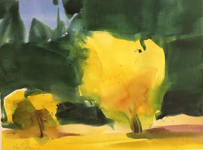
In class, we observed how edge quality could be adjusted to make the space more or less obvious. In the painting below, notice how the edges of the yellow trees go in and out of focus. The color and value differences between those shapes and the dark background are potent enough that the foreground will still separate from the background even if some of the edge that sets them apart is softened. The advantage of deliberately losing some of that edge is that the yellow trees look more integrated in the scene when they are not completely surrounded by a hard edge.


Using the image you were working with in class or one of the illustrations in this post to explore how adjusting the variables (composition, value, color ,edge quality) affects the illusion of space. You can fill a page with experiments in the form of unrelated vignettes. The idea is that you are trying out possibilities as a learning process that precedes making a proper painting. For our purposes, the learning is the goal, so it's fine if you never actually paint the whole scene. If you have time, by all means go ahead and put it all together in a painting, but, in either case, bring whatever you do to share with the class. And, have fun.


Intermediate Homework 9/12/17 Enlisting the Viewer in the Interpretation


This painting came up online as “related“ to whatever I was looking at and instantly took over all my attention. I wish I knew who painted it. Hell, I wish I painted it.

I’m fascinated by its combination of non-specific and thoroughly descriptive brushstrokes. Considering that the majority of the marks are nothing but marks, there’s still a lot we can conclude about the subject. For example, we know it’s a landscape, and a snowy one, at that. But look at those big dark rectangles. What, exactly are they? Some of them come together as a stream. Others might be rocks or tree stumps. They don’t display the features of these elements of landscapes, but they're located where we expect to see such things. I can feel my brain straining to get those marks to hold still and act like believable landscape stuff. And they do! Somehow, the context is sufficiently established that a big, dark rectangle is all we need to see to accept it as a cluster of trees.

So much for making sure the viewer knows what they’re looking at right from the start. This viewer, for one, would much rather be invited to have a role to play in the interpretation.

Let’s go down the list to see if we can begin to understand what the artist did to establish enough context to get his or her marks to come to life.

Composition and Value
Those few diagonally arranged darks in the center go a long way toward creating a feeling of space. The washes above the “stream” get lighter and less complex as they climb to the top of the page, contributing further to that sense of depth.
The biggest shapes, those two dark mid-value patches of woods on either side, are full of clues as to their identity. I think they would be patches of woods even out of context. Compositionally, they frame the scene and direct us into the open area in the middle.

Looking at the arrangement of shapes of different values, it’s clear that this is a rather simple composition. There are only a few shapes, overall, and they resolve neatly into light, middle and dark. I think this simplicity plays a part in getting us to do so much of the work of assigning identity to the non-specific areas. A more complex composition might just be too much to ask.

Color
The limited palette, like the simple composition, signals that we will not be distracted from the job of getting the whole painting to hold together.

Wetness
I notice that the lights and the darks are mostly hard-edged. The majority of the soft edges in this painting occur among the middle values. What do you make of that?


For homework, either loosely copy the snowy landscape, or try making a version of this Seattle scene. Remember, the context will go a long way toward making clear what’s what. For example, if you left a few light geometric shapes along the bottom of the big dark trapezoid on the right, would we know what they are?

Here's another one:


Have fun!