Working on the self-portraits in class, it was clear that the value contrast between the first and second layers did most of the job of creating an illusion of light and substance. The reliability of this effect makes it possible to be bold with color, as long as you hold on to the value relationship. The first layer, for example, could be richly multi-colored if the colors are similarly pale. The shadow pattern, too, could be made up of a variety of colors if they are all dark enough to work together to make the shadows.
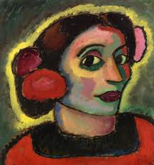 |
Alexei Jawlensky
|
Take advantage of the opportunity to experiment with exaggerated color relationships. Try making all the downward facing planes similar in color temperature, but different in hue. Or try making the shadows all cool and the lights all warm, or vice-versa.
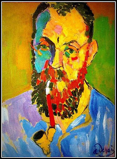 |
Andre Derain Portrait of Matisse
It is also possible to use color to provide all the contrast, as Derain has done here. Much of the blue shadow side of the face is no darker than the yellow, sunlit side, but it still reads as shadow. This work will carry over to our figure painting next Wednesday.
Have fun. Let go.
|

No comments:
Post a Comment