Friday, November 11, 2022

Free For All


Here’s a quick color study made with a big brush on small paper. The result is

almost entirely shapes with just about no lines at all.


Here’s another shape painting, by Jacob Lawrence. Both works begin with

plans, by the way.


Now for a  line - dominant scene by Lyonel Feininger. Here, even the shapes

are made by surrounding them with lines.


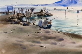
Finally, here’s a mix of lines and shapes from George Post, who made his elegant

compositions from careful pencil drawings.


When you are interested in combining lines and shapes you can begin by taking

note of what those around you do on purpose. It is just as useful for realism and

abstraction.

Find an image to paint that gets you thinking about what is made of shapes and

what is made of lines. Remember that you are in charge.

Friday, November 4, 2022

We Found the People!

 Let's  do some work practicing painting people in watercolor. Look up  artists whose paintings you admire. Chances are you'll like their people, too.

A couple of things to keep in mind; 

It's better to  make your figures too tall  than  too short.

Legs are longer than we think and heads are not that big.

Friday, October 28, 2022

Using Edges to Create an Illusion of Space

Using edge quality to create an illusion is familiar territory to most realist artists. It is especially important for watercolor painters, for whom the meaning of the shapes and strokes are realized by the behavior of the water. Look at this detail from a watercolor landscape. 


You can see that the paper was wet when the pattern of the background was applied, and suddenly dried when it reached the foreground. The abrupt change of edge texture reveals which shape was meant to seem to be in front. The illusion is also supported by color temperature changes along a transition line between background and foreground, but it is definitely what happens where hard edge meets soft that accounts for most of the impression of space. 


Choose a picture from your own collection or use one of these and experiment with hard and soft edges. Can you see the location of the major shapes change when you alter the edges?


Friday, October 21, 2022

The Paint Itself

In addition to the usual elements of a realistic painting in progress, such as color distribution or the illusion of light, a watercolor painter  often needs to pay attention to and make decisions about the look of the medium itself.  Is the paint worth looking at as a collection of brushstrokes apart from what it is a picture of?

Look at this watercolor by Georgia O'Keefe. The paint has been set free to flow and the transparent strokes are encouraged to allow light to pass through the subsequent layers. See how setting the strokes free  demonstrates that the subject matter can be made from nothing but the beautiful paint


Not every watercolor is first and foremost about the paint..
Here are two from John Marin : one that Scratches it's way across the page 
and another that swims gracefully.


How about making two versions of an image from one of these painters or another of your choice

and consider, for example,
how would Arthur Dove have painted the scene or object?
How about Marsden Hartley?
Charles Burchfeld?
Helen Frankenthaler?


Thursday, October 13, 2022

Green Light


Here's a motif we saw several times in last week's critique. The first  layer was  mostly soft-edged and pale, more shapes than lines.

 The collection of marks still has no content when the second layer is applied. It is heading toward recognizable content, but without any third layer darks we have to guess what we're looking at.


This collection of shapes becomes meaningful right away. Just about everything happens by the time the second layer is composed. 


And here's a combination of shapes and lines built along a traditional track that stops at light, middle, dark and ultra dark, picking up context along the way. 
Feel free to work with recognizable form and/or abstraction. 
Be prepared to describe how your painting unfolds


Thursday, October 6, 2022

Try Not to Try


Painting by Susan Dory


Can you make a thoroughly abstract painting like Joan Mitchell, Helen Frankenthaler or maybe Frank Stella or Donald Judd? Try to make a painting that doesn’t remind you of something else.


Take some time to look up these painters and when you are ready, start painting.


Thursday, September 29, 2022

Cross the Line: Realism>Abstraction

 We have seen several images that only need a stroke or two, to move from realism to abstraction.


Look at this image from China Beach. What would it take to nudge this image from the realist to the abstract?


Can you move this image both ways?

Give it a try.

Friday, September 23, 2022

Who's in Charge Here?


 How much information does it take before we can tell what the content is? Here's an altered landscape  that has been cut and pasted. Nothing is missing, but scene has been changed significantly. 


You can have all kinds of fun cutting up an image and then shuffling the pieces before putting them back together in a different order.  You might expect to see some crazy, meaningless collages, but give it a chance.  The subject needn't be a landscape. For example:


Use one of these or find your own image, cut it into thirds, reassemble it, and then paint it. 


                                                                .


Monday, September 19, 2022

What a lovely wedding!

 Sorry to leave you so little time for homework. I'l  get right to it.

Much of the painting work we do skips careful realism and jumps ahead to exaggeration and invention. We can recognize a moment where we may assume that the viewer  know whats we are saying even though we've left out most of the available information. 

Here's an image that would benefit from simplification and taking a few chances.


Here's another. How would you make fewer shapes? Do you need to  make clear what all that -made stuff is?

Friday, June 17, 2022

As You Please

 The tradition for the final homework of the term is for everyone to send a piece or two of finished or unfinished work. If you like, here are a few provocative images that you are welcome to use for copying or interpretation.


From many, one. Start with one big. pale shape and add color: light, middle, dark.


                                      This Monogram value study is already done.


This one would welcome a  limited pallet treatment, one warm, the other cool


Friday, June 10, 2022

Color by Instinct


Let's select one of these paintings and simplify the shapes like we did for the monochrome studies, only here we'll copy the colors as nearly as we can. Use as many colors as you please. As an example, in the first image on the right side, there are three different groups of trees, two tall ones and one short. If you have made all three the same what would be an economic way to correct that? As you can imagine, this exercise will benefit from using lots of practice paper.


That's it. Pay attention to your technique. Do you adjust the color temperature or the hue to correct  your colors? How do you lighten your colors? How does adding the compliment of a color change the mixture? How do you avoid running out of colors? Have fun!


Friday, June 3, 2022

Monochrome Value Study

Please read this more than once.

Making a single color study is a valuable tool for any medium. It is a powerful first step toward abstraction. it can reveal the compositional relationships between shapes. It can measure the role of color temperature in creating an illusion of space.

Like most studies, monochrome value studies begin by locating the major shapes. Drawing helps, but don't get carried away. At this point we need to know where the shapes are, not what they are.  Struggling to identify the components prematurely leads to overpainting and to a degree of complexity that is often not necessary.

Choose a color that can get dark enough to represent black.  Dilute with water to lighten your color, and enrich with pigment to darken it. How many steps your value study takes is usually determined by the complexity of the source image. 

    The relative simplicity of this image suggests a three step study;
 the light of the waves and some of the clouds, the middle value of the beach and some of the sky, and the dark of the sea stack and the shrubs.


This puddle scene, below. could also be given a simple treatment; light, middle, dark, but the subtlety of the middle value shapes would be lost. It looks like a five step study would be more appropriate; white, light, middle, dark, black.


Here are a few more;   Let  the study dry between layers.


If you're crazy enough to try painting the rainbow, I recommend practicing.


Thursday, May 26, 2022

I'm Just Playing

During our critiques and especially after, when I make the rounds and discuss your work one on one with you, I often hear the comment that you are "just playing". I know the idea is that you are experimenting, taking chances, but there is also a bit of  the suggestion that this is not your real work and should not be judged. 

I hope I can always encourage you to take chances and be inventive, even if it means in part that you risk being taken seriously. Who is the main judge, anyway?

I also hear "If I did that again, I'd do that part differently". Do you hear the opportunity in there? Imagine if you really did do it over again every time you said you would!

For homework, please find a painting among those from the last couple of weeks and identify a passage that would benefit from some analysis and paint it again.

Feel free to be playful!

Thursday, May 19, 2022

Trees and Freedom

 When a visual artist identifies where they need to be specific and where they can generalize, then the freedom to invent and have fun with the subject is revealed. Most often, these moments involve developing an understanding of how much descriptive information the hypothetical viewer really needs.

If your painting is green in the lower area and blue in the upper, chances are it's a landscape. With that important piece of information gained  it doesn't take much to tell what the dancing forms below the sky actually are. 


Here's an example; 


And another;


What portion of the  trees  needs to be present? Are some parts more important than others?
Oh, what do you say, how about just one more?

For homework, select one photo to work from and paint a refined image that includes only the essential information.


Saturday, May 14, 2022

 The Sky

How much do the skies differ in your landscapes? Do you work on some paintings with a snarl on your face and others with a grin? Do you have a standard cloud pattern that you use on all your work?

For homework, make a painting with two different skies. You may need to make it one that has nothing but sky above the horizon, so you can just set the second sky on top of the first for the photo. Then send both images to your monitor. 

Thursday, May 5, 2022

Full saturation


  The darkest darks in this image are approaching opacity. Any more pigment in the mix and the paper would be throughly masked. But don't back away yet! Some of the most beautiful passages remain to be laid down; the red barn, the warm grey fence and the cool grey window wall. There is still room to use  color and value to contrast the shadows and the sunlit areas.

Too often we stop short of  the real limit, thinking the paint will lose its sacred transparency.  The demo this afternoon was designed to encourage you to deliberately broaden the range of what is acceptable . If you stay out of the water bucket your paint will get darker and thicker by definition.


You can experiment with how to use the fact that watercolor dries lighter than it appears. Make a wash  of a powerful dark to cover the snow. Now add some super dark, made from pthalo blue and transparent pyrol  orange, and use your homemade black to make the tufts of grass and saplings.


Here are a couple more to try. Make the darks  as dark as you can , then make an even darker dark after that one dries. You should find just enough to make a layer that that is thick and dark enough to  make profound depth  but still fluid enough for the strokes to flow into each other.


Thursday, April 28, 2022

Beautiful Paint

Looking at the watercolors  of John Singer Sargent we encounter some  areas of simple, gorgeous paint and other contradictory passages of great care and complexity, often in the same painting.

Take a look at the  grass between the gassed soldiers' legs. Sargent knew that the carpet of green with just a scant specific blade was sufficient to describe lush grass. The gas mask, on the other hand, needed much greater care to  identify.


A similar comparison of Winslow Homer's early and later watercolors reveals a very different attitude toward the fluidity and transparency of the paint


                                                                    Sargent


A comparison of Winslow Homer's early and later watercolors reveals a similar change in Homer's brush handling. In the early years the artist was more concerned with narrating various stories than he was with celebrating the fluidity and transparency of the paint.


                                                                       Homer


Homer


For Homework, select one of your own paintings, one you are very familiar with, and make a version
of it that you don't have to correct.The idea is that the painting is one of thousands of versions that are 
perfect enough.

Thursday, April 21, 2022

The Bumper Sticker


 Now and then we discuss the all important phrase ; Shape first, then texture, if necessary. The idea is to remember to keep your brushwork general until the painting calls for more specificity, if it ever does.  

One way to stay open is to work on wet paper, at least for the first layer. Take a look at these examples;


                                                                           Rex Brandt


Rex Brandt
Brandt usually began a painting by wetting the whole sheet and blocking in the major shapes.. Can you imagine what the first layer of either of these paintings looked like?.For each shape there was a solid 
wash of color into which the damp brush was touched, making mid-value forms. like the blue green pattern in the water.

Would you like to make an interpretation of one of these? If not, how about  one of the two photos?
                   
If you have a photo of your own, by all means use that.


Wednesday, April 6, 2022

The Patterns


Here's a marine scene from Leslie Frontz, and a farm from George Post, below. Both pantings make use of simple patterns that rely on the context to help the viewer recognize the subject.


By themselves, the dark, squiggly shapes behind Frontz's rowboat have no meaning, but in the presence of the edge of the water we have all the information we need  to make a pretty good guess where we are.


Post's patterns in the Farm scene are even simpler to "read". With its pointy green strokes we can tell what kind of tree that is on the right, and those simple curves in the surface of the ground plane are unmistakeable.


The message here is that we don't have to paint everything. It is not your job to make sure the viewer recognizes exactly what everything is.

Meanwhile ...It is part of your job to make the patterns you devise engaging to look at completely apart from what they represent.  After all, paint on paper is all there is. If it's not fun to observe then  we have missed our mark.


For homework, please select one or more of these images and use patterns  to simplify your interpretation.  Karen, this might be a good time to let everyone know when the images should be submitted
Have fun