Saturday, March 9, 2019

Intermediate Homework 3/9/19 General to Specific

Most watercolors proceed from light to dark, since it is easier to put a dark on top of a light than to do the opposite. At the same time, the trajectory of a well-planned painting moves from broad, general statements toward more specific passages.
Select one of the following images or the ones attached to the beginning homework from this week. All are fresh photos, never before painted, except one that actually is a painting.
Stay loose until you have at least applied the middle values. I believe it's not the artist's job to make sure the viewer can tell what they're looking at, especial;ally in the early stages. To make sure you don't get specific prematurely, try wetting the whole page before you block in the lights.


Gage classes will be working from a model this coming week. If you have any large sketch paper, please bring it along. We'll use it for the short poses.


Beginning Homework 3/9/19 Light, Middle, Dark

Most images or scenes can be translated into watercolor with no more than three layers. The transparency of the medium suggests that we start with the lights and progress through middle value to dark. The following images are all new. No one has painted them before. They have been selected for the ease with which they can be seen as a series of layers.
I like to start by identifying the major shapes and outlining them with pencil or very pale paint.


Sky, hill, ground, trees. Keep it simple, and notice that any white you see in this picture is in your imagination. The darks here are very linear. You could easily make too many hard-edged, dark lines. Remember what Eliot O'Hara said about how many are enough, "Fewer than half as many as you think".


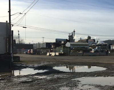
The key to simplifying this scene is to paint the cluster of sheds, vehicles blocks and fences as one single shape. Save a few whites within the overall shape and paint the rest middle value. Then put in a few dark rectangles and Bob's your uncle.


A patchwork quilt of rectangles. Graffiti or no graffiti?

Let's not all paint the snow scene.
Have fun

Gage classes will be working from a model this coming week. If you have any large sketch paper, please bring it along. We'll use it for the short poses.


Saturday, March 2, 2019

Intermediate Homework 3/1/19 Keep it Simple


How do you know when you've done enough to describe the subject matter in a painting? There always seems to be a little more that wants to be included. I think the key is to look inside rather than at the scene or the photo. You have to trust your gut feelings. 
In the alleyway sketch, above, the most important aspect is the sunlight. That's the story I want to tell, so if the shapes appear to be lit by strong light, the essential information is there. I could stop even though there is plenty more optional information I can see. On the sunlit side of the garage the siding is described with a few swift strokes. I haven't made clear whether the siding has corner boards or mitered corners. Should I add more information to make sure the viewer can tell? 
What about that brown shape in the lower right? I'm guessing no one but me knows what that is, but the sun is shining on it, and it contributes to the feeling of a cluttered alley. That's enough.


In this scene of headlands in fog Eliot O'Hara uses the foreground shape to tell us what the shapes in the background are. Only the closest form needs any detail for the viewer to know all they need to understand what the rest of the painting is about. Try closing one eye and covering the foreground. Without that information the background is insufficiently described, but when there is a clear context there is atmosphere and light and space. This is a painter who knows when to stop.


The following images present opportunities to tell a story that can be complete even though there is more that could be added. Decide for yourself what the most important thing is. Once that is present, that could be a good place to stop. Err on the side of too little information rather than too much.


Beginning Watercolor Homework 2/28/19 Figure /Ground


When we talk about the figure/ground relationship in visual art we are usually referring to how the forward objects interact with the background. This is not limited to literal figures. We could just as easily be considering how a vase of tulips stands out or merges with the space behind it.


Image result for raphael portrait of castiglione

Portrait of Baldassari Castiglione  by Raphael
I love this portrait. There isn't much space in the painting. I think Raphael wanted us to feel as if we were sitting quite close to Signore Castiglione, maybe at the same table. The soft shadow the figure casts shows us  there is a wall right behind him.  The artist keeps the figure separate from the background almost entirely by controlling the relative value of the wall and that remarkable tunic and hat. Having made sure that enough of the dark-clad figure contrasts with the lighter wall,  Raphael allows the sitter's elbow to merge with the wall.


Image result for wyeth watercolor

Andrew Wyeth uses similar means to separate the figure from the ground. On the dark side of the figure the background is light, whereas the light side of the figure is contrasted with a darker ground. Wyeth also uses the content to create another kind of contrast,  juxtaposing the rectilinear white cabinets with the scruffy figure.


In this photo the tree is separate from the mountain thanks to color, value and edge quality. If you were painting the scene, do you think you could afford to let some of the edge of the figure merge with the ground? Would you use hard edges or soft for the detail on the mountain?
Give it a try one way or the other, or perhaps both.


It's not necessary to duplicate the photo. Make any changes you please.