Friday, November 12, 2021

November 12 Color Temperature: Compared to What?

We've had some fun this week following Jane Blundel around the fascinating world of color mixing, a fitting end to our ten weeks with a definite emphasis on color in general.

I'd like to take one last look at warm and cool colors. Here are some images to consider  for an exercise that involves choosing a limited palette. Begin by selecting two colors, one warm and the other cool. They don't have to belong to the same hue family. For example, you could choose Prussian Blue and  Yellow Ochre. The colors are cool and warm only compared to each other. They have no intrinsic color temperature. 

To make this part easier, choose colors that are distinctly warm and cool when compared to each other. If it's hard to see the difference, use compliments.


 In  the picture above, let's say you chose to work with blue green and yellow orange.

Ask yourself , "What is the warmest thing in the scene?" The yellow curb? OK That's where you should use your warm color in its purest form. 

What is the coolest part of the image? The sky? I agree. Use the purest form of the color you chose to be cool for the sky. Everything in between your warmest and your coolest will be a mixture of warm and cool.  Got it? Good. Now read it again,  No hurry


Have Fun!


Saturday, November 6, 2021

November fifth Triad Playtime

This week we'll experiment with limiting our palettes by selecting only 3 colors, the primaries; red, yellow, and blue. You'll need one of each to make a triad, such as Ultramarine for the blue, Raw Sienna for the yellow and Burnt Sienna for the red. Any way you want to combine your colors is ok, as long as you only use the three colors you start with. The idea is to duplicate the colors in the photo as closely as you can. If your color keeps coming out wrong you may have to change one of the colors in your triad and start over.

Many realist artists, including Sargent,  Zorn and Wyeth used limited palettes all the time, and most of the rest of us have explored the process now and then to take advantage of the cohesiveness the technique provides. I'll post a couple of images to choose from, but feel welcome to use one of your own.


The palette I'm using in this example was one Sargent favored. The color choices would make a pretty good version of this photo, though he would have gotten stuck on that sky. It changes color as we go from left to right. What would you do? Try it and see what happens. 

The image below looks challenging. Do you think you'l need a red?


Here, to make that purple light below the bell tower on the right you might need two colors only. Hmmm.


Can you see why you will definitely need a piece of practice paper? Depending on the triad you choose it may not be possible to make all the colors in the image. It's best to see that before you get too far in a painting. If your triad can't make an accurate version of the image you'll have to go back to the beginning 
and switch to a different set of primaries. Or just get as close as you can and accept the result. You'll still see the cohesiveness we're after.


Friday, October 29, 2021

October 28 Make it easy on yourself

 Here are a few landscapes in which your main job is to invent a top or a bottom. That, and making them beautiful, of course.

The beautiful part comes mostly from not correcting or overpainting. This is an opportunity to see if it really is better to leave the paint alone once it's been applied.  An invented landscape can't be wrong , after all,, unless you insist  it is by trying to improve it. If you leave it alone you send out the message that this is the way it's supposed to be.


Invented corn field

If the color in your invented top or bottom is saturated, try and put enough pigment in the puddle to make it satisfying on the first try. Stay out of the water bucket unless your plan requires that you wash your brush.


You can use these images and try switching tops and bottoms, or make them up entirely. Have fun!


The Winter term Zoom-based class is full now. There are a couple of spots left in the in person class and the abstraction workshop. Send me an e-mail if you would like more information.
Tom


Friday, October 22, 2021

October 23, 2021 What Looks Tricky?

Whenever you come face to face with a new subject it helps to ask yourself "What looks tricky?" Then you can design a study that reveals a simple solution to the puzzles that remain unanswered. In the night scene, below, for example, you may find yourself  entangled in the direct presentation of the streetlights. If so, it would be a good idea to experiment until you find a sequence of layers that approximate the brightness of the lamps and the impact they have on their surroundings. 


I see half a dozen bright streetlights we are looking at directly, and as many buildings that are lit indirectly by the lamps. Some of the buildings are darker than the sky and some are lighter. Just to complicate things, some of the buildings are both lighter and darker than the sky. By comparing things to a single shape , the sky, in this case, we gain a basis for understanding how dark the other shapes are.

The lamps are obviously lighter than the buildings. They have soft edges, and a ring of pale color that radiates out from a white center. One of those glowing rings is cool, the others are all very warm. These  sources of light might be a good feature to practice. Would it work to make the edges hard? It would certainly make it easier when the sky closes in on the halo of color. Try it and see. You wouldn't need to paint the whole scene to find out, just a scrap of paper would show you the answer.

Then what? What if you look at the buildings on each side as single shapes rather than as a collection of numerous entities? Think of the overall composition as a big bow tie made up of 4 triangles; the sky is a triangle. The street is another, and the groups of buildings are the other two. 

When you have experimented enough to put all your pieces together use this image, or one of the other night scenes from Oaxaca for your homework. If you don't see the bow tie send me an e-mail.


Friday, October 15, 2021

October Fifteenth Finding an Easy Way

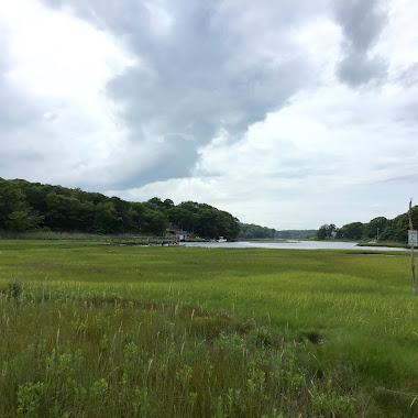
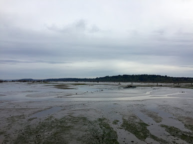
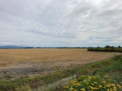
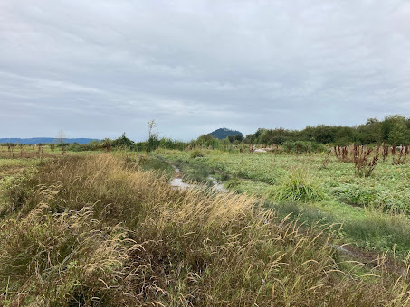
  For many realist watercolor painters the primary job is to discover how to simplify the scene or image they want to paint. The real world doesn't always resolve into a neat sequence of layers that can be laid simply on top of one another. In the photo below, for example, a scattering of very light blades of grass sits among an array of darker ones. 


To paint this subject accurately it seems that one would have to paint around the light grasses to avoid making them appear farther away than the middle value and dark strokes. This is a good example of the branch of watercolor painting known as "No Fun".  Surely there's a way to suggest the mixture of values without resorting completely to negative painting. Fortunately, we are not obliged to be accurate in our interpretation of the subject. Maybe just a few of the separate light grass blades would be enough. 

OK? Refining the image down to the smallest number of essential units sounds good. It still remains for you to discover how you would apply the paint to read as grass? Do you have answers to the following questions?

(1) Is there a way to paint the grass with an overall wash that can underlie everything that will come later?

(2) Is there anything that should be reserved?

(3) Is there anything that should be done while the shape is still wet? 

If so, carry on. If not, get out a piece of practice paper! You could try scraping out a few pieces of grass, just a few. Or maybe you could lift a couple of lights. You could also try masking fluid, once the paper is dry. And there's always opaque paint. Finally, you can usually make it easier by redesigning the look of the image. For example, what if you  make all the grass you invent darker than the previous layer. True, it  would look different, but it might look good.

For homework, experiment with these techniques. Try combining them. Try making an all soft edged version. Maybe all hard edged. Use one of the wetland scenes, and remember, err on the side of too little information.


Wednesday, October 6, 2021

What Isn't Neutral ? 10/7/21


                                                                      Joseph Zbukvich

What isn't neutral in this interpretation of fishing boats? Maybe the blue stripe on the boat, bottom left,. Or is that only colorful compared to all the greys and browns that are so subtly represented? The sail in the center seems downright yellow until you look at it by itself. Certainly yellow is the dominant color, but it's more like a mud puddle than it is like a lemon.

Note how subtly  the two distant hills display warm reddish brown in the nearer hill and blue-grey in the one that is farther away. Zbukvich understands how little color is required to show us what we actually see.

Most of what we see in the country and plenty of what we see in town is neutral. Let's try putting color back into these desaturated images. Just a little.


                                                                 Zbukvich


Zbukvich

From Many Shapes, One Shape October 1, 2021

Take a look ate this image. The big, complex shapes would benefit from some simplification. If you painted the whole big shape a mix of the cool blue, the warm red and the warm grass  the result would be a neutral. Don't forget to save the lights. While the overall neutral is still wet touch in the component colors of your simplified shape.Add in the strong darks. Voila!


Here are a couple more images that can be made easier to paint

by simplifying them. Instead of looking for the differences between the shapes, look for the similarities.


 E Plurubus Unum


Thursday, September 23, 2021

Sure Thing, Have Faith


What color is this barn? I'll bet you can see plenty of yellow, and probably some red, too. How about blue? Look inside the open bays where some farm stuff is visible. Kinda blue, right? The side roofs look bluish too, compared to the warm siding. As painters, we can recognize an opportunity to have some fun with color while also challenging the viewer to see this grey/brown building as a collection of primaries.

What if you allow the primary colors to run together on the paper? Might you see some patches of secondary color; orange, green and purple? If you kept moving the brush around on the paper eventually the whole barn would turn neutral; brown and grey, but just for today let's leave those patches of primary and secondary color boldly asserting themselves. This is where the viewers come in. If they stand back a little the colors  merge optically and display the entire spectrum all at once. The first layer can look like a crazy carnival comprising too many colors, but as long as your brushstrokes are vertical this experiment will not fail! Have faith. When you add those deep, rich darks the whole thing will come together, Guaranteed.                   


Friday, September 17, 2021

September 17 Color and Value are Separate Features of a painting


Which is darker, the Gray sky or the yellow window? Keep in mind that surrounding a color with a much darker one is likely  to have an impact. 
The dark "Frames" are much darker than anything else in the picture. Do you think you can afford to lighten them a little so they don't behave like flat black holes? When I look at the sliding door on the left of the big opening I can see some boards holding it together. To me, they make that dark shape more interesting than flat black would. The door would still be a lot darker than than the yard or the sky.


Take a minute to see where the darks and lights appear in this photo, below.The fir trees are dark when they are framing light areas, and light where they are framing the darks. I could pretend these bold  value relationships were revealed on site, but the truth is I didn't notice them until I  was reviewing the pictures. If you choose to paint this scene remember the questions that will make the light clear and bright; How dark is the shape I'm about to paint? Compared to what? 
For example, the  trees on the hillside are darker than the grass, but lighter than the shadows.


The image below has much in common with the previous one. Layer number one is a carefree treatment of the light trees, rocks and shadows, onto which the more specific darks can be laid.


Choose one or two of these and practice getting the values correct so that you can let go of accuracy in the realm of color. Have fun!


Thursday, August 19, 2021

Watercolor Homework 9/2/21 How Did You Color in Your Coloring Books


This photo has been desaturated. Since we're not at the scene, you are encouraged to color it in using any colors you please. What if you wanted to make a serene version? How about a lively palette? 

How do the colors you choose affect the mood you create? Try deliberately using colors that produce the feeling you want to display, rather than being hap hazard in your selections. See if you can think in color, mentally "coloring in" selections that give you Peacefulness, for example, or Anger. What color do you think the little building really is?
Make more than one version. Can you control the color/mood relationships?
Have fun!

Thursday, June 10, 2021

6/10/21 Everyone's Final Homework Exercise of the Term ; As You Like It


Traditionally, the final homework of a term is your choice, but a few folks have requested some particular images for inspiration. Maybe you would like to start with this photo, 


Or this close-up. I think I'd leave out the dead tree behind the madrona


 Here are a few studies of similar scenes painted in plein air. 
Perhaps you can put the photo and one of them together.


have fun


Thursday, June 3, 2021

Intermediate Homework 6/3/21 Neutrals Warm and Cool


Here are some images that feature neutral colored shapes. Comparing the shapes in terms of color temperature will reveal how warm or cool they are.


The deck, for example, is much warmer than the shingled wall, but cooler than the yellow bumper. 
Feel free to move things around.


This hay shed may not seem to involve neutrals at first, but if you tried copying it
you would see that with the exception of the tarp, everything in the picture involves all three primaries.


Subtle, i'd say. Watch out for texture. It wants to take over.


Beginning Homework 6/3/21 Do You Have a Plan?

 Here's an image that could progress very simply from light to dark and from general to specific. 


What should you do first? Then what? Is there anything you should do while the first layer is still wet? Is there anything that you should reserve? These are the kinds of questions you might need to answer in advance. 
Having at least a rough idea of the sequence of washes and strokes can make the painting process much simpler. For example, seeing this image for the first time you might be most attracted to the beautiful trees.
It could seem natural to paint them first, until you discover how tricky it is to paint what's in between them. 


Planning ahead needn't always be a complicated process. It can reveal a way to simplify a painting that at first seems very  complicated. Here's a scene that invites just a little planning. You might benefit greatly from a very simple road map:
Light, middle, dark. 

Have some fun with these. Maybe try painting one without a plan. Just dive in and see what happens.

Thursday, May 27, 2021

All Levels Homework 5/27/2021 Compared to What?

Is this barn warm or cool? Neither? Both?


It depends what we compare it to. When we see it juxtaposed against the grass it looks cool, but when it's next to the mountain it looks relatively warm. 

When you ask how light or dark a shape is the answer is always, "Compared to what?" The same goes for color temperature. How warm is this barn? Compared to what? It's warmer than the mountain, but cooler than the grass.

And yet, even though this old gray barn can change its temperature, it is still  a bit dull. It can be livened up by taking advantage of its complexity.

Since it has both warm and cool tendencies in this scene, why not mix a warm and a cool? Would you agree the barn has a dominant color? Blue, right? So start with blue, then add its compliment to neutralize it. You can allow the component colors to mix on the paper, leaving evidence of your process.


Notice how the barn boards leave the warm and cool components of  their neutral tones unmixed. This is an invitation to the viewer to mentally finish the job.

For homework, copy the painting or interpret the photo 


Friday, May 21, 2021

Beginning Watercolor Homework 5/21/21 Simplify!

If you have to choose between too much information and too little, go for too little. 


Here's a painting that uses no more than 3 layers in any given area to tell its story: Light, middle, dark.


And here's a photo that has the potential to do the same.


Leave out the detail. Please copy the painting or interpret the photo. Keep it simple.
 

Intermediate Homework, 5/21/21 Full Tilt

 Here are a few images that feature deep, heavily saturated paint. Many painters find them challenging, taking several layers to get the saturation rich enough. This exercise is an opportunity to practice getting it right on the first try.


Given that the paint will dry lighter than it appeared at first, it is logical to assume that you have to make it too  dark. Go ahead! Take the risk.


 If you can't see anything but black in large areas of one of these, feel free to invent the shapes and strokes that could be there. Maybe you can make them soft edged.


Don't be shy, now.

Wednesday, May 12, 2021

Intermediate Homewowk 5 / 12 / 21 Reading the Trees

 Now that we've spent some time looking at how some familiar artists paint trees the next step is to paint some of our own. First, let's determine what role the trees are playing in the big picture. 


These arboretum trees are meant to be decorative,


while this one plays a more practical role, providing shade beside a brick kiln.

The treatment you devise may be different one tree from another. Edges,value, composition, complexity may be manipulated to express the kind of presence the trees have in their particular context. 

For homework, please consider how you want to interpret these scenes. You may want to paint the same scene with different approaches. Never mind what George Post would do, what would you do?


Feel free to use the trees as a jumping off place. You are not obliged to make your interpretation accurate


Have fun