Friday, January 28, 2022

1/28/22 How are you at putting people in your paintings?

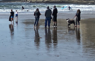
   How are you at putting people in your paintings? It came up this week when some of us got the courage up to include a figure walking through the low tide. I say "us", but I confess none of the brave ones were me."Too corny"I say, or "too uptight".

Actually, it's really fun to to fill a page with simple shapes that add up to figures . Let's practice for a while and share our discoveries in critique. 


Many figures  can be built around an upright rectangle which is the torso. The arms and legs are smaller rectangles that emerge from the upper and lower corners of the torso. A small dot rests on the top.
 Try it with mister red hat. First, make a simple green rectangle which will be the torso. Then, make short rectangles that sprout f rom the corners of the torso. These are the arms. Now com the long. rectangles that begin at the lower corners. These are the legs. Finally, the small dot that rests in the middle of the shoulders, which is the head.  OK, torso, arms, legs, head. Allow the separate parts to run together to encourage the feeling that your figure is all one thing. 


Here are a few more people to play with. Many painters make the arms and legs too short and the head too big. Err on the side of small heads and long arms and legs. I tend to leave out the facial features. The person is sufficiently present before the viewer can tell exactly who it is.

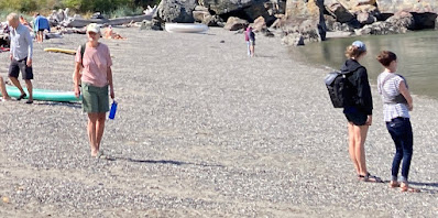
Try inventing people by following the unfolding  of shapes  described here. Try overlapping groups of figures.


Friday, January 21, 2022

1/20/22 CROP!

Before beginning  a painting we often make changes big and small to the objects if it's a still life, to the position of the model  or the boundaries of a cityscape or landscape. If you are working from a photo you can change the feeling of the scene by trimming the edges, or "Cropping". Here's an example;


This landscape has several features that I would not want to lose. I always like a clear value distribution; light, middle. dark, and a simple arrangement of just a few shapes; sky, cloud,  pond, hill, marsh.
But There's just too much green in the bottom half. And, speaking of halves, that horizon runs right across the middle of the world. Cropping some of the bottom off might solve both problems.


While I was at it, I stretched it left to right. This is definitely an improvement.


For homework, I'll offer a few more images for cropping.  Your job is to remember what you changed and  paint  a simple version of one of the transformed scenes.
Maggi and Anne Mariah, please set up the power point with the original images up first, followed by the painted versions. 
Painters, do  you think you can imagine adding or removing shapes?


Tuesday, January 4, 2022

The role of the middle value shapes


  As visual artists we often take note of the role played in our work by the darkest darks and the lightest lights, but we tend to overlook the mid value shapes.

Take a look at this study by Stanislaw Zoladz. What  Lovely, convincing light! Just one or two small triangles are enough to create a believable illusion.  But what would the illusion be without the subtle mid  values?

Here are a few images to experiment with. Paint the large, simple shapes very dark , or very light instead of middle value. If the shape you are about to paint is closer to dark than to light. paint it black. If it is closer to white than it is to black, leave it white. Read that last part again.