Thursday, March 24, 2022

General First, Then Specific, as Needed

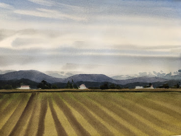
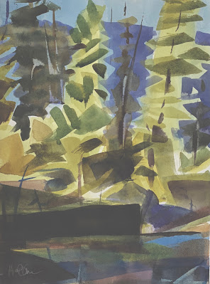
 Many excellent painters begin  by blocking in the major shapes while the paper is still wet. Using pale colors, they allow the shapes to run into one another, making a very general statement that comprises all soft edges. In this stage, the work in progress is more concerned with where the shapes are than what they are.

For RexBrant and Trevor Chamberlain (and many others) this is the best time to find out whether the viewer has sufficient  information .They can pause and wait for the paint to be dry enough to receive the next layer one stroke at a time .

Look for a scene or an image that invites a soft-edged first approach and practice till you have faith that  the picture will come together when the hard-edged darks are added. The two here are meant for observation. It's best if you find an image of your own to practice on.


Can you picture these when only the first layer was present?


Thursday, March 17, 2022

Copying, not Duplicating

Here's a painting full of light and loose brushstrokes. If you chose to make a copy what would you want to make sure you managed to include? The warm and cool distribution? How about the hard and soft edges, or the simplicity of composition? It would help to be able to see which elements of the copy are essential to your purpose.

Take a look at the green firs that stick up higher than any other shapes. What if the tallest one was in the middle rather than on the left? Would the copy still do justice to the original? What if you decided you were more interested  in the feel of the copy rather than its visual accuracy? Here are a couple more images to consider copying. 


Friday, March 11, 2022

Creating Symbols by Simplifying Components of the Landscape


This landscape could hardly be simpler. Details, in the form of texture, have been removed completely and replaced with symbols of an agricultural landscape. Ironically, the result is very realistic.

For the viewer, it is easier to identify what's missing than to edit out the inessential. They are more likely to say,"You missed a spot!" than to point out detail that needs to be edited.  


Alpine firs, right? You can tell by the elongated shapes and small stature. Not a needle in sight. The first layer was the pale,overall shape, then a mid-value triangle for each bough. Finally, the dark  trunk, a la George Post. The painting with the fewest strokes wins the jackpot.


Here are a couple of photos to practice on.


Saturday, March 5, 2022

Where to Begin.

You may recognize the work of Paul Klee here. He often used limits in color temperature to create a range of feelings in his paintings.


The cool dominance in this watercolor, for example,  sets up the expectation that the mood of quiet will continue.


                                                               Night Fire                  Paul Klee


Here, in a nocturne, Klee makes all the shapes very dark. There is no texture. The thickness of the paint makes it possible for the edges to be soft without the shapes running together. All of the shapes have significant features in common.  Perps you're starting to feel like painting....Can you find some shapes, or invent some?

  Look up Klee. See if you can identify what holds a painting you like together, then apply those aspects to a painting your own.  If you are feeling lost notice that Klee liked to make most of the painting conform to one feature, such as cool dark, while the rest is different in feeling, like the red square, which is relatively warm and light.

Have fun

Tom