Thursday, February 27, 2020

Shape First, then Texture, if necessary

I'm sure I don't need to post an image here to show you what an overpainted picture looks like. The main feature is too many brushstrokes. If you are about to paint a tree and the fist thought you have is, "Trees are made of leaves", odds are you'll make many more strokes than we neto recognize it as it a tree. 
I think we actually see the shape of an object before we see the components. First the forest, then the trees. The wall before the individual bricks.


For watercolor painters deciding what comes first is as simple as you want it to be. It's easy to add more leaves if you have too few, but it's difficult to take them away if you have too many.


                                          George Post

Here's a Georege Post painting that demonstrates the approach of, "Shape first, then texture, if necessary". The pattern of symbolic leaves is sufficient to suggest that the trees are made of many   though very few are depicted.

Below are a couple of photos that are loaded with texture. Try making a quick painting with all the detail removed so you can then add a little at a time and stop while you still feel like more is needed.


Intermediate Watercolor 2/26/20 The Rabbit Hole

Are you ready?

For this exploration let's follow the same progressions we use for realist work, that is, light to dark and general to specific. I'll suggest a step by step trajectory which you can follow or not, as you please. Read it through one time before we begin.

As a first step, let's generate some shapes.

Paint a piece of cheap paper with an overall middle value neutral wash, and another one with a dark wash of the same color. When the papers are dry, rip them into strips and patches.


Arrange the shapes on a piece of unpainted paper, leaving some white showing. Photograph the arrangements you like best.

Now select a palette comprising no more than three colors.
Wet a sheet of good watercolor paper. Using one of your torn paper designs as a rough guide, paint big, pale, soft-edged shapes. Leave some white.

Some variables to consider at this stage:
Do your first layer shapes touch each other? Do they touch the edges of the page? Are the sizes varied? Does one color dominate the design? There's a lot to think about

There is no "right way"to do this. With no external source  to compare to your painting, it can be challenging. Have faith, and don't give up. There are always more opportunities to resuscitate a lifeless painting.

The paper may still be wet, or partially wet at this point. Before you begin applying middle values, decide what kind of edges you want. Rewet any areas where you want soft edges. A spray bottle can be very useful here.
The colors you get by combining the components of your limited palette can play a significant role as background for the more intense original colors.
Keep an eye on the first layer shapes as you apply the second layer. Let some of the earlier marks and shapes remain visible. Saving some of the white areas can be important at this stage. You can always cover them later if you choose.

The final layer often involves efforts to pull the painting together. Glazing adjacent shapes to give them something in common, for example, or adding a stroke that originates in one shape and ends in another. This is when the darks and the purest form of your initial palette are called upon to punctuate  the ramblings of the earlier layers. Stop while you think you're still not finished.`
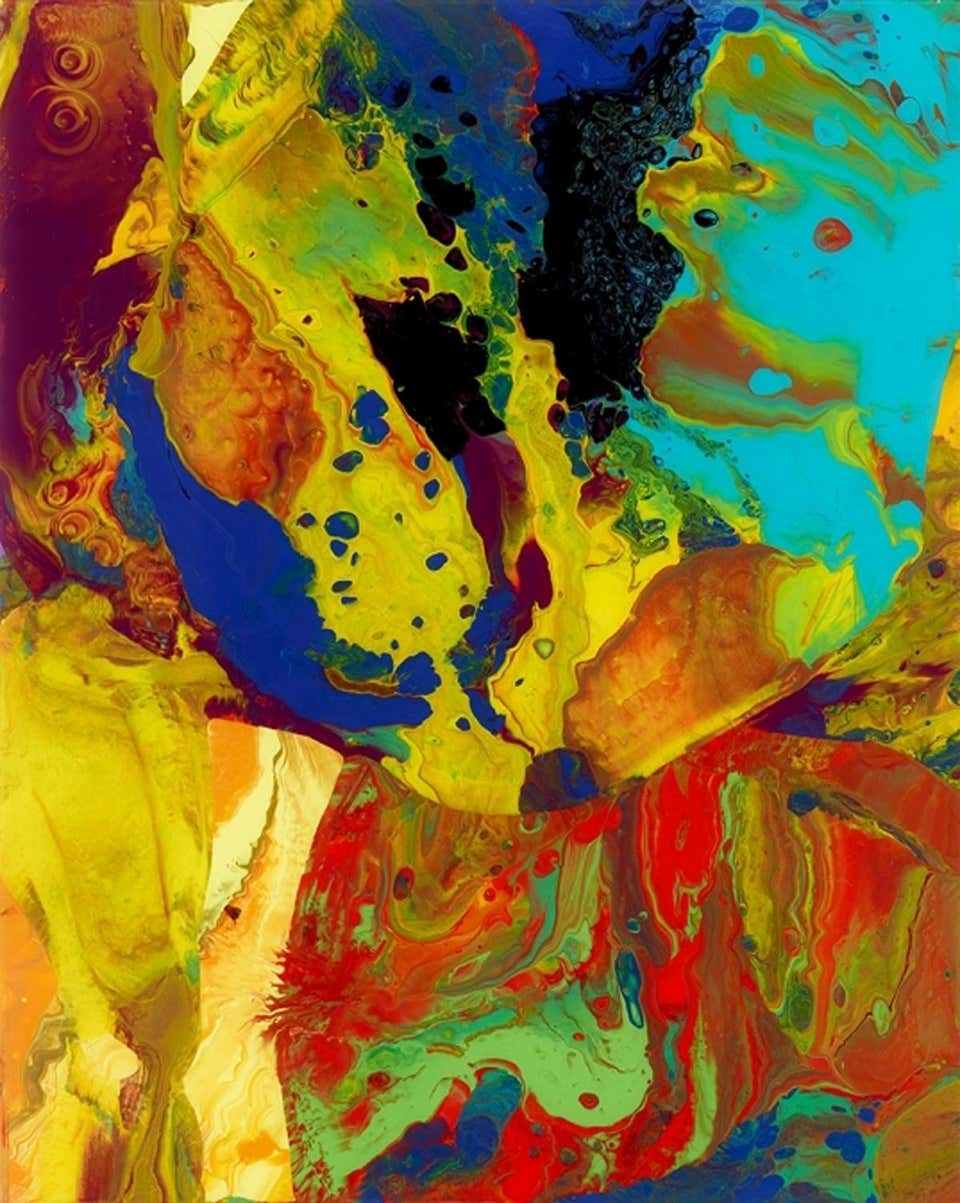

      
Tom Hoffmann


                                          Gerhardt Richter


Wednesday, February 19, 2020

Intermediate Homework, 2/20/20 Hold on here, Let go there

When you feel the urge to depart from accuracy in your paintings, but the prospect of having no guidelines gives you pause, do as the Fauves did. Hold on to value so you can let go of color!


Derain painted his buddy, Matisse in exaggerated colors, but a B/W of the portrait reveals how closely he held to the actual values.


This version of Mt. Hood is familiar and outrageous at the same time. The colors and the values are in the ballpark, which allows the brushstrokes to be more about form than content.


The placement of the shapes in this interpretation of the laguna in Melaque, Mexico are approximate at best, but the colors are true. Holding on to one major aspect of the scene lets us take liberties with another.

Play around with the images that follow. Value is the real heavy hitter. Try holding on to a reasonable interpretation of the relative darkness of the shapes in your first attempts.


Beginning Homework 2/20/20 Simplify

Sometimes reducing the complexity of a scene is a worthy goal in itself just for the pleasure of seeing how simply the content can be stated.


The trees in the painting are more symbolic than realistic. They are brushstrokes more than they are trees, which serves to enlist the viewer as a participant in the interpretation.

See what the following images suggest to you. Are there aspects you might exaggerate to enhance a feeling? Are there features you could simplify, or some that you could let go of to make the ones you keep more important?


Have fun!

Thursday, February 13, 2020

Beginning Watercolor 2/13/20, E Pluribus Unum

Building a tree by painting all the individual leaves is definitely the hard way to tell the story. With a couple of organic green shapes on the top of a dark vertical stroke you've got a tree. The part we forget is that there is a sympathetic, eager and intelligent audience awaiting the opportunity to meet us halfway. Show them the simple version and rest assured they will know what it is.


                                                                  Andrew Wyeth


Here, as usual, Andrew Wyeth Was thinking in terms of "shape first, then texture, if necessary." The stand of conifers is a solid dark shape. Along the profile edge there is a little bit of texture, just enough to suggest that the entire dark shape is made of that same detail. We, the viewer, will gladly do the job of "seeing" all the needles in the middle of the shape, even though Wyeth didn't paint any.

Below are a couple of images that respond well to seeing in layers. They also benefit from looking for ways to combine shapes to simplify the scene. Give one a try.


Intermediate Watercolor, 2/13/20 Careful or Carefree?


                                                                                   Eugen Chisnecean

Take a look at the boats in the lower right of this painting. The artist has allowed two separate shapes to intersect. What is he up to? It seems as if he'd rather we paid more attention elsewhere on the page. Given the role Chisnecean wants the boats to play in the big picture They have been sufficiently described as is.
There are several other places in the painting where adjacent shapes run together. Look at the buildings in the middle ground. The washes that describe the colors of the walls merge along partly soft edges. But the artist is keeping track of how much the shapes combine. He takes care to use hard edges, value contrast and color to keep the buildings separated enough to describe how the town is one thing made up of many.
The painting is a balancing act. Just where the artist is letting go of control of the movement of the paint, he is assessing how accurately he wants to describe the identity of the shapes.
Starting with a general statement and moving toward specificity, every artist finds their own stopping place, where the balance between accuracy and individual interpretation is realized.


                                         Chisnecean

Is this enough information for you?


                                                                   Michael Reardon

How about this one?
How do you know when to stop? Do you want to show the viewer how you created the illusion of space or light, or do you hope to leave them marveling at your skill? Secrets and tricks...


Here are a few similar images. Choose one, identify what looks tricky and practice that. When you're ready, make a simple version in which you allow shapes to merge.


I want to put a mountain in the background!


Friday, February 7, 2020

Intermediate Watercolor 2/6/20, Limited Palette

I've seen a lot of paintings that are troubled by too many colors but very few that require more. There must be something to learn here.

Every once in a while I like to revisit the benefits of a limited palette: Cohesiveness, authority, harmony...Who doesn't want a little of that?

Neutrals made from the colors that are used elsewhere on the page


Wyeth

Limited number of colors


Zorn


Dominant color


DeKooning


Look for an image that would benefit from a limited palette. Exaggerate, invent, interpret.
Have fun


Beginning Watercolor 2/6/20 Value Studies

Understanding the role value plays in a scene or a photo takes us a long way toward translating the subject into paint on paper. The key to that understanding is seeing the subject as a sequence of layers that progress from light to middle value to dark. With practice, we learn to look through the darks and middle values to see how and where the lights need to be established. Devoting 15 minutes to making a step-by-step monochrome value study is a powerful tool for discovering what does the work in every new subject.

Everyone got a start in class on a monochrome value study. Please finish those for homework, and give one of the photos that follow a try. I am adding a black and white version of a couple of them. Even though that does some of the work for you, there is still real value in building your study layer by layer.