Friday, October 26, 2018

Jill McElmurry

While we're still on the subject of symbolic realism, the artist I've been searching for has emerged, Jill McElmurry. I couldn't get the spelling right till today. Here's some of her wonderful work:


Hard edges, shape first, pattern rather than texture, limited palette. George Post would have been delighted. I wonder if they ever met.


Thursday, October 25, 2018

Intermediate Watercolor 10/24/18 The Easy Way


Photo by Sally Hayman

Squint!
This market scene resolves nicely into just a few shapes. There's a strip of dark along the top (the awning), with a strip of middle value rectangles (the doors) below that. Then there's a strip of dark below that (the shadow), and a strip of light below the dark (the fruit). Finally, there's a triangle along the bottom made of a mix of all three values. Five shapes.

It would be nice if you could paint everything light, then put the middle values on top of the light and the darks on top of the lights and the middles. Can you see a way to do that? 

Imagine wetting the paper first, then blocking in lights everywhere. The fruit could be a cloud of light yellow and red. It wouldn't matter if it bled a little into the triangular shape below, since the strong darks in that area will give sharp definition later to the bottom edge of the fruit. And it would be good if the red and yellow bled into the shadow area, since there are fruits in the shadow area, too. 

The strip of middle value doors could all be painted a color like the warm neutral you can see right behind the post in the center. I'd put some other neutralized middle value colors in while that wash is still wet. You can run those middle values right up to the top of the page. Later, you could add some slightly darker verticals in that area to show that there are various rectangular doors. Soft edges or hard? I think it could be either or both. I wouldn't make them as dark as the shadow section that comes last. That would make the background come forward. The dark awning along the top, if you decide to include it, could go down right on top of the middle values after they're dry.

Finally, the big shadow. Use your practice paper to get the value dark enough so you don't have to go back over the shadow again. If the fruits don't show through the shadow glaze well enough, add some red, yellow and green into the shadow while it's still wet. Make sure the paint on your brush is pretty thick for this job to prevent blooms, but If a bloom occurs, leave it.

How much information does the painting need before it's done? That's up to the individual painter, of course, but be respectful of your alter ego, the viewer. Leave a little for them to interpret. 

It may be a good idea to read this again before launching into a painting. A monochrome value study would also be very helpful.

 Here are a couple more images that resolve well into light, middle and dark layers to choose from.


Wednesday, October 24, 2018

Beginning Watercolor Persimmons made of paint 10/24/18

So far, in class we've done more work from photos than from life. This week's homework exercise puts your understanding of seeing in layers to work on a simple 3-D object, like an apple,


Image result for gerhard richter watercolor
Gerhard Richter

or a chalice.

Image result for lars lerin

Lars Lerin
(This is a watercolor, by the way)


Look around the house for an object that invites a watercolor interpretation. I find the refrigerator to be a great source of candidates. A bottle of hot sauce, a jar of mayonnaise, maybe a rutabaga. A stovetop tea kettle? Try setting up a single strong light source so the light and shadow shapes are easy to identify. 

Does your object resolve nicely into just a few layers? If so, get started with a monochrome value study. Keep it very simple. No need to make the first attempts into handsome paintings. The idea is to begin seeing a series of layers; light, middle, dark.

Once you've seen your way through the single color study, make a color version with a limited palette, just one each of the primaries. In fact, make 3 or 4 versions, all increasingly simple. 

Eventually, you will begin to recognize what needs to be there for the subject to have some presence. Adding the cast shadow will be very helpful. Make that simple, too, of course. Fussing with the shadow will do more harm than good.

After you've painted 5 or 6 of your rutabagas, or persimmons, the translation into "watercolor" will be realized. When you feel confident that you understand the subject in terms of layers of washes and strokes, put the model away, where you can't see it. Now paint a version or two by heart.


Friday, October 19, 2018

Beginning Watercolor 10/19/18 Thinking a couple of layers ahead

In class, we've been working on thinking and seeing in layers. Understanding a scene or an image as a sequence of layers allows us to foresee how what we're doing now will affect what comes later, and vice-versa


Eugen Chisnicean

Imagine what this painting looked like when only the first layer was there. There was a sky, but not any background buildings. The whole street and sidewalk level was wet stripes of warm red, cool blue and neutral grey, with no identifiable subject matter. The light blue was destined to become awnings, cars, and figures, but not till the  first layer dried and the middle value shapes and the dark layer were applied. 


Shari Blaukopf

Shari Blaukopf had two or more layers in place before her paper dried. The sky, for example, started as an overall light grey wash. The artist then put in the red where the trees were going to be, and the darker grey just below. It wasn't until the darker middle value shapes were applied (the trunks and branches) that hard edges began to show up. The final layer comprises just a handful of small dark strokes on dry paper.

Here are a few images that can be kept soft-edged for a layer or two. See how long you can wait before you start giving definition to the lights and light middle values.
Have fun!


Intermediate Watercolor 10/19/18 Symbolic Realism

 "Symbolic Realism" is a good name for paintings that feature images that are more about what we know or feel than what we see.


George Post

Anyone would immediately recognize these shapes as trees, even though they do not describe what the trees look like. They are more about trees in general than specific trees. The artist has created symbols that rely at least as much on shared knowledge of the subject as they do on careful observation.

Unfortunately, the term "Symbolic Realism" has already been attached to another type of image, altogether.

Frida Khalo


So, I'm looking for another term for the kind of symbolism I mean. Any ideas? For now, let's see if looking at a bunch of images can get us all on the same track. Gracias y adios, Frida. 


George Post
The array of rectangles in the background adds up to the feeling of overlooking a city. Post has observed what the buildings have in common more than how they are different.


George Post


Sterling Edwards

The simplicity of treatment Edwards displays comes from finding the features that the pueblo buildings have in common.


 George Post


Sterling Edwards
The halo effect surrounding the rocks is more about the feeling of being there than what you might actually see


Tom Hoffmann


Tom Hoffmann


In all of these paintings the subject matter has been distilled down to the essential information. Most of what has been removed was optional. If you were painting from life, you could observe what the background looks like when you focus on the foreground.


Here are some photos that invite refinement. See what you can do.


Add caption


Monday, October 8, 2018

Intermediate Homework 10/10/18 All Painting is Abstract. All Abstraction Tells a Story

This is the homework for the coming week. I'm posting it early because I'm heading to Portland for a workshop. Scroll down to find the entry for 10/3.


As we let go of the need to establish an illusion on the page the balance of form and content shifts distinctly toward form. Without narrative content to occupy the viewer’s attention, it becomes more important than ever for the paint itself to be worth looking at. Freshness and clarity, fluidity and interaction of colors, - the qualities that attract us to watercolor in the first place – are now the subject matter of the painting.

How do we decide what works best when we let go of the usual standards? Are there any guidelines, or is abstraction a painting free-for-all?
Nathan Fowkes has let go of texture and specificity, but he keeps a good grip on value and color.


In fact, the same standards that apply to realists are equally important to abstract painters. A painting with too many shapes, for example, feels busy whether it is a cityscape or a non-representational collection of forms. Wherever your work resides on the continuum from realism to abstraction it will benefit from being clear and deliberate in your use of value, composition, color and edge quality. As you extend the range of your comfort zone you can keep one foot in familiar territory.

 The transition from realism to abstraction is a process of combining what you know from your previous experience with experiments into the unknown.


The pattern of light, middle and dark is thoughtfully constructed, just as it would be if this were a painting of a barn.

There is as much of a story being told in an abstract painting as in a realist image. It may be a story about rectangles touching the frame of the painting, or pale, soft-edged shapes being traversed by hard-edged diagonals. The wonderful irony is that this kind of narrative is also present in even the most hyper-realist work. The difference is that in abstraction, the viewer is invited to pay attention to it.

The patterns of marks you make, the distribution of warm and cool color, the dark/light shapes, how shapes relate to the frame of the page, all the design decisions you make play a much more obvious role than they do in realist work. Most of these decisions have to be made deliberately, painting-by-painting, or we tend to fall into making the same default choices every time (the offset cross, the centered horizon).
Having said that, it is also important to leave room for surprises. Break your own rules, just to see what happens.
Some painters will naturally start exploring without guidelines and discover what works and what doesn’t. Others will want to begin with some deliberate structure in place, like keeping the shapes parallel to the edges of the paper.


For homework, do whatever you want.

Beginning Watercolor 10/10 Juggling Color and Value

This is next week's homework posted a couple of days early because I'm heading to Portland for a workshop. For the homework for 10/3 scroll down.


Looking at an image or a scene as a series of layers can be an entirely new way of seeing. Now that you have all had some practice deconstructing a photo in terms of layers of value, let's try seeing both value and color at the same time.


To make the process simpler, begin by identifying the major shapes. These are the shapes that need to be separated from each other in order to understand where they are in the illusory space. In the image above, the building on the right is farther away from us than the school bus, but closer than the dark green hill. To get the building to separate from its neighboring shapes it must be different from them in terms of value and/or color (for this exercise let's treat all edges between shapes as hard edges. Two variables are enough.)
For each of the major shapes, choose a color and value that will separate it from the adjacent shapes. Try to ignore the texture. The job is to deliberately oversimplify the information. The windows on the building, for example, could be left out without undermining the feeling of space. Put them in if you want, but first establish what you see when you squint. 
How about the bus? Think light, middle, dark. The whole shape can be painted the sunlit local color, except the windshield. Then, when that's dry the right side gets a second layer of middle value. Then a few dark windows and stripes, if necessary. 
Remember, this is a study. We want to find out if the illusion of light and space can be established with a minimal treatment. That will reveal what really needs to be in the painting. When the shapes have all been blocked in, ask where you would want greater subtlety or specificity. Make notes, but don't embellish the study tool much. Leave it too simple. The best way to find out if something belongs in the painting is to leave it out. If you have time, use the study as a road map for a proper painting.


How many shapes does the pile of logs represent? The key word is "pile".

Thursday, October 4, 2018

Intermediate Watercolor 10/4/18 Hold On Here, Let Go There

 Do you work from photos this time of year? If so, join the club. If not, I salute you. Given how many painters use photos for source material, I want to spend some time identifying the skills that help us not be bossed around by the camera.
Humans and cameras don't see the world the same way. First of all, unlike cameras, we do not see everything in focus at the same time. It may feel like we do, when our eyes flit so quickly from one spot to another. The instant we stop to observe part of the overall scene our eyes adjust to see that part clearly. It happens so fast it seems like nothing changed. Actually, most of what is visible to us at any given moment is out of focus!
Now that everyone has a camera in their pocket there are more photos than hamburgers. Most of these are point and shoot images, which tend to be in focus from foreground to back. It is useful to remember that this is a departure from human vision. Just because the photo shows us everything clear and sharp doesn't mean we have to paint it like that.


The full depiction of depth in this photo is in focus. Would there be any benefit to choosing soft edges in places before starting to interpret it as a watercolor?

It is often rewarding to alter the complexity of a distant feature, simplifying it despite how complex it may be in the photo. Here's a cityscape by David Taylor:


Those buildings in the background probably displayed much more information. Why do you think the artist chose to simplify them?

For homework, find a photo with everything in focus, or one chock full of information from foreground to background. Experiment with intentional changes. Keep track of what you were hoping to accomplish. If an alteration or adjustment doesn't have the desired effect, try changing a different variable. For example, what would Taylor's painting look like if those distant buildings were warm instead of cool?


This is a beautiful spot, for sure, but the space gets a bit ambiguous in the upper left quadrant. What might you do to get the foreground to emerge more obviously from the background?

Beginning Watercolor 10/4/18 Seeing in Layers

In class we practiced making monochrome value studies. Those who were there were just about ready to begin making a color version of their scene. Jump right ahead to that step if you like, or use one of the photos here to start over, doing another monochrome study, then proceed to the color version.
The monochrome studies should have only hard edges, but the color version can have whatever sort of edges you please.
If you haven't already done so, please take the time to make a 10 step value scale. Each successive layer involves more pigment, not just an additional layer of the lightest color.

Understanding a scene as a series of layers is mostly about assigning relative values to the major shapes.

Vecinos, Oaxaca
I would remove the scooter from the scene, and make the lamp post taller, so it doesn't get lost against the rooftop shapes. Maybe move that wire, too, so it doesn't go right into the corner of the frame.

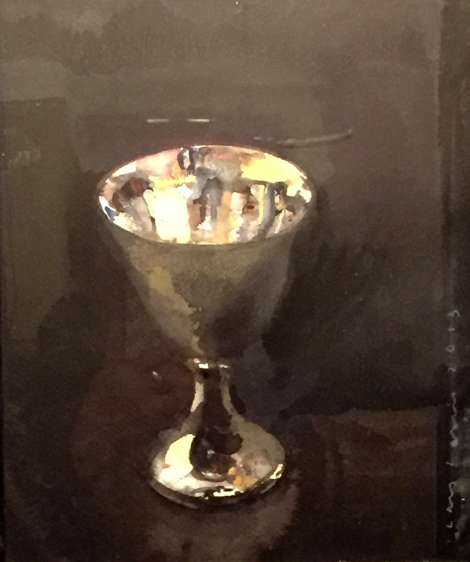
With only a little rounding up or down, the scene above resolves very nicely into just 3 values. Make a monochrome study of the image where every shape is either light, middle or dark in value. You can indulge, if you like, in more than one middle value. The red tile roof, for example, is lighter than the wall shadow, but both are lighter than the dark openings. One is middle value, the other is dark middle.
Use a single color, straight from the tube, not a mixture of colors. Choose one that gets dark enough to look truly dark, like the doorways in the photo. Carbazole violet would work, or pthalo, or use black, if you have it.
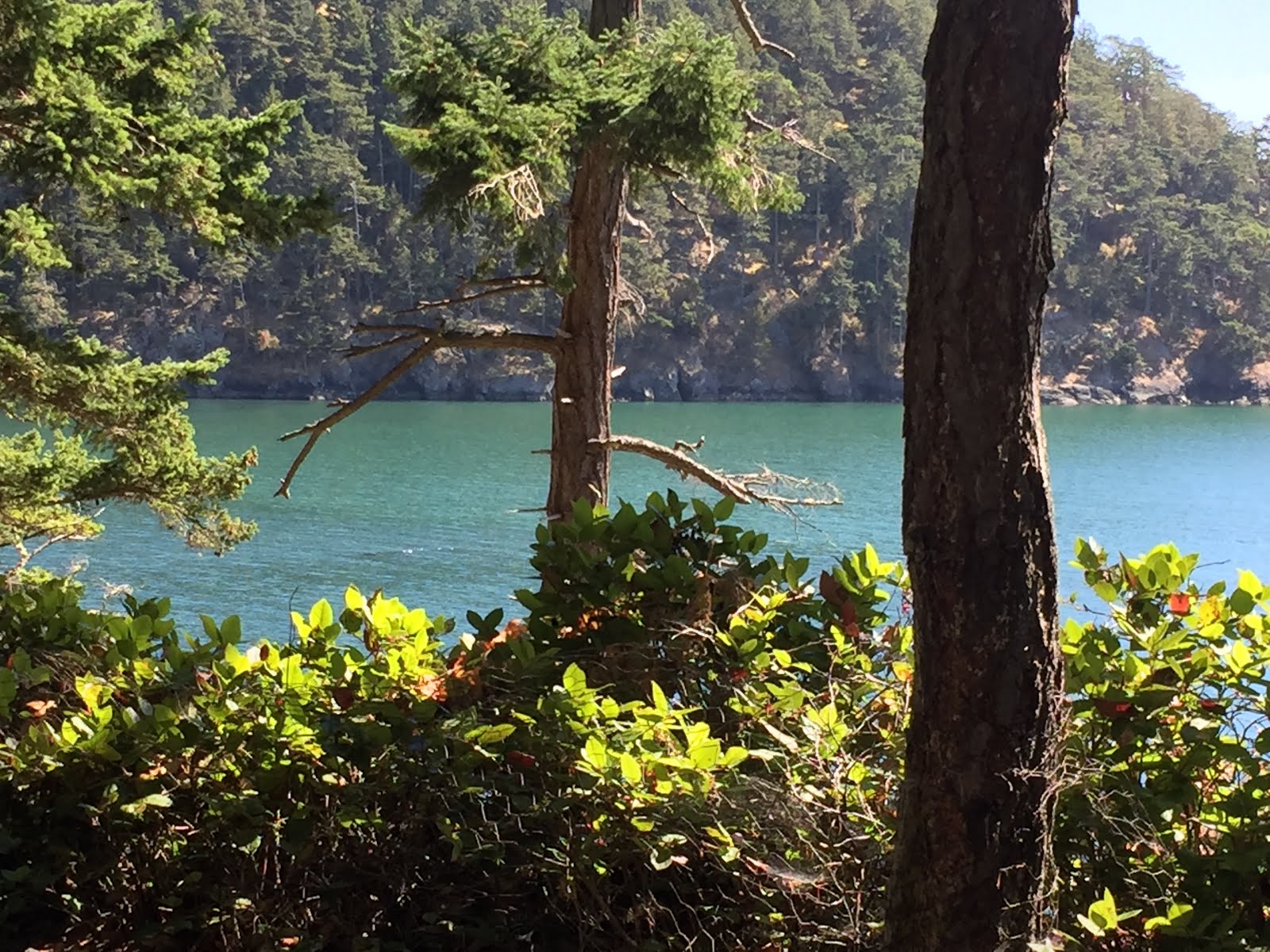
Here's another possibility. This one may require more than one degree of middle value, too.


Check the value of the "white" barn.

Using your monochrome study as a road map, make a color version using an expanded palette.