Wednesday, February 1, 2017

Beginning Watercolor, 2/1/17


Most of the visual information we perceive in a subject does not need to be included in a painting. A big part of the artist's job is to identify what is essential and what is optional. Which elements of your subject describe its fundamental nature?

Choose a simple object, like an apple or a persimmon, a milk jug, a glass of water - something that will not require fastidious drawing.

Set up the light source so that there is a clear and simple shadow pattern. Including a cast shadow is a good idea.

Paint a monochrome version first, emphasizing the darkest darks and the lightest lights. Leave out most of the subtle middle values to find out how important they really are.

Paint several versions in color, with an eye toward discovering which features do the real work of defining the subject. Let go of accuracy as you learn what matters.

When you feel that you have a good sense of which strokes and washes tell the story, put away the actual object and the studies, and paint one or two from memory. Now that you have answered the basic question, you are free to give all your attention to laying down some juicy paint!

Comments are welcome, by the way.


Silver Cup                   Lars Lerin

Intermediate Homework 2/1/17 Palette Logic

How many colors do you like to have in your palette? How many do you need? How would you decide which ones are your essentials?

Tough questions.

Luckily, we don't often have to make decisions about which colors stay and which must go (only when some fool gives it to you as a homework assignment).

Many artists like to have a warm and a cool of each color family, which, theoretically, provides a great deal of versatility. For example, a yellow that tends toward orange (New Gamboge), and one that is leaning toward green (Aureoline). You may ask, " Why not just get a yellow that has neither red nor blue?" Why, indeed.

Some like to add potent dyes, like Pthalo blue and green, and a couple of Quinacridones, for when the color you're mixing needs a quick shot of warm or cool, or when you want a powerful dark. Please pass the Transparent Pyrol Orange!

There are lots of ways to fill your palette. I met a painter once at a workshop who had 5 palettes. She needed her own whole table. I have to admit I was a little jealous of the one devoted entirely to blues.

I think we may all be a little weird when it comes to color. Why is it, for example, that I usually have 5 blues, and I can tell you what they are without hesitation, but I only have two reds, and I'm never sure about their names? There's something to be said for just gathering the colors you simply like best, and watching to see if the need for additional colors arises.

For homework, let's do some painting with a limited palette. Here are a couple of popular sets that have passed the test of time:

Anders Zorn:
 Yellow Ochre, Cadmium Red Medium, Ivory Black plus White. Some lists add Vermillion, Viridian, and/or Cerulean Blue.


John Singer Sargent:
Raw Siena, Burnt Siena, French Ultramarine, Ivory Black. Traces of Cobalt Violet and Prussian Blue


Choose your own group of colors, or try one of these. Limit your array to 4 or 5 colors. Maybe 3, if you're feeling brave. Some of the mixes you make will probably be less than perfect matches. Rather than add more colors, try letting them be to find out how the whole painting is affected by the limited palette. Give it a chance to assert its cohesiveness.

Please search for your own image, and bring it in so we can see how the palette you create works.


Thursday, January 26, 2017

Beginning Homework, 1/25/17, Seeing Value as a Series of Layers


Begin by making a value scale.

1) Paint the whole strip #9 (the lightest grey), except for a patch left white at one end.

2) Let the strip dry, then paint the whole thing #8, except for a patch of #9 and white.

3) Let it dry, then paint the whole thing #7, except for the patches of #8, #9 and white.


4) Continue getting darker by increments, always leaving a patch of the previous layer.

Don't leave white between your patches.


Homework:

Everyone worked on a deliberately over-simplified monochrome study of a color photo yesterday. It might be a good idea to do that again, using the same image or a new one. I'd like you to work much faster eventually, so you will be encouraged to do plenty of preliminary studies. Practice, practice.

When you have a feel for the dark/light relationships of the major shapes, try making a color version that stays true to the values. Keep it too simple. See if you can let go of texture and detail, giving emphasis to shapes. That will make it easier to focus on value as a feature of color.


Intermediate Homework, 1/25/17, Big Changes

In case you didn't bring home an image, and you can't find one online, here are a couple more to consider;


In the top two images there is some space described between the foreground and background, but what if you wanted more? The usual adjustments might do the trick;
Color: Make the background cooler or the foreground warmer.
Value: Compress the range toward middle value in the back ground, or exaggerate the darks and            
             lights in the foreground.
Wetness: Make the background much softer.
Composition: Can you enhance the illusion of space by rearranging the location of the major shapes?

What if you made all of these changes? In other words, why not maximize the differences between foreground and background? There may be a good reason why not, but let's have a look. Turn the dials all the way!

The image of the lake has a lovely streak of sunlight on the far shore. What might you do to intensify that light?

Some students are uncomfortable exaggerating the colors or the composition of a scene. It may feel like lying, or failing to do justice to the subject, as if we are meant to do the best we possibly can to duplicate reality. I believe our job is to interpret the subject in a way that displays our personal connection to it. Think of the origin of the word "Art", as in "Artifice".

If you work from your own image, please bring a print of it so we can see the changes that you made.

News Flash!

THE TUESDAY AFTERNOON CLASS WILL MEET AT THE PHINNEY NEIGHBORHOOD CENTER ON 1/31. THE USUAL HOURS, 2-5. THE ADDRESS IS
6532 PHINNEY AVE. N
SEATTLE, WA, 98103

WE WILL BE IN ROOM 6, IN THE BLUE BUILDING. I THINK IT'S BLUE.
TOM'S CELL # IS 206 930 2549


Thursday, January 19, 2017

Beginning Watercolor Homework 1/19/17 Seeing in Layers


Here are a few useful questions related to value;
What is the lightest thing in the picture? What is the darkest? Working from light to dark, what would you do first? When do the light shapes get their definition?

The relative lightness and darkness of the shapes is where the feeling of light in a scene resides. These relationships are observed entirely by eye. What your brain tells you, like that this is a white house, can get you into trouble. This is a white house but it is not white in the photo. Better to ask something like, "Which is darker, the house or the sky?"


 How dark is the house?

Anytime you ask how dark something is, the answer is always the same, "Compared to what?"

The house is lighter than________, but darker than________.


For homework, most of you brought home a picture from class. Using those or one of the above images, try breaking the scene down into three or four layers according to value. Keep it very simple. The object here is to get used to thinking a couple of layers ahead of yourself. We are not making handsome paintings today.
But, have fun!


Intermediate Watercolor 1/19/17 Who's in Charge?

 Do you work from photos this time of year? If so, join the club. If not, I salute you. Given how many painters use photos for source material, I want to spend some time identifying the skills that help us not be bossed around by the camera.
Humans and cameras don't see the world the same way. First of all, unlike cameras, we do not see everything in focus at the same time. It may feel like we do, when our eyes flit so quickly from one spot to another. The instant we stop to observe part of the overall scene our eyes adjust to see that part clearly. It happens so fast it seems like nothing changed. Actually, most of what is visible to us at any given moment is out of focus!
Now that everyone has a camera in their pocket there are more photos than hamburgers. Most of these are point and shoot images, which tend to be in focus from foreground to back. It is useful to remember that this is a departure from human vision. Just because the photo shows us everything clear and sharp doesn't mean we have to paint it like that.


The full depiction of depth in this photo is in focus. Would there be any benefit to choosing soft edges in places before starting to interpret it as a watercolor?

It is often rewarding to alter the complexity of a distant feature, simplifying it despite how complex it may be in the photo. Here's a cityscape by David Taylor:


Those buildings in the background probably displayed much more information. Why do you think the artist chose to simplify them?

For homework, find a photo with everything in focus, or one chock full of information from foreground to background. Experiment with intentional changes. Keep track of what you were hoping to accomplish. If an alteration or adjustment doesn't have the desired effect, try changing a different variable. For example, what would Taylor's painting look like if those distant buildings were warm instead of cool?


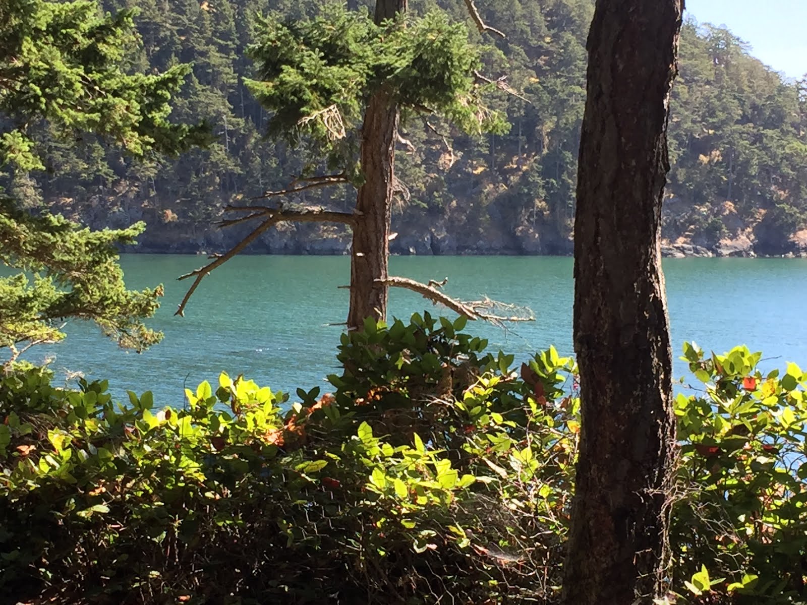
This is a beautiful spot, for sure, but the space gets a bit ambiguous in the upper left quadrant. What might you do to get the foreground to emerge more obviously from the background?