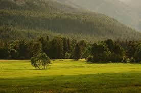
Landscape images are a great resource for finding good shapes and value relationships. Here are a couple that show promise:
A limited but elegant palette, but the composition needs tweaking.
Crop, perhaps?
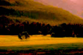
A good place to start is to consider moving the shapes around to build a solid composition. Don't forget, you can also crop, flip, rotate, whatever. The idea is to find or make an arrangement of shapes that will serve as a framework to show off the gorgeous paint. You may want to adjust the color or value to get your thinking outside the limits of your assumptions. The image below may not inspire you to paint...

but a little enhancement could start the juices flowing.

I like to spread out several blank pages from a sketchbook to make quick variations on the composition and the colors. You'll know when you see one that works especially well.
The one guideline I want to recommend is to minimize corrections your strokes and washes. At the very least, stand back and consider leaving whatever just happened alone before you mess around trying to get the look you thought you wanted. The well-crafted framework should ensure that whatever the paint does will be OK, and nothing is more important than the fresh look of paint that has been given room to flow.
Well, maybe just one more thing to keep in mind; Shape first, then texture, if necessary (and it's not necessary).
Have fun!


No comments:
Post a Comment