Monday, November 29, 2010

Hold it! Thoughts on confident watercolor, in three installments


When is a watercolor done?
Part one

            Knowing when a painting is finished should be easy, right? You just stop when it doesn’t need anything more. Why, then, is over-painting the most common disaster in the practice of watercolor?

            We all know that watercolor does not reward uncertainty or indecision. Changing your mind after you’ve committed to an approach usually leads to some kind of mud. It makes sense, therefore, to work confidently, and to leave the paint alone once it’s attached to the paper. Confidence comes largely from experience, of course, but to some extent it also comes from being thoughtful. Clarity of mind leads to clarity on the paper.
            Working in watercolor can feel like juggling a dozen balls at once. There seem to be too many variables to consider while you‘re up to your neck in trying to stop your painting from slipping away. But if you can keep track of just four things (color, value, wetness and composition), the odds of making the stroke you intend are pretty good. In fact, just being mindful of wetness and value will make a big difference in your painting.
            It only works, though, if you take responsibility for the variables. It’s not enough to be thinking wishfully about wetness. I often hear painters explain a mishap by saying “the paper got too wet”. Hmmm…and how did that happen? You have to be in charge. Sometimes blind luck will save the day, but it’s foolish to count on it.
            Developing good habits of awareness is mostly a matter of remembering to ask a few simple questions before you commit paint to paper. For example, asking “How dark do I want this stroke to be? “ will keep you from having to go back over a passage to make it darker or lighter. And how do you know how dark you want it to be? Compare it to what you already know for sure. Find something in the painting or the image source that is lighter, and something that is darker. In Migration Route the ridgeline of the distant mountains needs to be darker than the sky, but lighter than the trees that will come later.

Migration Route                                      Tom Hoffmann

  
            Knowing where you want the painting to go makes it easier to see when you’ve done enough. You will “recognize” the look you were after if your intentions are clear. Far too often we rely on an external source (usually a photo) as the basis for knowing whether the painting is finished. If you look to the photo to see if you’ve “got everything”, the answer will always be “No, there’s more”.
            There is no end to the information a photo can carry, and trying to cram it all onto the page eventually leads to another overworked painting. This is especially dangerous when you feel that an unidentified “something” is not right about a work in progress. If you check in with the photo, you will surely find something you haven’t noticed before, and assume (or hope) that it’s what’s needed to pull everything together. More likely, the real problem is that you’ve already got too much information in the painting, and adding more can only make it worse.
            Making conscious decisions in advance about which information is essential gives you an internal basis for knowing when to stop. Once again, remembering to ask a couple of questions before you start painting can reveal the essence of your interpretation:

              Why have you selected the subject in the first place?

Take time to articulate what you see and feel here that caught your attention. Say it out loud, or write it down. You may think you won’t forget it, but it is easy to get wrapped up in technical issues and lose track of your original purpose.

               In terms of form (color, value, wetness and composition), how can you be sure that the qualities you want will be in the finished painting?

The job is to identify the aspects of the image that must remain true, no matter where your individual style takes you. For example, the painting On the Green appears to be all about color. To translate into watercolor the feeling of paddling through the canyons of the Green River, I wanted to use intense color, but I also wanted to establish a believable sense of light, space and substance. How could I exaggerate color and still hold onto an effective illusion?

On the Green                              Tom Hoffmann

           
            Remember earlier where I suggested that keeping track of value and wetness would make a big difference in your work? Looking at a monochrome version of the painting reveals that it’s the relative dark and light that does most of the work required to pull off the illusion. This is what needs to be accurate. Holding on to this essential aspect frees me to have fun with color.


            If you are concerned that a thoughtful approach will stifle spontaneity, you needn’t be. Consider the value comparison from Migration Route, above. Once you have discerned the dark/light range that will work for the ridgeline, you can apply the paint with confidence. Within that range there are a great many strokes, not just one, that will do the job. It doesn’t have to be perfect, just perfect enough. When you know the relatively few things that need to be “correct”, you are liberated by certainty. Not having to be too cautious, you can make your mark and let it be. A bold stroke goes a long way toward convincing the viewer that everything is as it must be.

Hold it! Knowing when to stop


Part two


            Sometimes the sheer pleasure of making brushstrokes can lead to an overloaded painting. I often see students repeating a stroke over and over, as if they are biding time while they wait for inspiration. Part of what’s going on is that we want to keep adding more. We came to paint, after all, and it just plain feels good to swing the brush (until we notice that we’ve overdone it again).
            There are stages in the progress of a painting when it’s fine to indulge in the sensual pleasure of moving the brush over the paper, but there comes a moment when it’s wise to detach, and perhaps slow down.
            Watercolors usually develop from light to dark, which is suggested by the transparency of the medium. But an even more important progression is the movement from general to specific. The first layer of a painting is often composed of the big shapes, blocked in with pale washes. Successive layers of middle values and darks will eventually cover much of the paint you apply at this stage, which may allow for casual brushwork. As the middle values begin to go on, however (and certainly when you get to the individual, very specific dark strokes), a different quality of attention is called for.
            The more specific the marks you are making, the more you benefit from a kind of “detached engagement”. I think of it aswatching the painting develop stroke by stroke, as if someone else were painting it. If you were actually looking over another artist’s shoulder it would be easy to know when to say “Hold it! That’s fine just as it is”. Being deep into your own agenda, though, can blind you to what is right before your eyes.
            The idea is to be separated from your own intentions enough to be able to see whether what you’ve just done works, regardless of whether it conforms to your original vision. It is always possible that what is happening in the moment might be just fine, even if it's not what you thought you wanted.
            If you still decide it’s not right, before you rush to correct it ask yourself what the minimum is you could do to take it further. For example, if a hill in the distance stands out too much, it is less invasive to change its color with a simple glaze than it would be to try to scrub it out entirely. In general, if something bugs you, at least consider learning to love it. Doing nothing, after all, is the absolute minimum. Being suspicious of my immediate agenda, and knowing that I usually lose more than I gain by going back over a spot to “fix” it, I’m inclined to wait and see how it looks tomorrow.
             In short, be flexible, and avoid “painting yourself into a corner”. The transparency of watercolor demands that we hold off on getting very specific prematurely. That’s the logic behind a light-to-dark and general-to-specific progression. By not committing to brushwork that is difficult to change cleanly, we keep our range of choices as open as possible. Washes are more general than strokes. Soft edges are less specific than hard ones. Light is easier to cover than dark. You can always add another stroke a week later, if you decide it’s called for, but you can’t always take one away.
¨

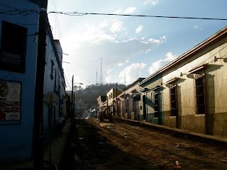
            One way to keep from getting specific too quickly is to stay abstract as long as possible. For me, this is mainly a matter of how I think about the subject. During the inner dialog that accompanies the painting process, I can describe the image by naming everything in terms of the content, or I can stick to the language of form. For example, here is a narrative, content-based description of the photo below:


            A street scene in Mexico, late in the day: One side of the street is in sunlight, the other in shadow. A woman carrying shopping bags is crossing the street, while another is standing on the sidewalk. Several cars, some parked, some driving, are in the middle distance. A big tree shows above the sunlit buildings. A mountain in the distance stands out against the clear blue sky.

Here is the same scene described in the language of pure form:

            The right quarter and the bottom third of the page are strips of cool, dark, neutral. A “V” comprised of warm, very light, rectilinear forms begins at the center of the page and widens toward the left.  A pattern of verticals is distributed across the “V” shape. Above it a semi-circle of intense medium dark green is silhouetted against a medium value blue, which fills the entire top left quadrant. Where the “V” and the dark strips converge, a mid-value purple-grey form widens upward, one third of the way into the blue.

            How I choose to think about the picture can have a profound effect on the way I begin to paint it. In the early stages of a painting I usually want to establish the general structure of the image, without getting caught up in specificity. The painting has to work first of all as an arrangement of big shapes, and at this level it is more important for the pattern of darks and lights to be strong than for any specific information about content to be present.
            Until I have taken care of the fundamental needs of the painting, I don’t have sufficient basis for deciding how much information to include. It is easy to get involved in the proportions of the woman crossing the street, for example, and lose track of the fact that she is primarily part of a big shadow. I want figures in the painting, and if I am thinking in terms of content I’m likely to think I have to duplicate the photo. But if I am thinking in terms of big, abstract shapes, there are no people, no sidewalk, no shopping bags; just a few somewhat darker and lighter strokes within the big shadow.

Here is a painting of the scene done from this point of view:


                                             Tom Hoffmann            Tinoco Y Palacios

            The figures in the foreground have a presence appropriate to the role they play in the big picture. Thinking abstractly allows me to stop as soon as I see that they have done their job. A content-based approach would have invited all the associations that attend the names of every part of the scene. Like many realist artists, I am susceptible to an imperative to do justice to each subject. I could easily get wrapped up in accurately rendering posture, hairstyles, ankles, and on and on, until the figures took on too much importance in the scene.

Hold it! Knowing when to stop


Working with only soft edges in the early stages is another way to prevent getting specific prematurely. Rex Brandt, among many other watercolorists, often painted wet-on-wet until he had decided where he wanted the viewer’s attention focused. Since hard edges describe specific forms, it makes sense to wait to include them until you know they serve your purposes. Just because your photo shows hard edges, or the part of the live scene you are looking at is in focus doesn’t mean that is how you must depict it in your interpretation.


                    Rex Brandt                                   Evening’s Catch

            In this painting Rex Brandt used hard edges very deliberately to direct the viewer’s eye. The big shapes had already been established as soft-edged washes before the relatively small and dark hard-edged strokes were added.

¨

            Of all the questions that help me keep my painting priorities straight, the most useful by far is

“What role does the part I’m about to paint play in the big picture?”

Often the area of primary interest in a painting is meant to be restricted to only part of the whole page. How the main variables are manipulated will determine the effectiveness of your intentions, as we can see in Rex Brandt’s painting, above. He has made definite choices about value, wetness and composition to reveal the relative roles of the different elements in his painting.
Take a long look at John Singer Sargent’s painting, below.


               John Singer Sargent                        Muddy Alligators

If you were to cover the picture now and try describing the alligators, you would probably remember plenty of specific information, both in terms of content and form. But what could you say about those trees in the background? What is the part the trees play in the big picture? Definitely a supporting role. Clearly, Sargent knew who the stars of the show would be. He used value, edge quality, color temperature and composition to keep us focused on the reptiles.

            When we are sitting in front of a scene, we automatically focus on each part we are about to interpret, and often proceed to paint them all in sharp detail. But Sargent seems to have kept his focus sharp on the alligators, even while he was painting the trees. You can literally do this, if you remember to ask about the relative roles of the elements of your subject.
            To try it, close one eye and focus on your thumb at arm’s length. Stay focused there, and look at what is behind your thumb. It probably looks indistinct, like Sargent’s trees. Now focus on the background. Your thumb gets fuzzy. One more thing you’re in charge of.

¨

Thursday, November 11, 2010

Intermediate Watercolor Homework November 11 2010


Changing conditions

Casa Cutural, Oaxaca
This Wednesday felt like the last chance to all go out to paint from life, but who knows? If you get the opportunity this week, try the exercise I demonstrated in class (remember the hilltown?)
Reduce your scene (or photo, if you end up indoors) to three values. Work in monochrome, with a color that can get dark enough to represent black.
Starting with a middle value, paint everything except the very light shapes, which will stay white. You may have to round areas up or down and commit to calling them either white or middle.
Next, paint all the strong darks black.
That’s all. Take note of where you want more subtlety (something between white and middle, for example).
Now expand your palette and paint a picture, using what the study taught you.
Vecinos, Oaxaca
Have fun
Tom
Palacia de Carne, Oaxaca

Beginning Watercolor Homework November 11 2010


Seeing abstractly

Many of you took home the photos you were using in class. I’ve attached a couple more that are similarly daunting.
Working from a complex image, move through a layer-by-layer interpretation that progresses from light to dark and from general to complex.
Practice keeping your thinking focused on FORM rather than specific content. Look for pattern, proportion, distribution and shape.
If you find yourself describing subject matter, take a step back, and refocus on abstract aspects of the material.
Stay abstract in your thinking all the way to the darkest little strokes.
Finally, when all the layers are in place, check to see how well the story has been told. Get as far away from the painting as you can (without leaving the room).
Take note of anywhere the page needs more information.

Have fun
Tom

Watercolor in Oaxaca


Watercolor in Oaxaca
with Tom Hoffmann
March 25-29 in Puerto Escondido
April 3-9 in Oaxaca City


Spend five days painting on the Pacific coast, in Puerto Escondido, or seven days in and around the Capitol City of Oaxaca, or BOTH!


Puerto Escondido is a small fishing town
with a remarkable variety of coastal settings. The beaches vary from calm lagoons to roaring surf, with dramatic rock outcroppings, fishing boats and plenty of palms. Away from the beach, the town provides images of everyday life – shops, the mercado, and neighborhoods full of the bold color, deep shadows and clear light we love to paint.


The colonial city of Oaxaca is a World Heritage Site that is 
one of the truly great cultural centers of the western hemisphere. Be ready to paint at the foot of grand cathedrals, from the rooftops of colonial casitas, in courtyard colonnades, winding alleyways, bustling mercados, Zapotec ruins, and down-to-earth brick factories. We will paint all day, and sometimes into the night, and when we are not painting, we will eat! The food in Oaxaca is irresistible, and the nightlife is inspiring

Tuition:  Puerto Escondido $500     Oaxaca $700         
Combined $1000
Please email Tom for details


Wednesday, November 3, 2010

Beginning watercolor Homework 11/3/10


Study

What we worked on in class were studies, not paintings. The object of a study is to learn what the painting needs. What does your study tell you?
Try asking yourself about each of the 4 main variables:

Study for Lake Shore in August
Bill Teitsworth
Wetness….            Where do I need hard 
                                 edges?
                                 Where do I need soft 
                                 edges?

Value……               Are the darks dark enough?
                                 Do I need more than 3 
                                 layers?
                                 Have I reserved the lights?

Color………           Does my chosen palette hold 
                                 the picture together?
                                 Am I using too many colors?

Composition…      Do the major shapes separate 
                                 in space?
                                Is the image balanced?


Assess the effectiveness of the illusion of space, light and substance. If it is not sufficiently present, can you see what will enhance it?

When you have a good idea what you want to change, take one more look. What remains challenging? Don’t let yourself go into soft focus about this part. It won’t go away. Practice it until you are confident, then make a painting.

Have fun.
Tom                      

Intermediate watercolor homework 11/3/10

What Can I Let Go Of?

Alvaro castagnet
Painting a complex subject like the downtown skyline is quite instructive. I learned a lot looking over everyone’s shoulders today. For most of us, the process involved a change in what we were paying attention to. 
Even though I started out saying that I wanted to represent the buildings as one big shape, in my first attempts I painted them one at a time. After a couple of tries, I realized that the feeling of being near that mass of concrete and glass was not about individual structures. I began to see the overall shape as the primary reality. Shape first, then texture.
Who can say why we insist on giving the secondary information (texture, detail) a starring role? I do know that for me it is a great relief to let go of the compulsion to spotlight all the players. I felt lighthearted by the time we left.
Try using the paintings and studies you made this afternoon as source material for a couple more versions. Without the actual buildings crying out for attention, you may be able to let go of even more.
Have fun.
Tom 

Friday, October 29, 2010

Intermediate Watercolor Homework 10/29/10


Four Layer Translation


From the Bridge      Bill Teitsworth
The array of paintings on the wall for this week’s critique was most impressive. Then we went and dove headfirst into the plein air puddle….

I think we should follow that with another translation of a complicated image into 4 layers: Lights, Mid-values, darks and super darks. 

Practice, practice…

If you get the chance, try a plein air subject, but if the weather doesn’t cooperate, look for something that seems daunting at first, but resolves nicely into layers. Be prepared to describe how you saw the scene in terms of layers.

Have fun
Tom

Beginning Watercolor Homework 10/29/10


More Shadows
After the Storm        Bill Teitsworth
Look for, or set up a shadow source with a little more complexity to the object that casts the shadow-- A straw hat, for example, or a station wagon. The object should require a bit of interpretation to get it to settle into a series of layers.
In the Shadow of Giants        Sterling Edwards


The main task, however, is the shadow. Take care to get the edges true this time. Keep doing it until you are completely satisfied. Clarity, efficiency and boldness!


Have fun
Tom

Thursday, October 21, 2010

Intermediate Watercolor Homework 10/21/10

Warm/Cool

        
Oaxaca A.M.
Here's an exercise for applying the info we began exploring regarding warm/cool.

Limit your palette to just 2 colors, one distinctly warm (yellow, ochre, gold, rich green gold, cadmium red light, pyrol orange, quin burnt orange...), the other very cool (any blue, violet, perylene green, hunter green, pthalo green...).

Make a version of a picture in which for every shape you decide how warm or cool it should be. The pure form of your warm color would be reserved for the very warmest part of the scene, and the purest form of the cool would only be used for the coolest part. Everything else would involve mixtures of the warm and cool colors. The second warmest shape, for example, would have a little bit of the cool mixed in. got it?


Sole
How you choose to make something warm or cool is a big category. At first it may seem arbitrary, but the more practice you have paying attention to it, the more your choices will be informed by patterns you've observed. To get started, look at the image you've chosen, to see if there is any content that you automatically think of as either cool or warm. The sky, for example, should be pretty obvious, as would the ocean, or a bare light bulb or fire. You might ask, "What would be the warmest (or coolest) part of this scene"? Then you have something to compare everything else to. If you decided, for example, that a brick wall in sunlight was going to be very warm, then the shadow on the wall would be somewhat cooler. The shadow on a clump of foliage would be even cooler, since the foliage in sunlight is cooler than the brick in sunlight. It's all relative, just like value. When you are deciding where on the temperature scale to place a particular subject, try looking for something a little cooler and something a little warmer than the part you are about to paint. Just as with value, when you notice that this new part should be lighter than THAT, but darker than THIS. So, too, with temperature, it helps to locate your new bit between two parts you're already committed to.
These photos would work for this assignment, but it’s always good to use one of your own, or work from life.

Please post your discoveries by leaving a comment.
Have fun
Tom

Beginning Watercolor 10/21/10


Shadow Color

Alley in the New World
Your work in the arboretum revealed a solid understanding of relative values of sunlit and shaded surfaces. Now let’s explore the effects of color for shadows.

We’ve observed that, as a rule, shadows are darker, cooler, and more neutral than the surface they fall on. This is usually true in nature, but in a painting, of course, you can do whatever you want. Depending on the feeling you are creating in the picture, you may want to make all the shadows ultramarine, for example, or let all the component colors of a neutral show in the shadow, leaving it for the viewer to mix them together.

Experiment with a simple scene, trying out different colors to see how the changes affect the overall feeling. Be subtle. Be outrageous.

Please share your discoveries here on the blog by posting a comment.

Have fun.

Tom

Thursday, October 14, 2010

Winter Watercolor Workshop

Attention Beginning and Intermediate Watercolor students:

During the seven weeks between fall and winter sessions you can stay in practice and continue to make progress through Tom’s Winter Break Studio Workshop Class. 

We will meet once a week for three hours on Wednesdays 9:30 – 12:30, December 1, 8, and 15, at Christie House in the Madrona Neighborhood.

The focus of the workshop will be translating high contrast photographs into light-filled watercolors.  

Homework will be assigned weekly.

Tuition is 120.00. 
Enrollment is limited. 
To reserve a space contact Tom
and mail your payment to Tom Hoffmann 
308 32nd Ave., Seattle, WA 98122.
Soledad, Oaxaca Mexico
Soledad