Thursday, February 2, 2012

Intermediate Watercolor Homework 2/2/12 warm/cool

Warm/Cool

        
Oaxaca A.M.
Here's an exercise for exploring the concepts we've touched on regarding warm/cool.

Limit your palette to just 2 colors, one distinctly warm (yellow, ochre, gold, rich green gold, cadmium red light, pyrol orange, quin burnt orange...), the other very cool (any blue, violet, perylene green, hunter green, pthalo green...).

Make a version of a picture in which for every shape you decide how warm or cool it should be. The pure form of your warm color would be reserved for the very warmest part of the scene, and the purest form of the cool would only be used for the coolest part. Everything else would involve mixtures of the warm and cool colors. The second warmest shape, for example, would have a little bit of the cool mixed in. got it?


Sole
How you choose to make something warm or cool is a big category. At first it may seem arbitrary, but the more practice you have paying attention to it, the more your choices will be informed by patterns you've observed. To get started, look at the image you've chosen to see if there is any content that you automatically think of as either cool or warm. The sky, for example, should be pretty obvious, as would the ocean, or a bare light bulb or fire. You might ask, "What would be the warmest (or coolest) part of this scene"? Then you have something to compare everything else to. If you decided, for example, that a brick wall in sunlight was going to be very warm, then the shadow on the wall would be somewhat cooler. The shadow on a clump of foliage would be even cooler, since the foliage in sunlight is cooler than the brick in sunlight. It's all relative, just like value. When you are deciding where on the temperature scale to place a particular subject, try looking for something a little cooler and something a little warmer than the part you are about to paint. Just as with value, when you notice that this new part should be lighter than THAT, but darker than THIS. So, too, with temperature, it helps to locate your new bit between two parts you're already committed to.
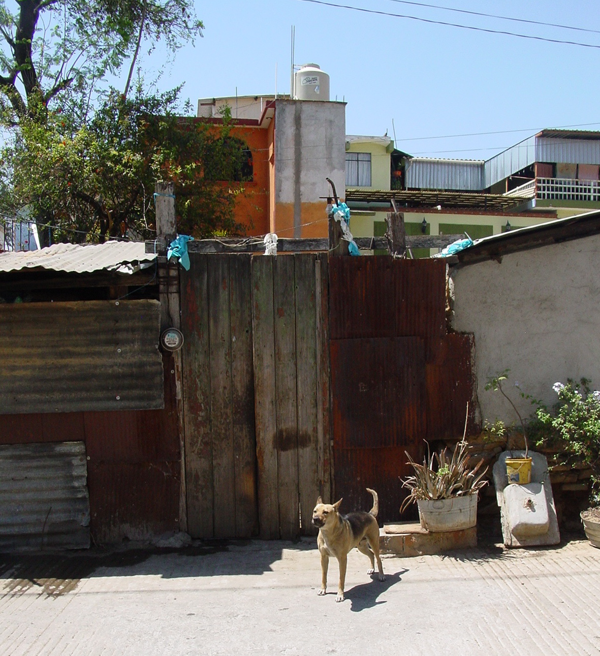
These photos would work for this assignment, but it’s always good to use one of your own, or work from life.

Please post your discoveries by leaving a comment.
Have fun
Tom

Beginning Watercolor Homework 2/2/12 soft edges

Greetings painters

Here are a couple of exercises that will, hopefully, shed some light on the variables at work when we put wet paint onto wet paper.

To practice, try this exercise, in which the wash on the paper is constant, but the wetness of the brush varies:

§    Make a large, shiny wash (not dripping wet) of a pale color.
§    Now load a brush with a contrasting color, using lots of paint and very little water, and make a stroke into the initial wash.
§    Next, add a little more water and make another stroke.
§    Keep adding water and making test strokes until you lose control of the edge altogether. When the brush becomes wetter than the paper you will see the second color displacing the first, resulting in a bloom.

A variation on this exercise keeps the wetness of the brush constant and varies the wetness of the paper:

§    Make three 6x6” washes, one just damp, one quite shiny, and one dripping wet.
§    Now load the brush with plenty of pigment and very little water.  Work quickly, so your washes don’t dry. Observe how the brush strokes look on the palette. (you should briefly be able to see the tracks of individual bristles before the stroke flows back together).
§    Make a short stroke in the center of each of your washes. Were the results what you expected?  
jj  
     
      Now make a soft-edged version of a sky, using the photo you selected, the actual sky, or working from your imagination. Keep it simple, and avoid correcting. if you think you've made a mistake, let it be, and make another version.
      Have fun!


Thursday, January 26, 2012

Intermediate homework 1/26/11 Three value study


Look for an image in which the major shapes are apparent. These are the shapes that must be separated from each other for the illusion of space to be effective.

Make a drawing of just the outlines of the shapes (no texture, no detail). Assign one of 3 values to each shape: white, middle gray, or black.

Now paint a monochrome study as simply as you can. It will probably be necessary to round your values up or down to avaoid using more than three. Make your decisions according to what you think will enhance the illusion of space.
If you've already done this in class, and you plan to work with the same image, feel free to skip this step.

The finished study, overly simple though it is, will serve you well as a "map" of what must remain obvious in the proper painting that it informs. As you develop a painting from the study, check often to make sure that the basic value pattern is similar to the monochrome version. Squinting helps.
Have fun

Beginning watercolor homework 1/26/12 Color Mixing

If you haven't yet gotten your good paper, you can do this exercise on just about anything. The object is two-fold: to awaken your instinct for color mixing, and to strengthen your awareness of the role the primary colors play in creating neutrals. The first part we did in class, so repeat it, or not, depending on your degree of confidence.

Part one:
Choose one red, one yellow and one blue, with an eye toward the ones that will "go both ways". Look for the yellow, for example, that will make good greens and good oranges.
Mix together two of the three colors, adjusting and fine-tuning until neither one dominates. Make a small patch of the new color on your paper.
Now add the third color to the mix, until none of the three dominate. Make a patch of the new color on the paper.


Part two:Make the darkest version you can of the three color mix, making sure no one color dominates. Just keep adding pigment to the puddle (but no more water). When the paint is so thick that it looks shiny even after it's dry, you've gone too far. Add a little water, and try a patch on the paper.

Part two:
Look in magazines for pictures with areas of solid color about 1 1/2" square, or bigger. Cut some out, paste them onto your paper, and try to mix a perfect match. Use the same limited palette you used for part one. Make patches of your attempts beside the cut-out.
Now try to match the same colors using a different set of primaries. Write down the colors you used near the patches.
Have fun

Wednesday, November 9, 2011

Homework 11/9/11 Shadow Pattern on Portraits

Look for a photo of a head that features a strong shadow pattern. Imagine it as a series of layers: First, an overall pale wash to represent the illuminated skin tone, into which color variations of similar value can be placed. Then, a shadow pattern, which can also be given soft edged variations, and, finally, the few darkest darks, like pupils and nostrils.


Keep it simple!

Sunday, November 6, 2011

Workshops

Date and descriptions of four upcoming workshops have been listed on my website, www.hoffmannwatercolors.com


Paint Science
Landscape Elements
Oaxaca
Puerto Escondido

Please take a look.

Saturday, November 5, 2011

Beginning and Intermediate Watercolor homework 11/4/11 Shadows

La Soledad, Oaxaca
The shadows in this painting may look very complex at first, but they are primarily a middle value layer laid on top of the lights. Each shadow is a purple shape, with warms and cools touched in while the purple is still wet.

In the case of the Cathedral facade, the warms and cools within the basic shadow shape play a big role in suggesting the changing planes of the sculpture. Shadows are often simpler, falling on flat planes, like the walls in the following scene:


In both images, though, the local color of the surface is painted first, as an overall wash. The shadows are applied on top of the sunlit area, not adjacent to it. There is no benefit to leaving the shadow area white, and then painting it in next to the sunlit part. It is more efficient and more convincing to put one layer on top of another than to try to match the edges of adjacent shapes.
Thinking in layers takes some planning and practice. Using the images you borrowed in class, or any photo or live scene that presents an interesting shadow pattern, start by blocking in the light first layer of the major shapes. Then apply the shadows. To be sure your shadows are an acceptable color and value, try them out on a patch of the local color made in advance on practice paper. Do not correct your shadows on the painting. Really. Don't fix them. Make another painting if you're not happy with the shadows. The skill you need to practice is not how to rescue the shadows, but how to get them right on the first try.
Have fun