Thursday, February 23, 2017

intermediate Watercolor Homework 2/22/17 Letting go of Control


Whatever your style, as a watercolor painter you are an advocate of the beauty of the medium. When you have an opportunity to give some control back to the paint, it is a shame not to take advantage of it. Every scene comprises passages that can be painted in a carefree manner and others that require more careful work. Recognizing which is which is part of a watercolorist's training.


Most of this Andrew Wyeth study is painted according to very broad guidelines. The texture of the wall could be flipped upside down and it would still be a reasonable representation of a rough stucco wall. The window, on the other hand, is much more carefully painted. Care was taken to keep the rectangle upright, and to reserve the thin mullions. It is the careful part that gives meaning to the carefree. Without the window the wall would be difficult to recognize as a wall. 

Do you think Wyeth knew this? I'm pretty sure he did. He wants to engage his viewers by giving us the means to see the paint as both subject mater and abstract marks on paper. I think he also takes pleasure in displaying the nature of the paint. We get to see the fluidity and transparency of the watercolor as much as we get wrapped up in the illusion of accuracy.


Look at the right half of this painting. It's easy to read it as a depiction of a tree and some space. Imagine removing the tree trunk. the tree would become a grey shape without identity, in the same plane as the other grey shape beside the house. Wyeth knew that the trunk would provide the meaning. The illusion of space and the identities of the shapes rely on that single vertical stroke. 


These photos provide opportunities to be carefree with paint application where the identity of the shapes and textures you make are established by a few careful moments. Ask yourself, "Does this have to be accurate, or can I be approximate?"

The broader the guidelines you devise, the more freedom you have to let the paint show itself off.
Have faith, and have fun


Wednesday, February 22, 2017

Beginning Watercolor Homework 2/22/17, The Sky


Painting clouds in class today the emphasis was definitely on soft edges, so we experimented with various ways of keeping the paper wet longer. We focused on keeping track of how wet the brush was compared to the paper.

Clouds look very much like watercolor brushstrokes. The transparency and fluidity of the paint is just right for describing weightless shapes, lit from within.

For homework; Watercolor artists are always looking for an opportunity to let the paint flow. This requires giving up immediate control, of course, but with a subject that has a broad range of acceptable results the odds are good that whatever happens on the paper will be fine.
Skies are a wonderfully forgiving subject. As long as we give the paint lots of room to assert its nature, the results are still likely to be in the believable range. If the marks you make are not what you intended, they may be perfectly lovely just the same. Allow for the possibility that they may not need to be rescued. In fact, for this assignment, please do not correct your mistakes.
Just make lots of sky studies, correcting on subsequent versions. You can invent your own skies or take of from one of these photos or paintings.


Trevor Chamberlain


Keep it simple. Be bold with value and subtle with color. Don't correct!


Thursday, February 16, 2017

Beginning Watercolor Homework 2/16/17, Damp into Wet

Working wet into wet is easier if you think about it as damp into wet. It helps you remember that the relative wetness of the brush and the paper is what you need to keep track of. What's implied is that the brush is usually drier that the paper.
Let's take some time to study this terrific Rex Brandt painting;


Look at the sky first. See the overall light grey wash? If you had seen that color and value as the "common denominator" for the sky, mixed up a generous puddle of it, and selected the biggest brush that would comfortably do the job, you'd be all ready to lay down the wash, right? Before you do, though, remember to ask if there's anything you want to reserve. In this case, there's that white building to paint around. You also need to consider how long you want the sky area to stay wet. How much soft-edged work needs to be done before the wash dries? It looks like there are two colors to apply; the darker grey and the burnt sienna. Can you do the sky wash, the grey clouds and the burnt sienna without washing your brush?
If you're inclined, make a copy of Rex's "Mud Puddle", but I'd like everyone to also interpret this photo;


At first glance, this scene appears to be all soft edges above and all hard edges below, but let's zoom in on the rocks;


See where the first layer colors change from warm brown to cool grey to green? The profile of the rock against the sky is definitely hard, but the mid-value transitions within the shape could be soft. How about the strong dark shapes and lines? What kind of edges do you want?

Would you paint the sky first or the rocks? Why?
How many layers does the rock comprise?


Intermediate Watercolor Homework 2/16/17 E Pluribus Unum

...from many, one, indeed!

When you're considering a scene as a potential painting subject, remember that most of the information you see does not need to be specifically identifiable in the finished painting.


Take a look at the grey shape behind the cable car in this night scene by Preston Blair. Could there have been more information visible out there than the artist chose to include? This is an urban scene, after all. Chances are the whole city lies below this vignette, but it suited Blair to make a very general statement about it, leaving out everything except a twinkling road.


Now look at the foreground shapes. How many are there? It's hard to say, exactly, since they're all very dark, and seem to merge into one another. The artist took care to separate the red house from the others, but just barely. As we look at the shapes to the left of that house, it becomes obvious that Blair chose to generalize about the similarities between buildings rather that to specify how they were different. He knew that we know enough to recognize the shapes as houses, and that's enough to tell the story.


Squint at this alleyway scene. The heavy shadow seems to invite a general treatment. It is by far the most noticeable feature of the majority of the page, and needs to be stated clearly before any secondary information, like the windows and doors in the shaded areas are included. Imagine an interpretation of the subject that had all the shadow shapes and none of the rectangles that are there within the shadow. Now imagine another version that has all the windows and doors and gutters, eaves, clapboards, etc., but no shadows. Which one would look more like what we see when we squint? 
No further questions. I rest my case. 
For homework, study this scene and paint it to your satisfaction.


Thursday, February 9, 2017

Intermediate Watercolor Homework, 2/9/17 How Much is Enough? Part one

So far, in class we've done more work from photos than from life. This week's homework exercise puts your understanding of seeing in layers to work on a simple 3-D object, like an apple,


Image result for gerhard richter watercolor
Gerhard Richter

or a chalice.

Image result for lars lerin

Lars Lerin
(This is a watercolor, by the way)


Look around the house for an object that invites a watercolor interpretation. I find the refrigerator to be a great source of candidates. A bottle of hot sauce, a jar of mayonnaise, maybe a rutabaga. A stovetop tea kettle? Try setting up a single strong light source so the light and shadow shapes are easy to identify. 

Does your object resolve nicely into just a few layers? If so, get started with a monochrome value study. Keep it very simple. No need to make the first attempts into handsome paintings. The idea is to begin seeing a series of layers; light, middle, dark.

Once you've seen your way through the single color study, make a color version with a limited palette, just one each of the primaries. In fact, make 3 or 4 versions, all increasingly simple. 

Eventually, you will begin to recognize what needs to be there for the subject to have some presence. Adding the cast shadow will be very helpful. Make that simple, too, of course. Fussing with the shadow will do more harm than good.

After you've painted 5 or 6 of your rutabagas, or persimmons, the translation into "watercolor" will be realized. When you feel confident that you understand the subject in terms of layers of washes and strokes, put the model away, where you can't see it. Now paint a version or two by heart.


Beginning Watercolor Homework 2/9/17 Neutral Colors

In class yesterday we practiced mixing neutrals. Let's review those efforts and summarize the results.

Start by selecting a set of primary colors - one red, one blue and one yellow.
Combine two of these and mix until neither one dominates. If you mixed blue and yellow, for example, the resulting green should be neither a yellow-green nor a blue-green.

Next, begin adding the third primary by increments, until none of the three primaries dominate. The result will be a neutral, either grey or brown. If you want to produce a grey and you keep coming up with brown, think of the brown as basically orange. Add a bit of blue to it and you'll see it change toward grey immediately.

When all three primaries are present in a mixture, the result is a "neutralized" color. Imagine mixing a little Pthalo blue with some Cadmium yellow. The resulting green would be intense and assertive, unlike the natural greens in the landscape. Grass painted that color would look more like astroturf. But if you added just a touch of the third primary the color would begin to come down to earth. Try it, and see.

Neutrals can be adjusted so that one or another of the component colors has subtle dominance. In the photo below, look at the pavement just inside the building on the left. Compare that color to the pavement back by the shed with the arched roof. One is warm and the other is cool. Do you see a small area of the pavement that is red-dominant? All three areas are neutral, and could be called grey, but the differences enliven the composition and help support the illusion of space.


To neutralize a color, add the compliment. 
The compliment of a color is whatever is missing if you want to have all three primaries equally present.
For example, green is yellow and blue. If we wanted all three primaries similarly present, we'd need some red. A more complicated example might ask, "What is the compliment of blue-green?"
Blue-green is blue plus yellow plus blue. To get all three primaries equally present we need another yellow and two reds, which add up to red-orange. Got it? Try it with paint and see if you come up with a good neutral.

For homework, try painting a scene like the one above or one of those that follow, where most of the shapes are neutrals, or neutralized. Use a palette that comprises only one red, one yellow and one blue. Combinations of the three components are welcome. In fact, they are the main idea! Also, feel free to adjust the colors to give one or another dominance.


Wednesday, February 1, 2017

Beginning Watercolor, 2/1/17


Most of the visual information we perceive in a subject does not need to be included in a painting. A big part of the artist's job is to identify what is essential and what is optional. Which elements of your subject describe its fundamental nature?

Choose a simple object, like an apple or a persimmon, a milk jug, a glass of water - something that will not require fastidious drawing.

Set up the light source so that there is a clear and simple shadow pattern. Including a cast shadow is a good idea.

Paint a monochrome version first, emphasizing the darkest darks and the lightest lights. Leave out most of the subtle middle values to find out how important they really are.

Paint several versions in color, with an eye toward discovering which features do the real work of defining the subject. Let go of accuracy as you learn what matters.

When you feel that you have a good sense of which strokes and washes tell the story, put away the actual object and the studies, and paint one or two from memory. Now that you have answered the basic question, you are free to give all your attention to laying down some juicy paint!

Comments are welcome, by the way.


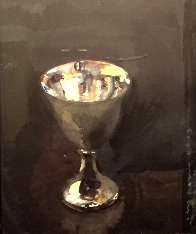
Silver Cup                   Lars Lerin

Intermediate Homework 2/1/17 Palette Logic

How many colors do you like to have in your palette? How many do you need? How would you decide which ones are your essentials?

Tough questions.

Luckily, we don't often have to make decisions about which colors stay and which must go (only when some fool gives it to you as a homework assignment).

Many artists like to have a warm and a cool of each color family, which, theoretically, provides a great deal of versatility. For example, a yellow that tends toward orange (New Gamboge), and one that is leaning toward green (Aureoline). You may ask, " Why not just get a yellow that has neither red nor blue?" Why, indeed.

Some like to add potent dyes, like Pthalo blue and green, and a couple of Quinacridones, for when the color you're mixing needs a quick shot of warm or cool, or when you want a powerful dark. Please pass the Transparent Pyrol Orange!

There are lots of ways to fill your palette. I met a painter once at a workshop who had 5 palettes. She needed her own whole table. I have to admit I was a little jealous of the one devoted entirely to blues.

I think we may all be a little weird when it comes to color. Why is it, for example, that I usually have 5 blues, and I can tell you what they are without hesitation, but I only have two reds, and I'm never sure about their names? There's something to be said for just gathering the colors you simply like best, and watching to see if the need for additional colors arises.

For homework, let's do some painting with a limited palette. Here are a couple of popular sets that have passed the test of time:

Anders Zorn:
 Yellow Ochre, Cadmium Red Medium, Ivory Black plus White. Some lists add Vermillion, Viridian, and/or Cerulean Blue.


John Singer Sargent:
Raw Siena, Burnt Siena, French Ultramarine, Ivory Black. Traces of Cobalt Violet and Prussian Blue


Choose your own group of colors, or try one of these. Limit your array to 4 or 5 colors. Maybe 3, if you're feeling brave. Some of the mixes you make will probably be less than perfect matches. Rather than add more colors, try letting them be to find out how the whole painting is affected by the limited palette. Give it a chance to assert its cohesiveness.

Please search for your own image, and bring it in so we can see how the palette you create works.