Thursday, May 5, 2022

Full saturation


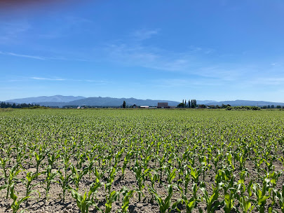
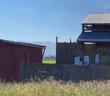
  The darkest darks in this image are approaching opacity. Any more pigment in the mix and the paper would be throughly masked. But don't back away yet! Some of the most beautiful passages remain to be laid down; the red barn, the warm grey fence and the cool grey window wall. There is still room to use  color and value to contrast the shadows and the sunlit areas.

Too often we stop short of  the real limit, thinking the paint will lose its sacred transparency.  The demo this afternoon was designed to encourage you to deliberately broaden the range of what is acceptable . If you stay out of the water bucket your paint will get darker and thicker by definition.
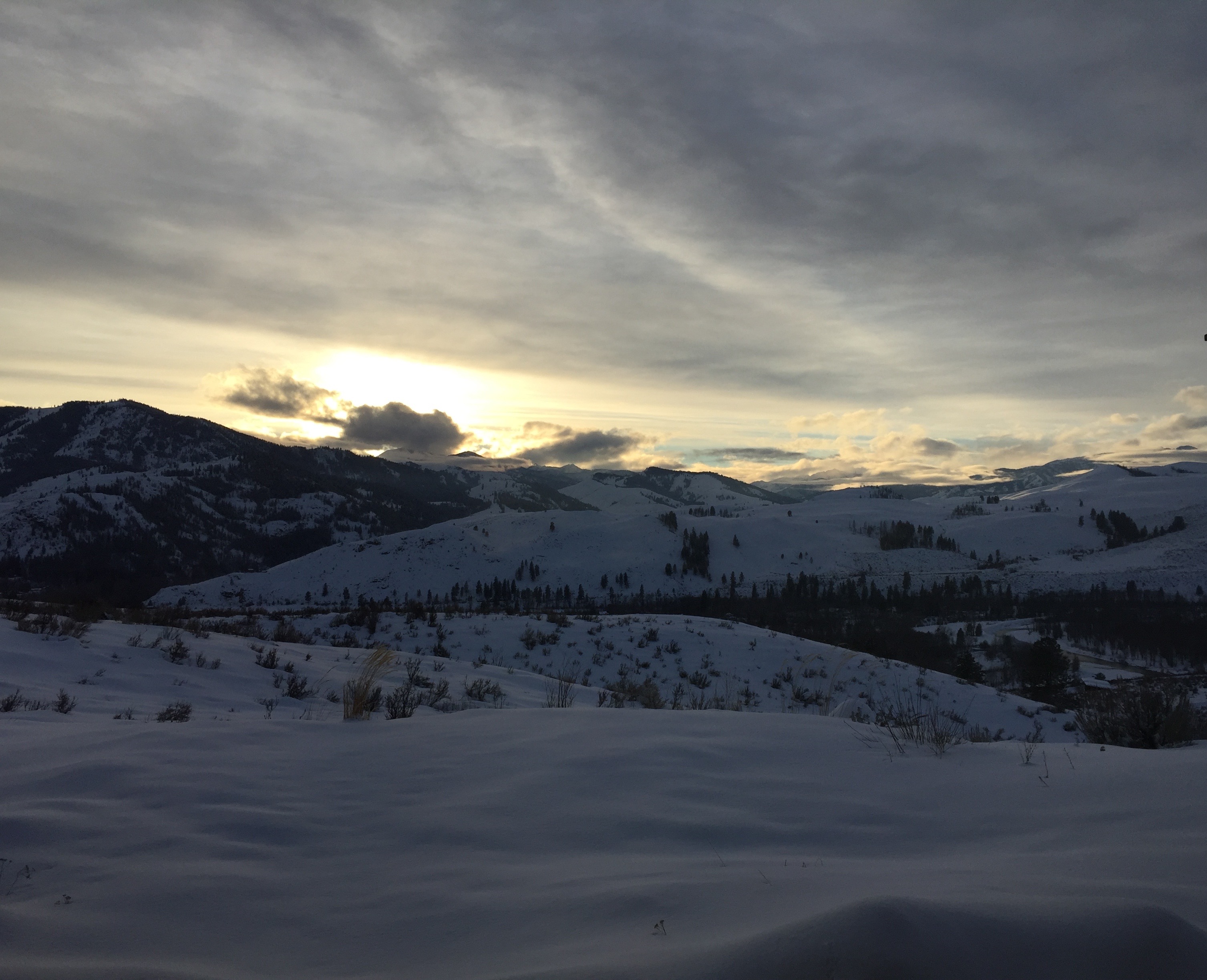


You can experiment with how to use the fact that watercolor dries lighter than it appears. Make a wash  of a powerful dark to cover the snow. Now add some super dark, made from pthalo blue and transparent pyrol  orange, and use your homemade black to make the tufts of grass and saplings.


Here are a couple more to try. Make the darks  as dark as you can , then make an even darker dark after that one dries. You should find just enough to make a layer that that is thick and dark enough to  make profound depth  but still fluid enough for the strokes to flow into each other.


Thursday, April 28, 2022

Beautiful Paint

Looking at the watercolors  of John Singer Sargent we encounter some  areas of simple, gorgeous paint and other contradictory passages of great care and complexity, often in the same painting.

Take a look at the  grass between the gassed soldiers' legs. Sargent knew that the carpet of green with just a scant specific blade was sufficient to describe lush grass. The gas mask, on the other hand, needed much greater care to  identify.


A similar comparison of Winslow Homer's early and later watercolors reveals a very different attitude toward the fluidity and transparency of the paint


                                                                    Sargent


A comparison of Winslow Homer's early and later watercolors reveals a similar change in Homer's brush handling. In the early years the artist was more concerned with narrating various stories than he was with celebrating the fluidity and transparency of the paint.


                                                                       Homer


Homer


For Homework, select one of your own paintings, one you are very familiar with, and make a version
of it that you don't have to correct.The idea is that the painting is one of thousands of versions that are 
perfect enough.

Thursday, April 21, 2022

The Bumper Sticker


 Now and then we discuss the all important phrase ; Shape first, then texture, if necessary. The idea is to remember to keep your brushwork general until the painting calls for more specificity, if it ever does.  

One way to stay open is to work on wet paper, at least for the first layer. Take a look at these examples;


                                                                           Rex Brandt


Rex Brandt
Brandt usually began a painting by wetting the whole sheet and blocking in the major shapes.. Can you imagine what the first layer of either of these paintings looked like?.For each shape there was a solid 
wash of color into which the damp brush was touched, making mid-value forms. like the blue green pattern in the water.

Would you like to make an interpretation of one of these? If not, how about  one of the two photos?
                   
If you have a photo of your own, by all means use that.


Wednesday, April 6, 2022

The Patterns


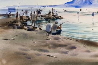
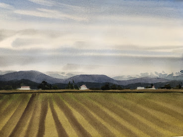
Here's a marine scene from Leslie Frontz, and a farm from George Post, below. Both pantings make use of simple patterns that rely on the context to help the viewer recognize the subject.


By themselves, the dark, squiggly shapes behind Frontz's rowboat have no meaning, but in the presence of the edge of the water we have all the information we need  to make a pretty good guess where we are.


Post's patterns in the Farm scene are even simpler to "read". With its pointy green strokes we can tell what kind of tree that is on the right, and those simple curves in the surface of the ground plane are unmistakeable.


The message here is that we don't have to paint everything. It is not your job to make sure the viewer recognizes exactly what everything is.

Meanwhile ...It is part of your job to make the patterns you devise engaging to look at completely apart from what they represent.  After all, paint on paper is all there is. If it's not fun to observe then  we have missed our mark.


For homework, please select one or more of these images and use patterns  to simplify your interpretation.  Karen, this might be a good time to let everyone know when the images should be submitted
Have fun


Thursday, March 24, 2022

General First, Then Specific, as Needed

 Many excellent painters begin  by blocking in the major shapes while the paper is still wet. Using pale colors, they allow the shapes to run into one another, making a very general statement that comprises all soft edges. In this stage, the work in progress is more concerned with where the shapes are than what they are.

For RexBrant and Trevor Chamberlain (and many others) this is the best time to find out whether the viewer has sufficient  information .They can pause and wait for the paint to be dry enough to receive the next layer one stroke at a time .

Look for a scene or an image that invites a soft-edged first approach and practice till you have faith that  the picture will come together when the hard-edged darks are added. The two here are meant for observation. It's best if you find an image of your own to practice on.


Can you picture these when only the first layer was present?


Thursday, March 17, 2022

Copying, not Duplicating

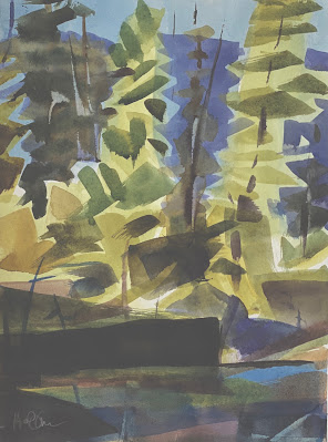
Here's a painting full of light and loose brushstrokes. If you chose to make a copy what would you want to make sure you managed to include? The warm and cool distribution? How about the hard and soft edges, or the simplicity of composition? It would help to be able to see which elements of the copy are essential to your purpose.

Take a look at the green firs that stick up higher than any other shapes. What if the tallest one was in the middle rather than on the left? Would the copy still do justice to the original? What if you decided you were more interested  in the feel of the copy rather than its visual accuracy? Here are a couple more images to consider copying. 


Friday, March 11, 2022

Creating Symbols by Simplifying Components of the Landscape


This landscape could hardly be simpler. Details, in the form of texture, have been removed completely and replaced with symbols of an agricultural landscape. Ironically, the result is very realistic.

For the viewer, it is easier to identify what's missing than to edit out the inessential. They are more likely to say,"You missed a spot!" than to point out detail that needs to be edited.  


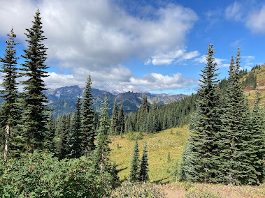
Alpine firs, right? You can tell by the elongated shapes and small stature. Not a needle in sight. The first layer was the pale,overall shape, then a mid-value triangle for each bough. Finally, the dark  trunk, a la George Post. The painting with the fewest strokes wins the jackpot.


Here are a couple of photos to practice on.