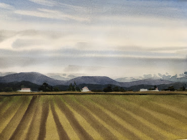
This landscape could hardly be simpler. Details, in the form of texture, have been removed completely and replaced with symbols of an agricultural landscape. Ironically, the result is very realistic.
For the viewer, it is easier to identify what's missing than to edit out the inessential. They are more likely to say,"You missed a spot!" than to point out detail that needs to be edited.
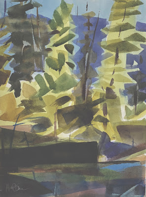
Alpine firs, right? You can tell by the elongated shapes and small stature. Not a needle in sight. The first layer was the pale,overall shape, then a mid-value triangle for each bough. Finally, the dark trunk, a la George Post. The painting with the fewest strokes wins the jackpot.
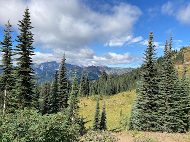
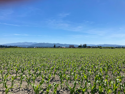
Here are a couple of photos to practice on.


No comments:
Post a Comment