Thursday, April 18, 2013

Intermediate Watercolor homework 4/18/13 A Found Picture

This exercise assumes that everyone lives in a space with at least one window. If that's not true for you, let's talk.
Set up your gear in front of a window. Using the window frame as the borders of your study, move around until the scene out the window makes a dark/light pattern that appeals to you. You may end up working from a standing position, or you may have to sit on the floor. Form trumps function for this project.
Make a quick sketch, in monochrome. This can be a postcard-sized pencil sketch, or a purple watercolor. The important thing is to map out the shapes. It is not necessary to take responsibility for the viewer being able to identify what they're looking at. Just show them the shapes.
Now, where would you like to go with this pattern? A warm/cool arrangement? A soft-edged interpretation, a la Whistler? A geometricized abstraction? Hold on to the dark/light array of shapes, and let go of everything else.


Beginning watercolor Homework 4/18/13 A sequence of layers

Coming to know a new subject in terms of washes and strokes can be a puzzling prospect. Where do I begin? To focus your awareness on the progression of a painted version of your subject, it helps to limit the distractions. First on the list could be color, which is often the most insistent variable. For this exercise, let's just set color aside, and make a monochrome study. Choose a color straight from the tube, so you aren't using your attention to keep matching one that you've mixed. It has to be one that can get dark enough to represent the darkest darks. You will be making a three value study in a single color.

Everyone chose a photo to work from. If you missed class, here is an image that will serve well as a subject.

Start by squinting hard at the image, so that shapes of similar value merge together, and texture dissolves. Assign a value - either white, middle or black - for each major shape. This requires some amount of compromise. You will have to decide whether to round things up or down. Remember that if you make a mistake, the study will still do its job very well. Finding out that a given shape should have been dark rather than middle, for example, is just as useful as getting it "right". The job of the study is to provide answers to questions. It does not have to be a handsome product in its own right.

Locate the white shapes. Paint the entire page middle value, leaving just those whites unpainted. Let the paper dry completely.
Now apply the dark layer, reserving the middle values and the whites. That's the whole story. All that's left is to assess the result. Where do you wish there were more subtlety (such as another value, halfway between black and middle)? Where should there be more specificity (where the picture would benefit from knowing a bit more about what comprises that big dark shape in the corner, for example)?
Make your notes directly on the study.

Thursday, April 11, 2013

Beginning Watercolor Homework 4/10/13 Color mixing

Please read this all the way through before launching into the painting.

Select a set of primary colors, one each of red, yellow and blue. These will comprise your entire palette for this exercise.

Paint an array of shapes on a 1/4 sheet of paper using the three colors in their pure forms and in a variety of combinations. You can let the shapes overlap, or keep them separate. There are no rules or guidelines, other than that you should leave at least 1/4 of the paper white.

Now, mix a big puddle of a neutral color in which none of the three components is dominant. Use this to surround the shapes, eventually covering all of the white. If you apply this neutral wash wet enough, you may be able to make the whole background without overlap marks, but it is not necessary to do so.
However it turns out, let it be. There is no right way to do this, so there is also no wrong way. In other words, there is no need to correct anything. If you are dissatisfied with your results, make another one.

Finally, make the darkest color you can using your three components. It should have just enough water to flow on evenly. Too much water will thin the paint, and make it lighter. Too little will leave the paint thick and textured on the paper. You can use a scrap of practice paper to try it out. If it is still shiny even after it's dry, it needs more water. Use this color to embellish your design further. The darks are powerful, so be deliberate in using them.
Have fun

It could look something like this Hans Hofmann

Then, again, it could look like this Vermeer

Intermediate Homework 4/10/13 Simplifying your subject by combining shapes

What we see when we look at a scene as an artist is different from what we see when we look at it as our immediate surroundings. What we need to know changes, depending on our purpose. The pedestrian needs to know where the hazards and the rewards are located, and which is which. The painter just needs to know if the shapes make an appealing pattern. To see with the eye of an artist, it is necessary to turn off the content program and switch to the form-based channel.
One kind of vision emphasizes the differences between objects. The other focusses on the similarities.

As realist artists, a big part of our job is to make the scene much simpler, so that its graphic impact can be easily perceived. We do the work of editing out the optional information, so the rest of the world can  see the essentials. One very useful way to do this is to combine shapes that are similar in value and/or color.

Find an image that interests you. Squint hard at it. Subtle differences in color and value disappear. Texture is absorbed into shapes. The simpler pattern that emerges is what the painting wants to emphasize. Make a quick study of this simplified version of the scene. Take note of what you let go of and what you held onto. Can you afford to simplify the scene even further? At some point, when you have really shifted from differentiating to combining, your treatment will become entirely abstract. stand way back from the image, and see if the content comes back. Please bring in all your studies.
Have fun.

Thursday, March 14, 2013

Intermediate Watercolor 3/14/13 Taking Off

With all those shadow shape studies we did the past two weeks, there should be plenty of images that can serve as the basis for some color experimentation.
Try making some simple versions of the poses you observed, using the dark/light pattern as a jumping off place. Holding on to the value relationships, try introducing surprising colors. Let go of your assumptions about color. Does the shadow side of a figure have to be cooler? Are downward-facing planes always warm? Can the eyes be different colors? Can a line change color temperature half way along? Is hair never green and purple? Who's making the rules?

Julia Kay


Joan Brown

Manuel Neri

Beginning watercolor 3/14/13 Letting Value do the Work

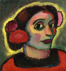
Working on the self-portraits in class, it was clear that the value contrast between the first and second layers did most of the job of creating an illusion of light and substance. The reliability of this effect makes it possible to be bold with color, as long as you hold on to the value relationship. The first layer, for example, could be richly multi-colored if the colors are similarly pale. The shadow pattern, too, could be made up of a variety of colors if they are all dark enough to work together to make the shadows.
Alexei  Jawlensky

Take advantage of the opportunity to experiment with exaggerated color relationships. Try making all the downward facing planes similar in color temperature, but different in hue. Or try making the shadows all cool and the lights all warm, or vice-versa.

Andre Derain   Portrait of Matisse

It is also possible to use color to provide all the contrast, as Derain has done here. Much of the blue shadow side of the face is no darker than the yellow, sunlit side, but it still reads as shadow. This work will carry over to our figure painting next Wednesday.

Have fun. Let go.

Thursday, March 7, 2013

Beginning Watercolor Homework 3/7/13 layers, again

In class we discussed the process of making a step-by-step demonstration of the sequence of layers that led to a simple study of an image. To review the process, please read this description carefully:

Start by identifying the major shapes in the image. There should be no more that 10 or 12.
Make a simple drawing that locates the shapes.
Paint in the first layer - the lights - of each shape, keeping the treatment as simple as possible (no texture or detail).
Now make two more first layer pages, so that you have 3 more or less identical sheets.
Put the second layer - middle value - on top of the first on two of your 3 sheets.
Finally, apply the 3rd layer - the darks - on top of one of the second layers.

When the process is finished, you should have one sheet that just has the first layer, one that has first and second layers, and one that has three layers. If you need a fourth layer to get the super-darks, just apply them on top of the third layer. No need to make a separate , fourth version.

In case you missed class, here are a couple of simple images that will resolve nicely into three layers. If you think there should be a fourth layer of super darks, put them on top of the three layer treatment.


In case you were not in class, here's an image that resolves neatly into 3 or 4 layers.