Thursday, March 17, 2016

Beginning Watercolor Homework 3/17/16 Seeing the Head as a Series of layers

Looking at a subject as a series of layers must be pretty familiar by now. Starting out with a general statement about the major shapes in their palest form is the foundation for a painting that will become darker and more specific as you proceed.


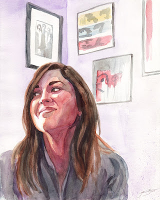
Looking at the face, above, can you imagine what the first layer looked like when it was all there was on the page? The remaining lights we see in the finished portrait were originally part of a silhouette shape of the entire head, neck, and sternum. It was a little darker than the white parts of the shirt, and a little lighter than the background.
A layer of middle value warm was laid on top of the pale first layer, covering almost all of it. Only a few lights remain. This new shadow shape is a little darker than the background, but not too dark. There is still room in the range of possible values to make a few slightly darker areas within the shadow, and the darkest darks in the next layer to come. The next darkest layer is the hair, which contains the darkest parts of the painting. Notice, by the way, that the hair is treated as a small number of shapes ranging from white to light, to middle, then dark. It is its own series of layers, observed and presented as a few shapes rather than as a collection of a great many individual strands.
How many layers do you see on the shirt?

Following are a few more layered portraits, which are followed by a couple of head photos.
For homework, please translate one of the photos into a series of layers, or copy one of the paintings. Please err on the side of too little information. It should be too simple.


Remember, getting the values right is far more important than the colors. For each layer, ask what it is darker than and what it is lighter than.


Tuesday Afternoon All Levels Class and Intermediate Homework 3/17/16 Abstraction from the landscape

In class we spent time putting emphasis on the look of the paint as paint. Once the desire to create a convincing illusion is put aside, we are free to give more of our attention to the fluidity and transparency of the medium. Meanwhile, though, it is still necessary to fashion an engaging composition and a pattern of values with a strong graphic presence.

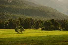
Landscape images are a great resource for finding good shapes and value relationships. Here are a couple that show promise:


A limited but elegant palette, but the composition needs tweaking.


Crop, perhaps?


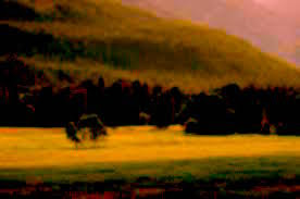
A good place to start is to consider moving the shapes around to build a solid composition. Don't forget, you can also crop, flip, rotate, whatever. The idea is to find or make an arrangement of shapes that will serve as a framework to show off the gorgeous paint. You may want to adjust the color or value to get your thinking outside the limits of your assumptions. The image below may not inspire you to paint...


but a little enhancement could start the juices flowing. 


I like to spread out several blank pages from a sketchbook to make quick variations on the composition and the colors. You'll know when you see one that works especially well.

The one guideline I want to recommend is to minimize corrections your strokes and washes. At the very least, stand back and consider leaving whatever just happened alone before you mess around trying to get the look you thought you wanted. The well-crafted framework should ensure that whatever the paint does will be OK, and nothing is more important than the fresh look of paint that has been given room to flow.
Well, maybe just one more thing to keep in mind; Shape first, then texture, if necessary (and it's not necessary).
Have fun!


Thursday, March 10, 2016

Everyone's Homework 3/8/16 Seeing the figure as a series of layers

Just like every other subject, the figure can also be treated as a series of layers that progress from general to specific and from light to dark. The same set of questions that inform the development of a still life or a cityscape apply:


1) Is there a way I can paint the whole shape with an overall wash that can underlie everything that will come later?

2) Is there anything I should reserve from the previous layer?

3)Is there anything I should do while the wash is still wet?

A logical choice for the first layer, as usual, would be the color and value of the light-struck areas of the figure.
You might choose to reserve the white of the paper in a few spots that catch some extra light.
While the wash is still wet you could indicate some variation in that first layer, like the slight redness of the calves and the neck and hands. These would be very similar in value to the overall wash.

Layer number two is the shadow shape. Much of it is soft-edged, but for your first few sketches I'd recommend ignoring that, and drying the paper before beginning the shadows.

Making a study of just the shadow shape on blank paper is a good way to get accustomed to seeing the shadows as a separate layer, and learning what role they play in the definition of the figure and the light.

Layer number three is the darkest darks. In a figure with a strong light source these are often lines that occur where two body parts are pressed together, such as the upper arm meeting the torso, or where a breast rests on the ribcage. Sometimes some of the shadows are also very dark


When you mix up the color for the first layer, keep it pale enough that the shadows, which are usually middle value, will make a noticeable contrast. Also, keep in mind that when you are applying that first layer, it is not yet necessary to perfect the shapes and proportions of the figure. The shadows and the lines provide ample opportunity to give definition to the body. Putting in a background offers yet another chance to trim off any awkwardly indicated bits.


The notion that anything is thoroughly represented by three simple layers is, of course, absurd. The subtleties of color and value are beautiful and fascinating, but to attempt to include them all would lead to a seriously over-painted watercolor. For now, at least, let's aim for a reasonable representation of the thrust of a pose, the feeling of strong light, and maybe a little of the presence of an individual.


Friday, March 4, 2016

Everybody's Watercolor Homework 3/4/16 Devising The Preliminary Study

The best way to know if something belongs in the painting is to leave it out. 


Ok, I confess I don't always make a preliminary study before I "try out" the image. But I almost always wish I had. If you're impatient, like me, please read this post anyway. I'll have more to say about how to follow up on what happens when you just dive right in.

When you are drawn to a particular subject, it may seem unnecessary to make a thumbnail sketch or a value study. If a juxtaposition of interesting shapes presents itself, you may feel as if you need to get totally involved right away, before the "flow" gets interrupted.
I get that, believe me. There is an ideal process in my imagination that goes like this: Inspiration leads to action. Action leads to expression. Expression = Success!
Realistically, though, the experience is usually more like: "Wait. let me try that again", which leads to the same mistakes, which leads to another attempt. And so on. So much for the flow.

I want to make a case for giving a thoughtful approach a try. The sacred "flow" will not be halted because you allowed your intelligence to play a part in the process. Think and experiment all you want. As soon as you make the first brushstroke, the current will begin to carry you again.

Before you launch into what you hope will be a proper painting of a new subject, take a minute to assess how ready you really are. Go down the list: Value, Composition, Edge quality, Color. Do you feel confident in each category? If so, off you go. But if not, see if you can give a name to your uncertainty.
When I consider this photo of Hart Pass, below, I know right away that I have a good sense of what I want to do with color. I also know that I like the bold contrast of light and dark. I may want to turn down the value of that big triangular shadow in the center of the page. It could look like a big hole in the scene if I don't lighten it a bit. I believe I can see that well enough in my mind's eye that I don't need to make a study to test the idea. But what about edge quality? I'm not sure the illusion of space would survive having so many hard edges, but which ones should I soften? Aha! The unanswered question.

Now I know what sort of study I need to make. I'll make a very quick sketch that has no hard edges at all. Then I can use that to tell me where I wish I had one or two. Maybe three. I can pause and ask where a hard edge would be essential and make a note of that information, adding locations one at a time, stopping when there are just enough.


If checking in at the gut level doesn't reveal how confident I am, there are a few simple questions, based on where my paintings most often go wrong that I can ask for each of the four main variables:

Color: How many colors will be enough?

Value: What should the value range be in the foreground? Middle ground? Background?
             Is the pattern of values appealing?

Edge Quality: Where do I really need hard edges?

Composition: Are the major shapes where I want them?
                         Are there too many shapes?

Remember, you are asking these questions to inform an interpretation of the subject, not a duplication of the photo. The two approaches will give you very different answers.

Often just focusing your awareness by asking questions reveals the answers, and no study is required. Sometimes assumptions are revealed that are self-imposed obstacles to expressiveness. Stay receptive to ideas when you are in the planning stages of a painting. It is a creative process that helps you get out of your own way.

Whatever form of study I decide to make, I like to start by seeing shapes. I often look for the shapes that need to be separated from each other to understand where they are in space. How will you use color to separate the shapes? How about value? Edges? Composition?

 In the photo below, there is just enough overlap to tell us where the buildings are in relation to one another. This would be the right time to make sure there are no unfortunate convergences of profile that cause the shapes to appear to be in the same plane. It's easier to move a shape now, when it's not yet made of paint.


 Sometimes. though, you may not care about creating a convincing illusion of space. Notice how the buildings make one big shape when you compare them with the sky. Their geometric patterning contrasts dramatically with the simplicity of the plain blue wash. I can see how deliberately flattening the space could express something of the experience of being surrounded by big buildings. A couple of pencil studies, just outlines of the shapes in slightly different positions, should reveal how such a treatment might be done.

It helps to be clear about what is important to you in the subject you intend to paint. For the downtown scene, for example, the assumption that a feeling of space was essential turned out not to be true. That changes how the variables need to be employed. If you no longer need to separate the individual buildings you probably want to emphasize the similarities rather than the differences.

For homework, please find an image or a live scene you'd like to paint. Assess your readiness and devise a study that will provide answers to one or two unanswered questions. If you keep it down to just a couple of questions the odds are better that you'll see the answers.

Make your study quickly. It's not a painting, and it will do its job just as well if it looks wrong. We're just after information, not fame.

When you're ready, paint the picture. Keep the study where you can see it while you paint, and please bring everything; studies, notes and paintings, to our critique.