For the last homework of the term, you decide what to paint.
If it's warm and dry enough, go outside. Everything is worth painting!
.
Thursday, November 10, 2016
Saturday, November 5, 2016
Intermediate Homework 11/5/16 Shadow Color on the Figure
The beginning class' homework this week includes several photos (see below) of models in light similar to what we'll use in class Wednesday. Use those or any you find on your own to experiment with color in the shadows.
Here are some ideas that might stimulate a wide open inquiry:
Make the shadow shape with a warm middle value, and add a cool color of similar value while the warm is still wet.
Mix together a warm and a cool to make an all-purpose shadow color. Paint the entire shadow shape nice and wet with the mixture. Add touches of the warm component into the overall shadow wherever you see warmth, and the cool component where the shadows look cooler.
Paint your first layer using a wash made from all three primaries. Use the same three colors in their pure form to make the shadows, placing them according to your observations of differences in shadow colors.
Have fun!
Don't forget to bring in lots of paper for Wednesday's class.
Beginning Watercolor 11/3/16 The Shadow Shape on the Figure
Here are several poses that show distinct shadow patterns. We'll have similar lighting conditions on Wednesday, so it would be good to practice seeing the shadows as a separate layer from the initial local color wash and strokes.
Try painting just the shadow shape a few times. This will help you look through the array of layers and focus on one at a time. It will also reveal the role of the shadow shapes. Do the first few in monochrome, so you aren't distracted by color.
You might also try painting the first layer of the figure twice and adding the shadows to just one of those. This will make very clear how much of the illusion of light and 3-dimensionality comes from the shadows.
After you gain some confidence, try painting a few shadow patterns without drawing them first. Stay relaxed, and allow yourself the luxury of inaccuracy. See if your mistakes reveal where you really need to be careful and where some leeway exists.
Have fun, and don't forget to bring plenty of paper to our next session.
Thursday, October 27, 2016
Beginning Watercolor Homework 10/26/16 Shadows
What is the most important thing about shadows? From the watercolor painter's point of view, it's the fluidity and transparency of the paint. Even more than we want to get the value or color correct, we work to make the shadows with an extremely even wash. If you make them paler than they actually are, they can still be believable shadows, only describing a different set of light conditions. But if your shadow is made up of many strokes that display streaky overlapping marks, it will look more like a tarp than a shadow.
The most important thing about shadows is that they have no substance.
The key to making weightless shadows is to apply the paint with a wet brush. Make a big puddle of your color and dip into it often, so that each stroke flows freely into the others.
Okay, then, what about color? Generally, shadows are darker, cooler and more neutral than the surface they fall upon. If that surface is already neutral, like a sidewalk, then the shadows are just cooler and darker.
Since the surfaces where shadows fall come in every color, so do the shadows.
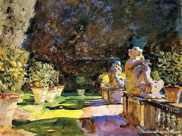
John Singer Sargent
See how the shadow changes color as it moves across the path and onto the grass? On the figures, the shadows are warm or cool depending on the direction the planes are facing.
With a transparent medium, it seems possible that the local colors of the grass and the path would show through a single colored shadow enough to be appropriately different. For homework, draw a very simple path with a pronounced local color and different colored verges on the sides, like the grass and gravel in Sargent's painting. Beside the path, add something that would cast a shadow across path, verge, and anything else you want to include (imagine, instead of the potted plants in the Sargent there could be a pink stucco wall that the shadow would climb)
Put down a wash for each local color in your scene. Then mix up an all-purpose shadow color and paint the shadow as a second layer on top of the surfaces you are depicting.
Now make the same drawing and first-layer washes. This time, mix a separate shadow color for each surface and connect them to make a continuous shadow, as Sargent did.
Did both approaches work? Do you have a preference?
If you have time, experiment with the color of the shadows. Can the shadow be a different color than the sunlit parts of a surface? How different? Can there be more than one color in shadow even when the surface material doesn't change? Bring everything to our critique, and hope for sunshine!
Intermediate Watercolor Homework 10/26/16 Color Harmony
I believe we all have inner resources which we could make good use of as painters, but which we have not learned to trust. Let's try a quick color exercise that requires thinking and feeling in the realm of color choices, and see if it helps tap into the store of knowledge we have built over the years.
Step one:
Mix up a color you like, simple or complex, and make a patch of it on clean paper.
Step two:
Now, mix up a color that clashes with the first one. Don't overthink this. Just go with what your gut tells you. Make a patch of the second color on the same page as the first, but be sure to leave a space between them for a third patch.
Step three:
Make up a color that unifies the first two. Its job is to make a bridge between the two that didn't go
well together.
We may not always agree about dissonance or harmony!
Do this several times, and bring them all in to critique. We will study how and why the bridges work.
Friday, October 21, 2016
Intermediate Watercolor 10//16 All Painting is Abstract. All Abstraction Tells a Story
As we let go of the need to establish an illusion on the page the balance of form and content shifts distinctly toward form. Without
narrative content to occupy the viewer’s attention, it becomes more important
than ever for the paint itself to be worth looking at. Freshness and clarity,
fluidity and interaction of colors, - the qualities that attract us to
watercolor in the first place – are now the subject matter of the painting.
How do we decide what works best when we let go of the usual standards? Are there any guidelines, or is abstraction a painting free-for-all?
In fact, the same standards that apply to realists are equally important to abstract painters. A painting with too many shapes, for example, feels busy whether it is a cityscape or a non-representational collection of forms. Wherever your work resides on the continuum from realism to abstraction it will benefit from being clear and deliberate in your use of value, composition, color and edge quality. As you extend the range of your comfort zone you can keep one foot in familiar territory.
The transition from realism to abstraction is a process of combining what you know from your previous experience with experiments into the unknown.
There is as much of a story being told in an abstract painting as in a realist image. It may be a story about rectangles touching the frame of the painting, or pale, soft-edged shapes being traversed by hard-edged diagonals. The wonderful irony is that this kind of narrative is also present in even the most hyper-realist work. The difference is that in abstraction, the viewer is invited to pay attention to it.
The patterns of marks you make, the distribution of warm and cool color, the dark/light shapes, how shapes relate to the frame of the page, all the design decisions you make play a much more obvious role than they do in realist work. Most of these decisions have to be made deliberately, painting-by-painting, or we tend to fall into making the same default choices every time (the offset cross, the centered horizon).
Having said that, it is also important to leave room for surprises. Break your own rules, just to see what happens.
Some painters will naturally start exploring without guidelines and discover what works and what doesn’t. Others will want to begin with some deliberate structure in place, like keeping the shapes parallel to the edges of the paper.
For homework, do whatever you want.
How do we decide what works best when we let go of the usual standards? Are there any guidelines, or is abstraction a painting free-for-all?
Nathan Fowkes has let go of texture and specificity, but he keeps a good grip on value and color.
In fact, the same standards that apply to realists are equally important to abstract painters. A painting with too many shapes, for example, feels busy whether it is a cityscape or a non-representational collection of forms. Wherever your work resides on the continuum from realism to abstraction it will benefit from being clear and deliberate in your use of value, composition, color and edge quality. As you extend the range of your comfort zone you can keep one foot in familiar territory.
The transition from realism to abstraction is a process of combining what you know from your previous experience with experiments into the unknown.
The pattern of light, middle and dark are thoughtfully constructed, just as it would be if this were a painting of a barn.
There is as much of a story being told in an abstract painting as in a realist image. It may be a story about rectangles touching the frame of the painting, or pale, soft-edged shapes being traversed by hard-edged diagonals. The wonderful irony is that this kind of narrative is also present in even the most hyper-realist work. The difference is that in abstraction, the viewer is invited to pay attention to it.
Having said that, it is also important to leave room for surprises. Break your own rules, just to see what happens.
Some painters will naturally start exploring without guidelines and discover what works and what doesn’t. Others will want to begin with some deliberate structure in place, like keeping the shapes parallel to the edges of the paper.
For homework, do whatever you want.
Thursday, October 20, 2016
Beginning Watercolor Homework 10/20/16 Downhill From Here
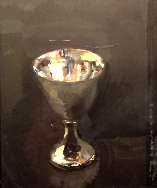
So far, in class we've done more work from photos than from life. This week's homework exercise puts your understanding of seeing in layers to work on a simple 3-D object, like an apple,
Gerhard Richter
or a chalice.
Lars Lerin
(This is a watercolor, by the way)
Look around the house for an object that invites a watercolor interpretation. I find the refrigerator to be a great source of candidates. A bottle of hot sauce, a jar of mayonnaise, maybe a rutabaga. A stovetop tea kettle? Try setting up a single strong light source so the light and shadow shapes are easy to identify.
Does your object resolve nicely into just a few layers? If so, get started with a monochrome value study. Keep it very simple. No need to make the first attempts into handsome paintings. The idea is to begin seeing a series of layers; light, middle, dark.
Once you've seen your way through the single color study, make a color version with a limited palette, just one each of the primaries. In fact, make 3 or 4 versions, all increasingly simple.
Eventually, you will begin to recognize what needs to be there for the subject to have some presence. Adding the cast shadow will be very helpful. Make that simple, too, of course. Fussing with the shadow will do more harm than good.
After you've painted 5 or 6 of your rutabagas, the translation into "watercolor" will be realized. When you feel confident that you understand the subject in terms of layers of washes and strokes, put the model away, where you can't see it. Now paint a version or two by heart.
Friday, October 14, 2016
Hold On Here, Let Go There
The tanks and stacks of the gasworks are way too complicated to render accurately. which is a very good thing. It forces us to find a way to simplify the subject, which entails identifying a few essential visual features to hold on to, and letting go of everything else. On Wednesday we kept a loose grip on composition and had some fun with color. Wild and crazy as we got, every painting made that afternoon would be instantly recognizable as gasworks.
Most of the edges were hard. Let's try letting go of that aspect, too. You can find thousands of photos of the structures online, or just use your paintings as jumping off places.
What color sky do you want?
Will it work to have different colored tanks?
What if the cylinders and the shadows are only roughly attached?
Can the shapes dance around a bit?
Have fun!
Making a Watercolor Value Scale
Cut a strip of good paper, about 2 x 8 inches.
Leave a white strip at one end and paint the rest of the paper very light (2).
Dry thoroughly between layers.
Leave a strip of number 2 next to the white and paint the rest medium light (3).
Keep leaving a strip of the previous layer and darkening the rest till you have 10 patches with white on one end and black on the other.
Try to make uniform value jumps with each layer, but don't worry if it's not perfect. It will still work.
You don't need the numbers on your scale.
Beginning Watercolor Homework 10/13/16 Juggling Color and Value
Looking at an image or a scene as a series of layers can be an entirely new way of seeing. Now that you have all had some practice deconstructing a photo in terms of layers of value, let's try seeing both value and color at the same time.
To make the process simpler, begin by identifying the major shapes. These are the shapes that need to be separated from each other in order to understand where they are in the illusory space. In the image above, the building on the right is farther away from us than the school bus, but closer than the dark green hill. To get the building to separate from its neighboring shapes it must be different from them in terms of value and/or color (for this exercise let's treat all edges between shapes as hard edges. Two variables are enough.)
For each of the major shapes, choose a color and value that will separate it from the adjacent shapes. Try to ignore the texture. The job is to deliberately oversimplify the information. The windows on the building, for example, could be left out without undermining the feeling of space. Put them in if you want, but first establish what you see when you squint.
How about the bus? Think light, middle, dark. The whole shape can be painted the sunlit local color, except the windshield. Then, when that's dry the right side gets a second layer of middle value. Then a few dark windows and stripes, if necessary.
Remember, this is a study. We want to find out if the illusion of light and space can be established with a minimal treatment. That will reveal what really needs to be in the painting. When the shapes have all been blocked in, ask where you would want greater subtlety or specificity. Make notes, but don't embellish the study tool much. Leave it too simple. The best way to find out if something belongs in the painting is to leave it out. If you have time, use the study as a road map for a proper painting.
How many shapes does the pile of logs represent? The key word is "pile".
Friday, October 7, 2016
Intermediate Watercolor Homework 10/7/16 Using Variables to create Space
Crafting an illusion of space in a painting involves separating the major shapes so that they appear to be nearer or farther away from the viewpoint. All of the main variables can be employed toward this end. You may have heard that warm colors advance and cool colors recede, for example. Edges can be adjusted to enhance the feeling of space, with some shapes softer than others to suggest distance. Overlapping shapes in a composition makes clear that one is in front of the other. An expanded or compressed value range usually reads as nearer or more distant, respectively.
The first task is to get the shapes that are meant to be in different places within the illusory space to separate. Any ambiguity regarding the relative location of the shapes undermines the illusion.
How many of these variables need to be involved to get an effective separation? Let's look at a couple of images with an eye toward how the illusion is created, and how it might be enhanced.
It's pretty easy to see that the pointy rock in the center is closer to our viewpoint than the group of shapes in the upper part of the page. There is a little ambiguity on the upper left edge of the point. Why is that section confusing? Is it necessary to increase the differences there? If not, why not? If so, what can be done with color, value, edges or composition to turn up the separation.
The space is clear enough in the foreground area of this scene, but it gets a bit vague in the middle distance. Which variables could be adjusted to clarify where each of the shapes is located?
This is a well-composed image, but a little tweaking could make it stronger. Would color changes improve the feeling of space? How about value? Is it possible for shapes to be too separate from each other?
For homework, choose one of these or use your own image and adjust the dials up or down to make the feeling of space more effective.
Beginning Watercolor Homework 10/7/16 Seeing in Layers
Understanding a scene as a series of layers is mostly about assigning relative values to the major shapes.
Vecinos, Oaxaca |
With only a little rounding up or down, the scene above resolves very nicely into just 3 values. Make a monochrome study of the image where every shape is either light, middle or dark in value. You can indulge, if you like, in more than one middle value. The red tile roof, for example, is lighter than the wall shadow, but both are lighter than the dark openings. One is middle value, the other is dark middle.
Use a single color, straight from the tube, not a mixture of colors. Choose one that gets dark enough to look truly dark, like the doorways in the photo. Carbazole violet would work, or pthalo, or use black, if you have it.
Here's another possibility. This one may require more than one degree of middle value, too.
Using your monochrome study as a road map, make a color version using a limited palette. Choose one red, one yellow and one blue. Make all your colors by combining those primaries.
Friday, September 30, 2016
Intermediate Watercolor Homework 9/30/16 Adjusting Composition
Most of the time the "Reality" of what you choose to paint can be treated as a jumping off place. It's your painting, you can alter it however you please. Nothing is sacred. I think we all understand this intellectually, but there can be some powerful forces that urge us to duplicate the source, as if that's our job. One of these is the notion that the more the painting looks like the scene, the better the painting is. That may, in fact, be exactly the criterion you want to apply, and it is as valid as any other, but if you find yourself bound to accuracy even though you'd prefer to make a personal interpretation, you might consider a "one thing at a time" approach.
Let's begin by looking at changes you might make to the composition of a scene. This need not involve big changes, like altering the color of a building, or deleting something altogether. Sometimes just turning your paper to a vertical rather than horizontal format can resolve compositional issues.
How would changing the composition affect the illusion of space? What if you raised the roofline of the rusty building till it overlapped the ridge line of the hill?
For homework, start with a photo and make any changes you believe would improve it as a painting source. See if you can identify the changes you want before you make a painted version. Remember, the best way to see if something belongs in the painting is to leave it out. And by all means remember, nothing is sacred. Bring in the original so we can all see how your changes affect the results.
Let's begin by looking at changes you might make to the composition of a scene. This need not involve big changes, like altering the color of a building, or deleting something altogether. Sometimes just turning your paper to a vertical rather than horizontal format can resolve compositional issues.
If you are actually on the scene, you can make profound adjustments to the composition by changing where you stand. Which of the following arrangements of shapes appeals most to you?
A change like this is easier to make than one that violates reality. We don't need permission to move the whole scene up or down, but it can seem like a sin to remove something, or change just part of the scene.
The first step is to allow yourself to consider changes that improve the potential painting. In the photo below, can you picture how the scene would look if you took out the car on the left? Or the building behind it. Maybe both.
For homework, start with a photo and make any changes you believe would improve it as a painting source. See if you can identify the changes you want before you make a painted version. Remember, the best way to see if something belongs in the painting is to leave it out. And by all means remember, nothing is sacred. Bring in the original so we can all see how your changes affect the results.
Beginning Watercolor 9/29/16 Don't Panic!
Given a complex subject like the background in the photo, below, you could easily get into a spot where the paper dries before you have a chance to paint all the soft-edged layers you intend. If you want that hill across the water to look farther away than the place where we are standing, for example, everything back there should be soft-edged. Hmmm, tricky
Time does play a part in the operation, but it is not necessary to get all wrapped up in a race against the clock. Panic is definitely not good for your brushwork. Let's consider what can be done to take the edge off the process.
The option that may come to mind first is to PAINT FASTER! This is not terrifically helpful, since efficiency comes from long term experience, and we are looking for what can be adopted today. Instead of speeding ourselves up, then, how about slowing down the drying time?
That hillside in the background of the photo comprises 4 or 5 different applications of paint. Starting with the lightest layer, a "common denominator" of very pale, warm neutral can be applied to the whole shape (leaving the foreground trees white). Now, while that first wash is still wet, the middle value areas - the forest green and the rock shadows - can be painted. These are followed by the darker green shadows and the darkest recesses within the rock shapes.
That's a lot of color mixing and brushwork. Chances are the initial wash could be dry before you even finished the middle values.
Unless...
You make that wash wetter. A lot wetter. Then, when you prepare the brush for the additions just make sure it's drier than the paper, to prevent blooms.
Of course, the wash will eventually dry, no matter how wet you make it, so watch for hard edges you don't want. If you see one, stop painting and dry the paper thoroughly. Now you can re-wet it and proceed making soft edges.
Back to the photo. Notice that the foreground lights are lighter than those in the background and the darks are darker. This difference in the value range contributes to the feeling of space. Using hard edges in the foreground would add to the illusion.
For homework, look for an image with areas that have multiple layers with soft edges, or use the one you brought home from class. Practice the complex parts on good quality paper. When you feel confident, try putting it all together in a proper painting.
Saturday, September 24, 2016
Intermediate Homework 9/24/16 Deciding on Edges
What kind of edge does this form need?
Sometimes the subject matter of what you are about to paint will tell you whether the edges of the form should be hard or soft, but there are no rules about this. Clouds often appear to have soft edges, for example, but you can paint perfectly acceptable clouds with only hard edges. You can search long and hard in most of Edward Hopper’s watercolors and never see a soft-edged cloud.
More often, it is the focal point of the picture that determines how wet the paper and the brush need to be in any given area. Hard edges are assertive. They tend to describe distinct forms, while soft edges merge with the field on which they have been applied.
In Familiar Rock, we are encouraged to see the trees on the foreground headland as individual forms, while on the hillside in the background we are meant to see the forest as a whole.
Soft edges tend to describe a subject in general terms, while hard edges are usually more specific. Consider the role that the particular area you are about to paint is meant to play in the big picture before deciding whether your paper should be wet or dry. How much attention do you want the viewer to pay here?
It is often appropriate to imply complexity in a subject rather than to specify it. Too much specific information leads to a confusing picture, where the viewer’s eye is pulled in several directions at once. If your pictures tend to lack clarity and cohesiveness, consider holding off on the hard edges until you know where you really want them. As a preliminary study, try blocking in the lights and the middle values all wet-on-wet. By the time you’re ready for the darks, you will probably have a good basis for deciding where you want to focus attention. See how the picture “reads” if you only make hard edges in that center of interest.
For homework, make a very simple version of your choice of image, or one of those below, using only soft edges or only hard edges. When the study is finished, ask yourself where you wish there were the other kind of edges. In your imagination, decide where the most meaningful strokes would go if you were
limited to only a few, say, three or four.
If you have time, make both an all soft edged study and an all hard edged one. By then you'll be ready to make a very well informed painting.
Have fun.
Beginning Homework 9/24/16 Soft-edged Skies
Sorry the homework is late to be posted. There's a glitch in the process that almost defeated me
Paint a few soft-edged skies. This means that as soon as you see a hard edge, STOP. Let the painting dry completely, then re-wet the area where you plan to make more soft-edged strokes.
Can you tell how many layers of paint were applied to make this sky? It looks like four to me. First, the paper was wet with clear water, then a layer of pale, warm peach color was applied across the bottom and center. While the paper was still wet, the lighter gray went down. Then the dark gray, and finally, the blue. The brush needed to be washed once - between the dark gray and the blue.
Remember to stay aware of how wet your brush is compared to the paper. And don't correct these paintings. If something goes wrong, let it be. Really.
When the paper is dry, add some hard-edged landforms. Or, on second thought, let them be soft, too. Experiment. Be playful, and have fun.
Take a look at this week's intermediate homework for a short discussion of how choosing hard or soft edges affects the focus of the painting.
Subscribe to:
Posts (Atom)