Saturday, March 5, 2022

Where to Begin.

You may recognize the work of Paul Klee here. He often used limits in color temperature to create a range of feelings in his paintings.
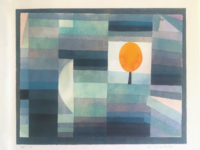


The cool dominance in this watercolor, for example,  sets up the expectation that the mood of quiet will continue.


                                                               Night Fire                  Paul Klee


Here, in a nocturne, Klee makes all the shapes very dark. There is no texture. The thickness of the paint makes it possible for the edges to be soft without the shapes running together. All of the shapes have significant features in common.  Perps you're starting to feel like painting....Can you find some shapes, or invent some?

  Look up Klee. See if you can identify what holds a painting you like together, then apply those aspects to a painting your own.  If you are feeling lost notice that Klee liked to make most of the painting conform to one feature, such as cool dark, while the rest is different in feeling, like the red square, which is relatively warm and light.

Have fun

Tom


Friday, February 18, 2022

Making Deliberate Decisions


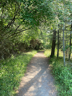
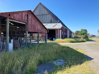
When you take photos to use later for painting you may be falling back on a kind of automatic decision making, such as placing the horizon or a center of interest right in the middle of the page, like this;


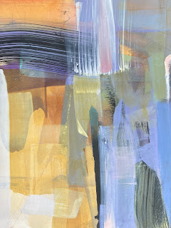
Abstract painters are not immune to falling back on default compositions,  such as the ubiquitous offset cross (see below):


We are all influenced to some extent by the presence of the reference photo, as if its colors, values,  edges and complexity are the "real " ones. Even if they were accurate there is no obligation for you to duplicate the settings as you perceive them. The photo is just a jumping off place. 

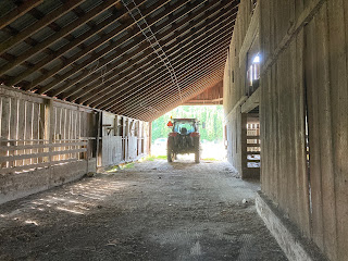
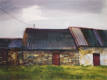
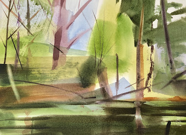
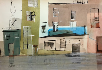
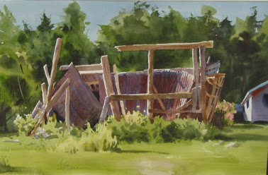
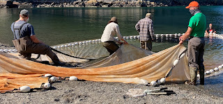
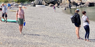
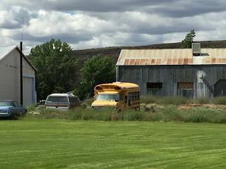
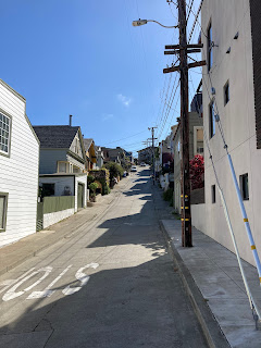
Here are some images that display engaging features of the watercolor medium. Choose one. Your job is to interpret the color, value, composition, edge quality and complexity by asking whether these variables satisfy you. Every feature of your interpretation is adjustable. Keep a sheet of practice paper nearby. Invent, explore, decide. A painting is the result of asking "What if"? Make your decisions deliberate.


Sunday, February 13, 2022

Technical Practice with a Focus on Color Temperature

Time for some technical practice, with a focus on color temperature.

Let’s start with a copying exercise that involves very subtle color differences. Limit your palette to just one warm and one cool. You may make combinations, in fact you’ll need to.

It may help to begin by identifying the warmest part of the scene and the coolest.

Below is another very subtle scene

Notice the temperature of the downward-facing surfaces.


 Or try this one, it may be the easiest.


IMG_E0772.jpg


Have fun,

Tom 


Thursday, February 3, 2022

Putting People in Your Paintings Part 2

It was thoroughly enjoyable copying figures last week . It should also be fun actually inserting invented figures into deserted scenes. Your firs job is to make a copy of a painting. I'll supply a few here, but you  can certainly use one of your own.


Tear a piece of paper that you can move around on the painting.
Remember it should get smaller as it moves farther away.When you like the location you  can cut a figure shape and glue or tape it to the painting, or paint right on the painting. Make as many people as you want?
Do you have options regarding the color and value of the figure?


Friday, January 28, 2022

1/28/22 How are you at putting people in your paintings?

   How are you at putting people in your paintings? It came up this week when some of us got the courage up to include a figure walking through the low tide. I say "us", but I confess none of the brave ones were me."Too corny"I say, or "too uptight".

Actually, it's really fun to to fill a page with simple shapes that add up to figures . Let's practice for a while and share our discoveries in critique. 


Many figures  can be built around an upright rectangle which is the torso. The arms and legs are smaller rectangles that emerge from the upper and lower corners of the torso. A small dot rests on the top.
 Try it with mister red hat. First, make a simple green rectangle which will be the torso. Then, make short rectangles that sprout f rom the corners of the torso. These are the arms. Now com the long. rectangles that begin at the lower corners. These are the legs. Finally, the small dot that rests in the middle of the shoulders, which is the head.  OK, torso, arms, legs, head. Allow the separate parts to run together to encourage the feeling that your figure is all one thing. 


Here are a few more people to play with. Many painters make the arms and legs too short and the head too big. Err on the side of small heads and long arms and legs. I tend to leave out the facial features. The person is sufficiently present before the viewer can tell exactly who it is.
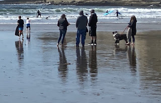
Try inventing people by following the unfolding  of shapes  described here. Try overlapping groups of figures.


Friday, January 21, 2022

1/20/22 CROP!

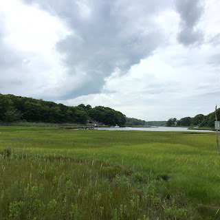
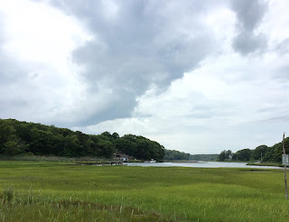
Before beginning  a painting we often make changes big and small to the objects if it's a still life, to the position of the model  or the boundaries of a cityscape or landscape. If you are working from a photo you can change the feeling of the scene by trimming the edges, or "Cropping". Here's an example;


This landscape has several features that I would not want to lose. I always like a clear value distribution; light, middle. dark, and a simple arrangement of just a few shapes; sky, cloud,  pond, hill, marsh.
But There's just too much green in the bottom half. And, speaking of halves, that horizon runs right across the middle of the world. Cropping some of the bottom off might solve both problems.


While I was at it, I stretched it left to right. This is definitely an improvement.


For homework, I'll offer a few more images for cropping.  Your job is to remember what you changed and  paint  a simple version of one of the transformed scenes.
Maggi and Anne Mariah, please set up the power point with the original images up first, followed by the painted versions. 
Painters, do  you think you can imagine adding or removing shapes?


Tuesday, January 4, 2022

The role of the middle value shapes


  As visual artists we often take note of the role played in our work by the darkest darks and the lightest lights, but we tend to overlook the mid value shapes.

Take a look at this study by Stanislaw Zoladz. What  Lovely, convincing light! Just one or two small triangles are enough to create a believable illusion.  But what would the illusion be without the subtle mid  values?

Here are a few images to experiment with. Paint the large, simple shapes very dark , or very light instead of middle value. If the shape you are about to paint is closer to dark than to light. paint it black. If it is closer to white than it is to black, leave it white. Read that last part again.