Friday, March 16, 2018

Everyone's Homework 3/16/18 Muchas Gracias!

As another term ends I'd like to thank all of you for your enthusiasm and your perseverance. I know this watercolor business ain't easy, but when we are surrounded by a community of like-minded, light-hearted individuals willing to fail more often than succeed and still keep smiling, it makes it worth coming back for more.
Here's a short film forwarded by my oldest friend that reminds me what it's all about:
Sorry, I can't make a link for this, but if you google

New York Times My Grandfather's Memory Book

you'll find it. I recommend spending 5 minutes watching it.

As for your homework, please make a fearless painting or two and bring them in to share.

West, from Gasworks hill


Friday, March 9, 2018

Tuesday Afternoon Homework 3/8/18 Simplify!

The photo below is made up of 29 shapes.


Or, SQUINT! The photo above comprises 3 shapes.

Are you allowed to eliminate most of the information? How about just for today. Let's make these images really simple.
Reduce the number of shapes by combining adjacent shapes that are similar in value.
Empahsize shapes by eliminating texture.


Something like this.

or this


Beginning and Intermediate Homework, 3/9/18 Model Warm-up


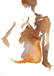
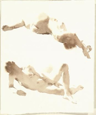
Here are several images that feature a strong shadow shape.
Many of them offer an opportunity to exaggerate color.
Some may raise the question of how softening some edges would change the feeling.
Others might invite just painting the shadow shape.
In other words, you can use the poses as starting points, inventing, simplifying or exaggerating elements of the image as you please.
Simply copying the paintings and photos is a fine route to take.
Try introducing extra color in the extremities (feet, hands, knees, head).
What if you do the drawing last, instead of first (Shape First, then Line, if necessary)?
Go fast.
Go slowly.
Light, middle, dark.


Friday, March 2, 2018

Beginning Homework 3/1/18 Thinking in Layers

To extend our classwork into the realm of understanding a painting subject as a series of layers, I'd like everyone to make a demonstration piece comprising three separate sheets of paper. One will show only what the first layer looks like (the pale under-painting of the major shapes). Then another that shows the first and second (lights plus middle values), and, finally, one that shows three layers (light, middle and dark). The idea is to show the layer by layer development of your painting.
The process breaks down like this:


Start by identifying the major shapes in the image. There should be no more that 10 or 12.
Make a simple drawing that locates the shapes.
Paint in the first layer - the lights - of each shape, keeping the treatment as simple as possible (no texture or detail).
Now make two more first layer pages, so that you have 3 more or less identical sheets.
Put the second layer - middle value - on top of the first layer on two of your 3 sheets.
Finally, apply the 3rd layer - the darks - on top of one of the second layers.

When the process is finished, you should have one sheet that just has the first layer, one that has first and second layers, and one that has three layers. Please bring all three, plus the photo in to class.

In case you missed class, here are a couple of simple images that will resolve nicely into three layers. If you think there should be a fourth layer of super darks, put them on top of the three layer treatment.

Please read all that again. It's a little confusing, I'm afraid.


Intermediate Homework 3/6/20 Creating Abstract Guidelines for Complex Realist Images


This dramatic sky wanted to be painted! It's a little intimidating, though, with all that activity in the sky. Rather than try to duplicate that complex array of marks, I'll look for guidelines that will lead toward an interpretation that feels similar. 
The warm wash across the upper sky portion seems simple enough, but the array of grey brushstrokes requires some analysis. It helps me to ask a few questions the answers to which provide guidelines for approaching the subject in a general way.

What proportion of the sky will become grey?
60%, roughly.

How are the grey strokes distributed?
The majority of the marks are spread across the center of the top half of the page, extending from one side to the other, running right off the page. Mostly clumped together, with a couple apart from the group. Only one or two strokes touch the top of the big shape.

What kind of marks are they? (organic? geometrical? Horizontal? Vertical? Hard? Soft?) 
Soft-edged but still distinct, roughly horizontal, irregular and varied.

The answers to these questions are abstract, in that they don't refer to content at all. Theoretically, following them will lead to a passage that reads as a tumultuous sky. It should be possible to turn your back on the scene (or turn the photo over) and still make a convincing version without mentioning the words "sky" or" cloud". Thinking abstractly eliminates the profusion of associations that come along with naming content. 

This approach is basically an act of faith. It requires letting go of the usual process where we keep checking to see if we've made sure the viewer will know what they're looking at. The viewers may be hypothetical, but they still deserve respect! Trust that they'll be willing and able to make sense of what you offer, and that they'll appreciate the opportunity to participate in the interpretation. 


The following images might seem more approachable if you observe them as pure form and leave content at the door: