Friday, June 9, 2017

Intermediate and Beginning Watercolor Homework 6/8/17 What Matters Most

Here are a few images that require close attention to Value. To create a convincing illusion of light you would need to establish the range within which the value of any given shape would work relative to its neighbors.


Choose one that looks fun to paint. You may want to make a quick monochrome value study first. Make notes about the relative values of each shape. Where would you like to make adjustments for the sake of the painting? Not everything you see in a photo is best "as is".The foreground shadows in the Monument valley image, for example, are too dark. They come off as flat black shapes. If you were really there, you'd be able to see into those shadows and observe much more than the photo displays.

When you're confident about the relative darkness of the shapes, devise your palette. Make sure you select colors that can make a dark enough dark to tell the story. This exercise REQUIRES having a practice paper handy. Remember to bracket the values, looking for something lighter than the shape you are about to paint, and something darker. For example, in the graveyard scene, the headstone on the left is darker than the sunlit grass, but lighter than the shadows on the grass.
Feel free to paint more than one image.

Thursday, June 1, 2017

Intermediate and Beginning Homework 6/1/17 Letting the Components of Your Color ixing Show

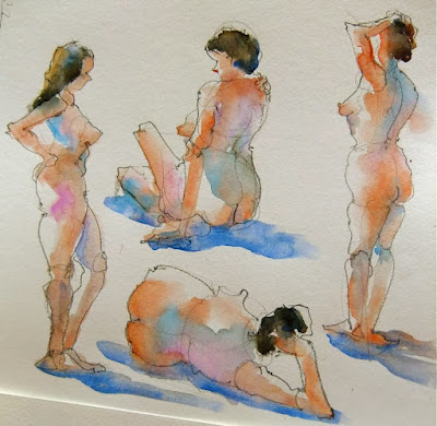
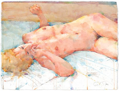
We've been focusing on neutrals lately, and we've touched on the idea of letting the components of your mixes be visible in their more intense forms within the washes you make. The figure offers a good opportunity to practice this, in both the local flesh tone and the shadows. Here are some examples of figures where the colors are left unmixed or are touched into a neutral wash that is still wet:


Look at the local color of the skin tones of the figures below. Try copying the colors, keeping track of  what you mix. In every case, I expect there was some of each of the primary colors involved. Experiment with allowing the component colors to remain incompletely mixed. You can start with a thorough mixture, where all the components have been mixed till they are evenly tinted throughout the wash, and then touch in a little of the components. If you're feeling brave, try double-loading your brush (loading more than one color at a a time).  Do the same for some of the shadows. 


This should be good practice for working from the model next week. If you have some large drawing paper (11x14" or larger), please bring a bunch for the short poses. It's fine if it's not watercolor paper, in fact, using relatively inexpensive paper encourages experimentation. Have a few pieces of the good stuff, too, for the longer poses toward the end of the session.