Friday, September 30, 2016

Intermediate Watercolor Homework 9/30/16 Adjusting Composition

Most of the time the "Reality" of what you choose to paint can be treated as a jumping off place. It's your painting, you can alter it however you please. Nothing is sacred. I think we all understand this intellectually, but there can be some powerful forces that urge us to duplicate the source, as if that's our job. One of these is the notion that the more the painting looks like the scene, the better the painting is. That may, in fact, be exactly the criterion you want to apply, and it is as valid as any other, but if you find yourself bound to accuracy even though you'd prefer to make a personal interpretation, you might consider a "one thing at a time" approach.
Let's begin by looking at changes you might make to the composition of a scene. This need not involve big changes, like altering the color of a building, or deleting something altogether. Sometimes just turning your paper to a vertical rather than horizontal format can resolve compositional issues.


If you are actually on the scene, you can make profound adjustments to the composition by changing where you stand. Which of the following arrangements of shapes appeals most to you?


A change like this is easier to make than one that violates reality. We don't need permission to move the whole scene up or down, but it can seem like a sin to remove something, or change just part of the scene. 
The first step is to allow yourself to consider changes that improve the potential painting. In the photo below, can you picture how the scene would look if you took out the car on the left? Or the building behind it. Maybe both.


How would changing the composition affect the illusion of space? What if you raised the roofline of the rusty building till it overlapped the ridge line of the hill?

For homework, start with a photo and make any changes you believe would improve it as a painting source. See if you can identify the changes you want before you make a painted version. Remember, the best way to see if something belongs in the painting is to leave it out. And by all means remember, nothing is sacred. Bring in the original so we can all see how your changes affect the results.


Beginning Watercolor 9/29/16 Don't Panic!

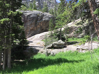
Given a complex subject like the background in the photo, below, you could easily get into a spot where the paper dries before you have a chance to paint all the soft-edged layers you intend. If you want that hill across the water to look farther away than the place where we are standing, for example, everything back there should be soft-edged. Hmmm, tricky
Time does play a part in the operation, but it is not necessary to get all wrapped up in a race against the clock. Panic is definitely not good for your brushwork. Let's consider what can be done to take the edge off the process.


The option that may come to mind first is to PAINT FASTER! This is not terrifically helpful, since efficiency comes from long term experience, and we are looking for what can be adopted today. Instead of speeding ourselves up, then, how about slowing down the drying time?
That hillside in the background of the photo comprises 4 or 5 different applications of paint. Starting with the lightest layer, a "common denominator" of very pale, warm neutral can be applied to the whole shape (leaving the foreground trees white). Now, while that first wash is still wet, the middle value areas - the forest green and the rock shadows - can be painted. These are followed by the darker green shadows and the darkest recesses within the rock shapes.
That's a lot of color mixing and brushwork. Chances are the initial wash could be dry before you even finished the middle values. 
Unless...
You make that wash wetter. A lot wetter. Then, when you prepare the brush for the additions just make sure it's drier than the paper, to prevent blooms. 
Of course, the wash will eventually dry, no matter how wet you make it, so watch for hard edges you don't want. If you see one, stop painting and dry the paper thoroughly. Now you can re-wet it and proceed making soft edges. 

Back to the photo.  Notice that the foreground lights are lighter than those in the background and the darks are darker. This difference in the value range contributes to the feeling of space. Using hard edges in the foreground would add to the illusion.

For homework, look for an image with areas that have multiple layers with soft edges, or use the one you brought home from class. Practice the complex parts on good quality paper. When you feel confident, try putting it all together in a proper painting.


Saturday, September 24, 2016

Intermediate Homework 9/24/16 Deciding on Edges

What kind of edge does this form need?

Sometimes the subject matter of what you are about to paint will tell you whether the edges of the form should be hard or soft, but there are no rules about this. Clouds often appear to have soft edges, for example, but you can paint perfectly acceptable clouds with only hard edges. You can search long and hard in most of Edward Hopper’s watercolors and never see a soft-edged cloud. 
More often, it is the focal point of the picture that determines how wet the paper and the brush need to be in any given area. Hard edges are assertive. They tend to describe distinct forms, while soft edges merge with the field on which they have been applied. 
In Familiar Rock, we are encouraged to see the trees on the foreground headland as individual forms, while on the hillside in the background we are meant to see the forest as a whole.


Familiar Rock                                   Tom Hoffmann

The hard edges of the nearer trees are necessary to keep them separate from the more distant hillside. If the painting were made with only hard-edged shapes, or all soft edges, the pictorial space would be ambiguous. Choices have been made that deliberately focus the viewer’s attention, much as you would focus a camera.

Soft edges tend to describe a subject in general terms, while hard edges are usually more specific. Consider the role that the particular area you are about to paint is meant to play in the big picture before deciding whether your paper should be wet or dry. How much attention do you want the viewer to pay here?

Red                                              Mary Whyte


Limiting the hard edges to the face and the hat keeps the viewer’s eye from being distracted elsewhere.  The job of the background, for example, is simply to “set off” the figure. Once that is accomplished, nothing more needs to be added.


It is often appropriate to imply complexity in a subject rather than to specify it. Too much specific information leads to a confusing picture, where the viewer’s eye is pulled in several directions at once. If your pictures tend to lack clarity and cohesiveness, consider holding off on the hard edges until you know where you really want them. As a preliminary study, try blocking in the lights and the middle values all wet-on-wet. By the time you’re ready for the darks, you will probably have a good basis for deciding where you want to focus attention. See how the picture “reads” if you only make hard edges in that center of interest.   

Baby Grand Baler               Tom Hoffmann

Here, the baler is clearly the star of the show. The stacked hay bales play a supporting role, and would compete for center stage if they were more specific. They are made up of many brushstrokes, but because these are mostly soft-edged marks, it is possible to take in the overall shape as one form, without being distracted by too much information.


For homework, make a very simple version of your choice of image, or one of those below, using only soft edges or only hard edges. When the study is finished, ask yourself where you wish there were the other kind of edges. In your imagination, decide where the most meaningful strokes would go if you were 
limited to only a few, say, three or four.
If you have time, make both an all soft edged study and an all hard edged one. By then you'll be ready to make a very well informed painting.


Have fun.

Beginning Homework 9/24/16 Soft-edged Skies

Sorry the homework is late to be posted. There's a glitch in the process that almost defeated me


Paint a few soft-edged skies. This means that as soon as you see a hard edge, STOP. Let the painting dry completely, then re-wet the area where you plan to make more soft-edged strokes.


Can you tell how many layers of paint were applied to make this sky? It looks like four to me. First, the paper was wet with clear water, then a layer of pale, warm peach color was applied across the bottom and center. While the paper was still wet, the lighter gray went down. Then the dark gray, and finally, the blue. The brush needed to be washed once - between the dark gray and the blue. 
Remember to stay aware of how wet your brush is compared to the paper. And don't correct these paintings. If something goes wrong, let it be. Really.


When the paper is dry, add some hard-edged landforms. Or, on second thought, let them be soft, too. Experiment. Be playful, and have fun. 
Take a look at this week's intermediate homework for a short discussion of how choosing hard or soft edges affects the focus of the painting.

Wednesday, September 14, 2016

Intermediate Watercolor Homework 9/14/16 Thoughts about Plein Air Painting

It seems a little crazy to try to practice, or even talk about plain air painting while looking at photographs, but here goes...

I  hear many people say they feel intimidated or overwhelmed by the quantity of information painting from life presents. It would be helpful, I think, to have some guidelines. What needs to be included in a painting and what can be let go? What is essential, we are asking, and what is optional?

Let's try to zero in on the fundamental aspects of the alleyway we visited today. We started by looking at the space as a shoebox. As such, the most significant visual features were the sides and top and bottom of the box, or the planes that defined the space.

This way of seeing recognizes the planes as more important than the individual fences, garages, bushes and dumpsters each plane comprises. It is essential to make apparent that there are vertical and horizontal planes first, and then to make some reference to the more specific, smaller components within each plane. If the viewer were unable to identify just what those components were, or exactly how many there were, it would still be possible to feel the basic structure of the scene. Most of the specific information can be released. That hypothetical viewer will do the work of making it all meaningful.

Once you have discovered that there are boxes full of information that do not need to be named, it is useful to shift into abstract vision. All those recycle bins and garage doors can be sufficiently described by just making some rectangles within the larger shapes that represent the big planes. Give the viewer some credit. They will recognize those rectangles as "alleyway stuff", and that's good enough. It is not your job to make sure the viewer can tell exactly what they're looking at.


For homework, what would work best is to get outdoors and work from life some more, looking for the most important features of your scene. If that's not convenient, you could work from the studies you did in the alley, or try one of these shoeboxes.
Have fun


Beginning Watercolor 9/14/16 Shadows

In class today we came up with a fair description of how shadows are different from local color. By comparing aspects of the two we were able to conclude that shadows are generally darker, cooler and more neutral than the surface upon which they are cast. As with just about everything pertaining to art, there are exceptions to these rough guidelines. Let's do some comparisons to see how dependable the guidelines are.


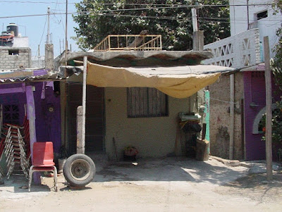
This image presents a real variety of shadows. The red chair is half in shadow, half sunlit. The beige tarp is sunlit on the upward-facing surface and shadowed on the under side. The tarp also casts a shadow onto the ground, where we could compare the color and value of that shadow to the sunlit dirt  beside it.
Is it true, in this case, that the shadow is darker than the local color?
Yes, definitely.
Is it cooler?
Again, yes, it is.
How about more neutral?
Well, not really. The ground is already quite neutral. The shadow is also neutral, but not more so. One is a warm neutral, the other is a cooler neutral. Hmmm. Lets compare the sunlit tarp to the shadow on its under side.
Is the shadow darker?
Yes, for sure.
Is it cooler?
No. If anything, it's warmer.
Is the shadow more neutral?
Um, no, it's not. The upward-facing surface is nearly white, which is pretty much a neutral, but the downward-facing surface is a rich golden ochre.
Some of the guidelines appear to be slipping away. All that's left is that the shadow on a surface is darker than the sunlit areas of that surface. How can we find colors that will work for shadows if we have no recipe for success?
The answer is to observe and inquire. Which is darker? Which is cooler (or warmer)? Which, if either, is more neutral?
And while you're at it, what kind of edge does the shadow shape have?

Each of you selected a couple of photos that contain shadows and local color near or adjacent to each other. Starting with observation and inquiry, see if you can come up with answer to the questions above.
Take your time mixing colors to represent the local color and the shadows you see in your images. It is not necessary to make an exact match. Instead, focus on making a convincing  pair of colors. Do they describe a believable quality of light?
This is also an opportunity to practice mixing colors from the primaries. Choose one red, one blue and one yellow, and see if you can get reasonably close to the colors and values you see in the photos. Keep track of the colors you used by writing the mix beside the patches of color on your practice paper. To darken a color, try adding some of its compliment.
Don't forget to bring in your flops as well as your triumphs.