Sunday, November 15, 2015

Homework for the final week of Fall term 11/14/15


In the spirit of becoming your own teacher, the final exercise is up to you. What usually informs my choice of homework is what we have been doing in class and what we will be working on in the next session. That puts us in the portrait/figure realm. I’ll attach a few images that may interest you if you want to follow up on the portrait practice you’ve had in the past two weeks. I’ll also attach a couple of figures with distinct shadow patterns for those who’d like to warm up for the model we’ll have this coming week.

It’s all about seeing in layers, right? A useful exercise would be to paint the shadow pattern by itself, with no pale first layer at all. This reveals the role the middle values play in describing light and volume.


Friday, November 6, 2015

Intermediate and Beginning Watercolor Homework 11/6/15 Portraits in layers

Looking at a subject as a series of layers must be pretty familiar by now. Starting out with a general statement about the major shapes in their palest form is the foundation for a painting that will become darker and more specific as you proceed.


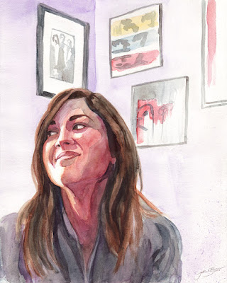
Looking at the face, above, can you imagine what the first layer looked like when it was all there was on the page? The remaining lights we see in the finished portrait were originally part of a silhouette shape of the entire head, neck, and sternum. It was a little darker than the white parts of the shirt, and a little lighter than the background.
A layer of middle value warm was laid on top of the pale first layer, covering almost all of it. Only a few lights remain. This new shadow shape is a little darker than the background, but not too dark. There is still room in the range of possible values to make a few slightly darker areas within the shadow, and the darkest darks in the next layer to come. The next darkest layer is the hair, which contains the darkest parts of the painting. Notice, by the way, that the hair is treated as a small number of shapes ranging from white to light, to middle, then dark. It is its own series of layers, observed and presented as a few shapes rather than as a collection of a great many individual strands.
How many layers do you see on the shirt?

Following are a few morw layered portraits, which are followed by a couple of head photos.
For homework, please translate one of the photos into a series of layers, or copy one of the paintings.


Remember, getting the values right is far more important than the colors. For each layer, ask what it is darker than and what it is lighter than.


Thursday, October 29, 2015

Beginning Watercolor Homework 10/29/15 Name That Tune


The wall in sunlight; the shadows; the roof overhang. Light; middle; dark. I can name that tune in three layers. 
Shape by shape, the painted version of the scene comes together as a series of layers. How many layers will it take to paint the door? The sky? The cobblestones?
Wherever possible, try to keep the whole page at a similar degree of completion, rather than bring one shape all the way to realization while the rest are still white paper.


Some parts of this scene require three layers, some only one or two. Keep it simple.

The shadow is the second or third layer of the road, depending how much of the joint lines you want to include. In either case, the shadow is painted on top of the lighter layers, rather than alongside them. If this doesn't make sense, send me an email!


Hmmm. This one might need 5 layers!

Intermediate Watercolor Homework 10/28/15 The Easy way

There's a long-term benefit to finding the easiest way to translate a scene into the language of watercolor. When you start looking for the most efficient route, you end up devising solutions and strategies that display a real economy of means. 'Easy' somehow turns into 'Magical".
The appeal of a very simple interpretation comes from the role the viewer plays in recognizing what he or she is seeing. When the artist presents just the essentials, the viewer supplies all the details.


John Singer Sargent describes the important aspects of the laundry very efficiently. He knew he wanted to show us the drape of the linens, - the weight of them, and how they hang - and he clearly intended to depict the bright sunlight. Once those essential aspects were present, he stopped describing the subject. 


Surely there was more information available, but Sargent knew that this simplification of the light and shadow told the story well enough. By no means has he told us everything he could see. He has treated the collection of linens as a single shape, for example, even though here was plenty of evidence that the individual items were separate from each other. The feeling that the sheets look "real " actually comes from our surprise at learning that this was all we needed to be shown. We - the viewers - are participants in the interpretation. Sargent provides what he sees as the essentials. Anything else, we  project.

The job of deciding what is essential and what is optional is not necessarily all about the "true nature" of the subject. It has more to do with being very clear about what you want to say. One artist's essence will probably not match another's. To choose which elements of your subject you want to display, you need to check your own feelings. The answer, as the cartoon guru says, lies within.


What do you think Edward Hopper wanted to communicate about the cars or the rocks? Was there more he might have added?


If you were getting ready to paint this scene, what would you want to be sure came through? Pick just a couple of aspects. 


How about this courtyard view? What seems essential to you?

Once you have fulfilled your intentions, the rest of the information you see can be left out. Just because you can see it doesn't mean it has to be in the picture! For example, if you wanted to communicate a feeling of serenity in your painting of the courtyard, it probably would not be necessary to make sure the viewer could tell what kind of plants are in the pots.

Before you begin painting, ask yourself if your intentions are clear.

If you use one of your own pictures, please bring the original in for the critique.


Friday, October 23, 2015

Intermediate Watercolor 10/20/15 To Separate or not to Separate...

That is the question.
Sometimes we use color, value, edge quality and composition to separate shapes from each other. Sometimes we want to use these variables to combine shapes.


In this scene the background and foreground are squashed together. It would be easier to read the space if some shapes were combined and others were separated. That black and yellow drum, for example, needs to be placed more obviously in the foreground group of shapes. What makes it's location  ambiguous? 
I usually start with value to see what role that powerful variable plays in both the problem and the solution. Sure enough, the opening of the drum is hard edged and light, just like that shovel handle and the light, horizontal strip of wood. How could the drum or the background shapes be changed to emphasize their differences?
I'd like to see what would happen if I glazed some of the background with a darker wash, swallowing those bright objects in the same shadow that runs along the top. This would be an example of combining shapes to clarify space.
While we're at it, what about further separating the drum from the background by changing it's value and /or color?

If you brought an image home from class, check to see if it lends itself to experimenting with combining and separating shapes. If not, see what you can come up with, or use one of those that follow. There are a couple in the beginning homework from this week, too. In fact, read that whole post. It is quite relevant to your studies.

The basic idea is to use the simplifying effects of combining shapes and separating shapes to make the illusion of space more convincing. Keep track of how you decided which method to use, and be prepared to tell us how well it worked.


Beginning Watercolor 10/20/15 The Illusion of Space

Traditionally, representational painting involves the creation of an illusion of space. When there are recognizable elements in the scene, we are usually told where they are relative to one another. Even when impossible events occur, like Chagall's figures floating in air, forms overlap, revealing which is nearer to the viewer.

Marc Chagall has flattened the space somewhat in this fantasy, but he still provides enough clues for us to tell where things are

Depending on the feeling you want to convey, you can manipulate the variables of form to show the viewer how much depth you mean to suggest in your painting. 

The effectiveness of your illusion depends largely on understanding what we are used to seeing. In the painting below, for example, Chloe Yingst uses the scale and placement of the poles to convince us that these few shapes represent miles of space. Her composition, simple as it is, gives us plenty of information about where things are in relation to each other. We will be giving emphasis to composition in today's exercise.


Our brains know that the poles are all the same size, but our eyes are used to seeing them as smaller in the distance. The illusion of space comes from depicting what our eyes are accustomed to seeing. Imagine if the poles were painted all the same size.

 In class everyone selected a photo. Those will work well. There are a couple more at the end of this post, or look for something you like that clearly depicts depth.

Begin by identifying the major shapes in your scene. These are the shapes that need to be separated in order to understand where things are. Make a simple pencil drawing outlining the shapes. No need to describe them. We don't need to know what they are. At this point it only matters where they are.

Keep it very simple. The number of shapes should not exceed 10 or 12. If there are lots more objects than that in your scene, consider combining some. Adjacent shapes of similar value can often be combined to good effect. In the study below, there is a definite foreground, middle ground and background. Notice how the various dark buildings in the background have been encouraged to run together. Instead of several shapes, there is now only one. The individual identities of the buildings were not an essential feature of the space. They could be implied rather than specified. The group of buildings did need to be separated from the taxi, however, to better understand how much space is being depicted. We want to know that there is some room between the middle ground and background. This was easier to achieve once the background had been simplified. If those buildings were separated from each other they would have had much more in common with the taxi, making the space more ambiguous.
Read that last paragraph one more time. That point about combining shapes is important.


Once the major shapes are identified and drawn , take a moment to check for unfortunate convergences. Increase overlap wherever necessary to make it easy to tell what's in front of what. It's much easier to move the shapes around when they are only pencil lines.

As you begin layering the lights, middle values and the darks, consider when in the sequence you need to get shapes to separate from each other. It may be that the early stages of the process don't require that you keep the individual identity of each shape intact.
In Trevor Chamberlain's sketch, below, look at the sunlit buildings in the background.


When the pale, warm washes were being applied it was not necessary to make sure the viewer could tell how many buildings there would ultimately be. The washes could run together and still get the definition they need later. 
The separation between foreground and background also happens at a relatively late stage. The dark arch does its job more easily if it can be applied right on top of those pale washes, rather than by painting very carefully along an edge. 
When did the windows come along, by the way?

OK, here are a couple more images. Have fun!


Friday, October 16, 2015

Everyone's Homework 10/15/15 Adjusting the Variables


  In this landscape Joyce Hicks makes sure to separate shapes everywhere there is a step back into the illusory space. Notice that she keeps a hard edge between shapes. How is she using color to suggest depth? What about value? And what is she doing with placement of the shapes relative to each other?


Camilo Huescar uses a different balance of variables to suggest space in his landscape. It still involves value, color edge quality and composition, but the "settings" on his dials are not the same as Joyce Hicks'.

It is often useful to exaggerate one kind of difference between shapes in order to downplay another.


Piet Lap maintains a hard edge between water and land all the way back in the space he describes, which ensures that we will still feel the space even though he has allowed the edges between shapes above the waterline to blur together. Is this deliberate or accidental?


It is not difficult to see which shapes are in front of which in this photo, but there could be confusion in a painted version. That roof, for example, hard-edged and very light, would jump forward in space. What could you do to keep it back where it belongs? If you wanted two tiers of foliage behind the building, how could you adjust color, value and edges to realize that transition?

For homework, either copy one of the paintings, above, or paint a version of one of these photos. Pay attention to the variables. Keep track of how you decide to dial them up or down to create the illusion you want, so you can tell us what you've done. Remember, there's no sin in making it really easy for the viewer to read the illusion. Or in making it deliberately ambiguous. You can move shapes around for better overlap. You can soften hard edges, neutralize some colors while intensifying others, lighten this, darken that. Question everything! Just because the shadow on the tree on the right is the same value and color as the closer one on the left doesn't mean you're obliged to paint it like that. Change it till it works. You can do whatever you want!
And have fun.


Thursday, October 8, 2015

Intermediate Watercolor Homework 10/8/15 Staying Abstract


If you are laying down the first layer of this scene, like the green upside-down "L" and the beige one, is it necessary to keep the shapes clearly divided? Would it be OK to let them run together? How can you tell?

The answer is probably more in your gut than in the photo, since the photo displays a very distinct edge. It's really a matter of what you're comfortable with. You can do whatever you want.

Ask what is important to you. Light? Space? If you do decide to give control back to the paint, will the important things still be possible to realize in later layers?

How about the sky? If the green and beige flow into the blue, will those darks on top of the building separate them again?

These are the kinds of questions that can help you decide where you need to be careful and where you can be casual.

Here are a couple more images that offer opportunities to play fast and loose in the early stages. I find that "What the Hell!" is a pretty good guideline. It's only paint, after all.


Beginning Watercolor Homework 10/8/15 Seeing the Sequence of Layers in Advance

Some paintings I admire are easy to understand as a series of layers that proceed from light to dark and from general to specific. Others resist this kind of analysis and remain mysterious.


In any given area or shape there are seldom more than three layers in George Post's paintings. Notice how he uses an invented pattern to describe texture, like the herring-bone marks in the conifers.


Here's Post's pal, Rex Brandt at work. This painting takes a little longer to understand as a sequence of layers. The white building, for example, and the puddle, are first defined by what surrounds them, rather than by a wash that shows us the basic shape.


In this scene from Iceland (painted by me, on a good day), there are areas similar to George Post's shape followed by texture approach, and others that involve first reserving a white shape, as Rex Brandt did so well.

The homework is to copy a watercolor that engages you - one of these or anything you like. As you finish each layer, say, light, middle value and dark, take a moment to assess the effectiveness of the illusion of space, light and substance. You may be able to discover when in the sequence the illusions are established.
Have fun!

Friday, October 2, 2015

Beginning Watercolor Homework 10/1/15 Seeing in Layers

Most of you have a photo from class that resolves well into a series of layers. In addition to finishing that piece, try the following, if you have time.

Make a simple drawing outlining the major shapes in one of these photos, below, or one of your own.

Block in the first layer everywhere.

Save that piece of paper as is, and make another painting of the first layer with the second layer added. Now you have one page with one layer and another page with two layers.

Do a third page with three layers. If the image requires a fourth layer, such as a few super darks, add them to the third layer on that same page.

If everyone brings in three pages, we'll have a wall full of step-by-step demonstrations to learn from!


Intermediate Watercolor Homework 10/1/15 Soft is Hard

Whenever we look at something we automatically bring it into focus. It's a survival mechanism, and therefore difficult to override, but when we're painting it's important to be able to choose what is in focus and what is not. If everything has distinct edges the painting can be brittle and staccato. The hard edges tend to compete with each other for attention, shattering the repose of the scene.


This painting would benefit from fewer hard edges. Those dark brown shapes in the background are threatening to come loose and rush forward. The clouds, too, are a little too assertive.

Choosing where to have soft and where hard edges is a very important part of making a cohesive watercolor. It's much too powerful a tool to ignore.


The edges in this Eastern Washington scene are all deliberately made hard or soft according to the job each shape plays in the big picture. Notice that the top of the big fir is hard, while the rest of the tree is soft. Why is that, do you suppose?

To decide where to use hard edges in a new painting, it helps to make a quick study that has none at all. Zero hard edges. Then you can use the study to decide where you really need hard edges. To select the most important places to opt for sharp focus, try giving yourself a ration of, say, three spots. This forces you to look at the study with an eye toward how to make good use of hard edges without overloading the painting. If three is not enough, add more, but one at a time, with detachment. Let the painting tell you where another is needed, rather than the scene or the photo.

To give this a try, you'll need to soak your paper for a few minutes. Put a 1/4 sheet in the sink or tub, in cool, not hot water. While it's soaking, wet the board or table where you plan to place the paper for painting. Now lift the sheet out of the water, in  and let it drip a while. Then flatten it onto the wet surface. It will stay wet much longer than if you had just wet one side with a brush, but not forever, so move right along. Block in the major shapes with a layer of their palest color. The water that is already on the paper is enough for the whole job, so keep the brush pretty dry. Adding more water will make puddles on the page, inviting the shapes to wander too much.

As you move on to the middle value shapes the paint on your brush can be thicker than the first layer. When you get to the darks, it can be even thicker. Remember, as soon as the brush touches the wet paper you are adding the water that is already there to the brush. If you see a hard edge, stop painting.
You can dry the paper thoroughly and re-wet the area you want to work on with a single stroke of a large brush. Going back and forth when re-wetting will loosen the earlier layers and make a mess.

This is not an easy task. It requires a lot of concentration and a little speed. Don't forget that you can rewet a spot once the area is thoroughly dry, so no need to panic.

Remember, it's easier to add a hard edge than to take one away, and it's much easier to soften an edge while it's still wet than after it has dried.

Here are a couple of candidates: